Juventus FC faces fan uprising after launching minimal new logo
Italian football club Juventus has unveiled its new crest, but the team's fans think the minimalist rebrand is an own goal.
Turin-based Juventus, sometimes dubbed Juve, is the current league champion and widely considered one of the most successful football clubs in the world.
Its existing logo features the silhouette of a charging bull, as well as a crown, bold black and white stripes, and the team name underlined in yellow.
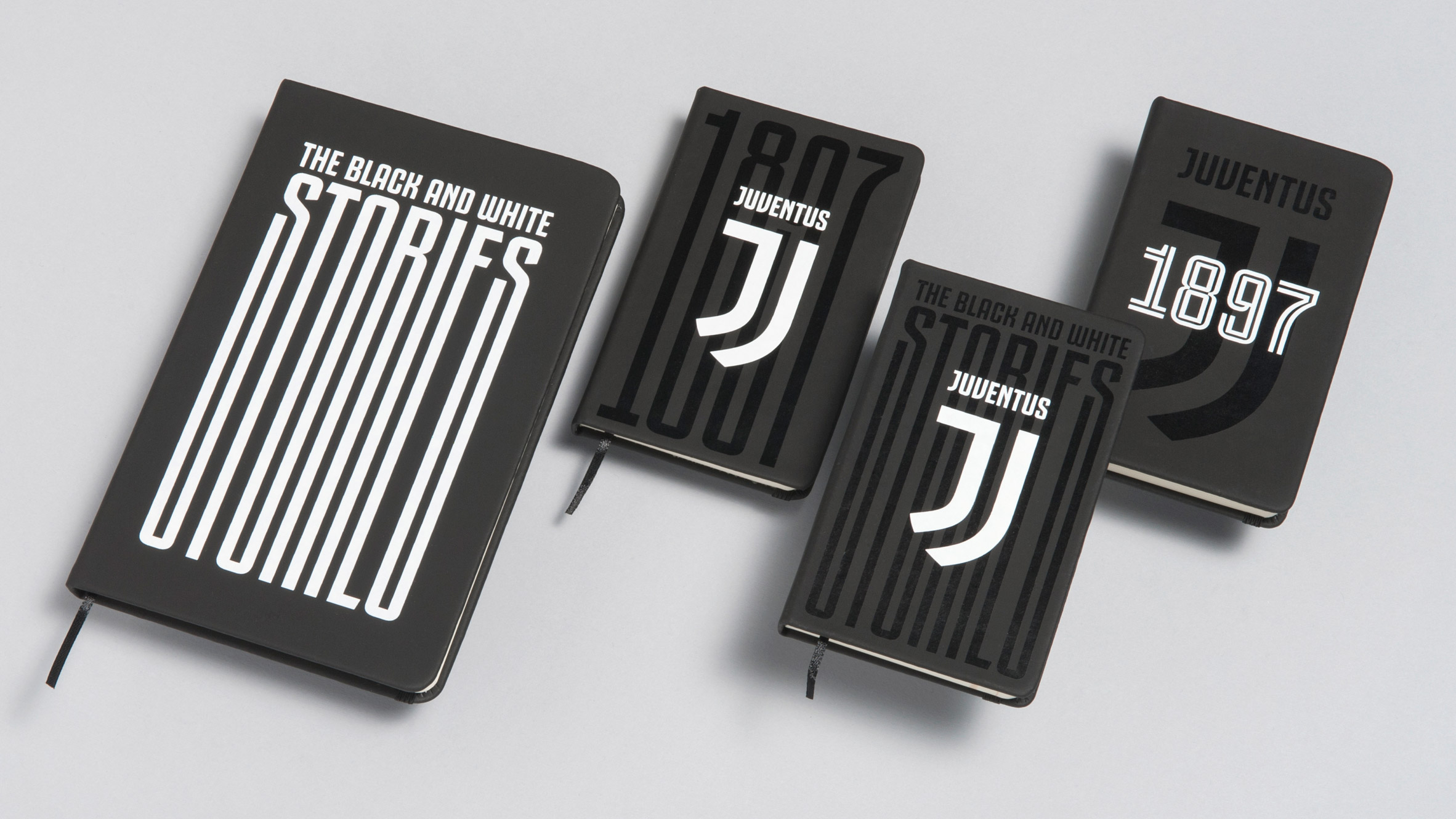
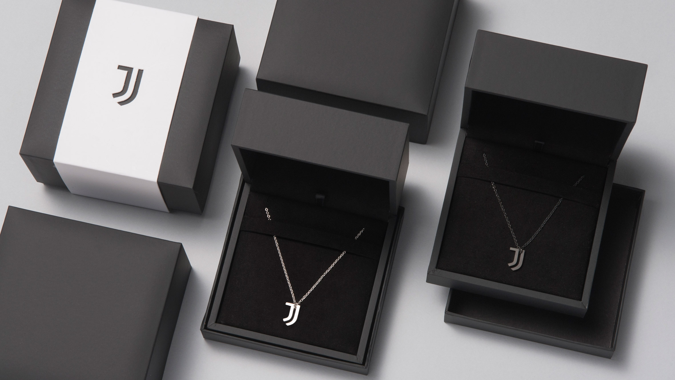
For the stark redesign, Juventus, working with design agency Interbrand, discarded most of these elements. Instead, the flat design features two J-like stripes that hang beneath the team name, which is spelt out in distinctive lettering.
The new visual identity, titled Black and White and More, is intended to help the brand grow in presence as the club explores new business initiatives less directly related to football.
However, club fans were quick to disparage the rebrand on social media. Some complained the new logo is too anonymous and corporate.
Juventus have unveiled their new badge, which is a tribute to the JD Sports logo. They just love their big brand sales. pic.twitter.com/oeATZTVFjK
— Paddy Power (@paddypower) January 17, 2017
"The new logo tells me this is the Juventus brand and we are customers, not fans," wrote user @JuventusCrazy.
Some felt it resembled a pattern someone might shave into their facial hair.
The new Juventus logo was clearly based on Alessandro Del Piero!
Via @FootballRamble pic.twitter.com/10qMKyAtXd
— 101 Great Goals (@101greatgoals) January 17, 2017
Others found the branding quite limp.
Try not to rotate the new #Juventus logo sideways. It's not a good look. pic.twitter.com/BFVvH04lXX
— footballitalia (@footballitalia) January 16, 2017
The new visual identity was unveiled last night at an event at the Museo Nazionale della Scienza e della Tecnologia Leonardo Da Vinci in Milan.
Manfredi Ricca, chief strategy officer at Interbrand, presented the new logo as one that could be applied in diverse ways beyond what is already common in sport.
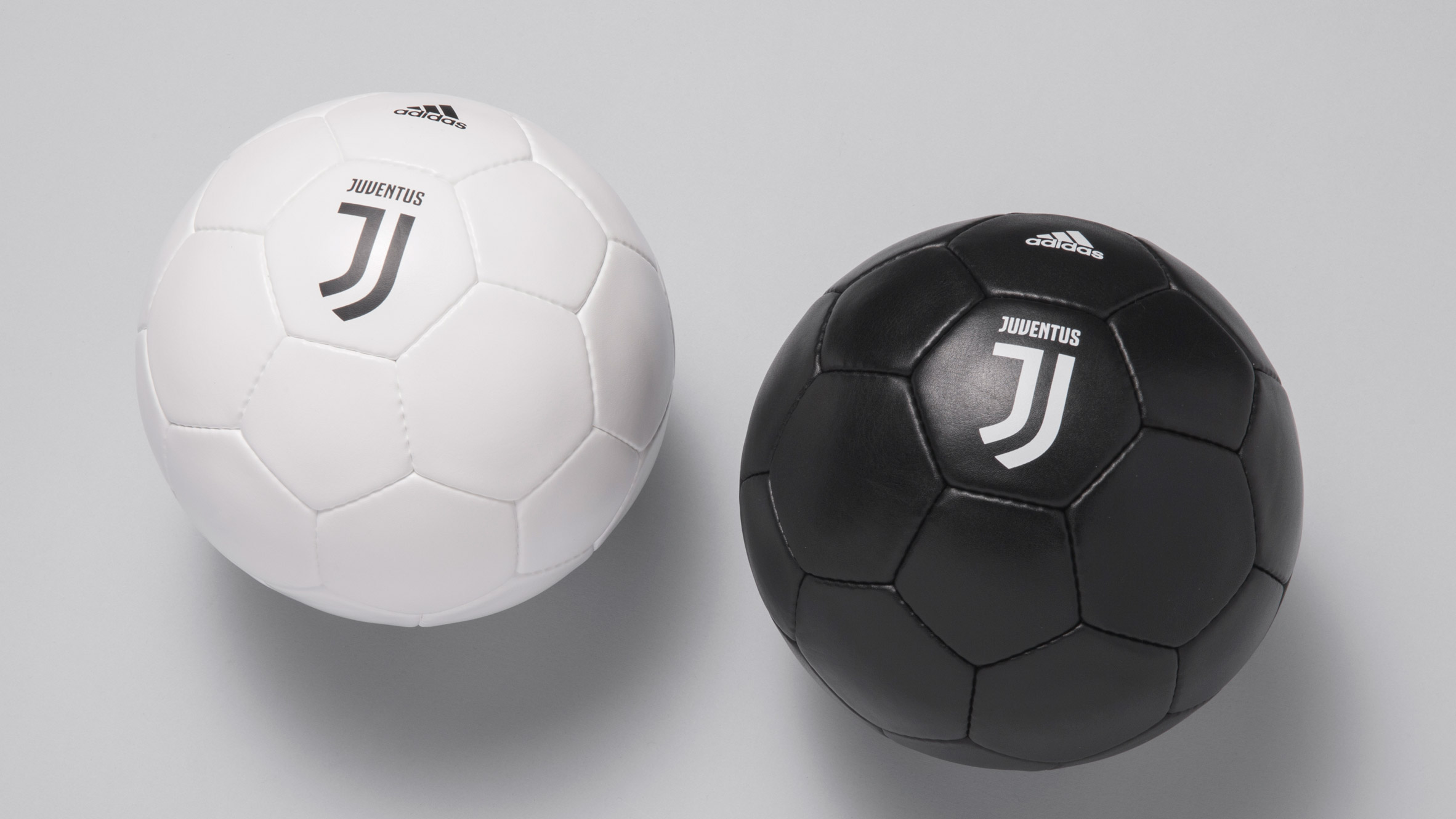
"No club in Europe has so far been able to transcend sport and convey the philosophy behind that," said Ricca.
"If there is one club capable of taking that step, it's Juventus – the brand is synonymous with ambition and excellence and these are principles that can inspire truly unique experiences," he continued.
"The new visual identity has been designed to boldly take the club's spirit into new, unexpected realms."
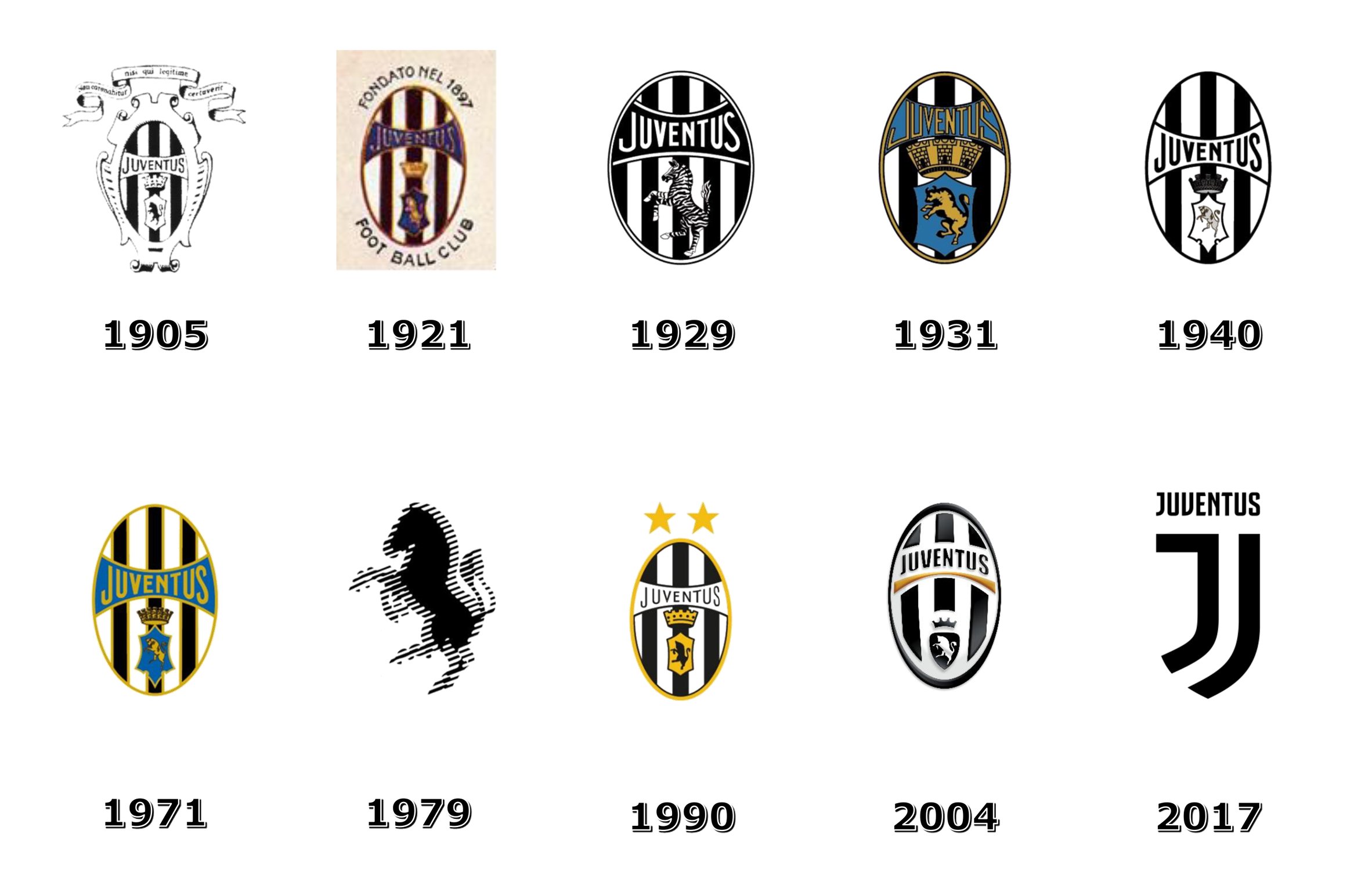
Juventus had used its existing logo since 2004. Almost all of the club's previous logos, dating back to 1905, had featured an oval crest enclosing black stripes and an animal rearing up on its hind legs.
The bull had been the animal of choice since 1990. Before that it was a zebra.
The project shows the minefield that faces companies undertaking rebrands. Customers have lately reacted against redesigns from brands including Instagram and Uber, whose logo was briefly so criticised its head of design stepped down.
Flat design has gained dominance since Apple's iOS7 in 2013 and Google's Material Design manifesto in 2014. As well as ridding graphics of drop shadows and textures, the trend has seen skeumorphic logos – which aim to emulate real-world objects – replaced with more simple icons.
The approach is now also de rigueur outside of web graphics, with companies including Deliveroo, Mastercard and the English Premier League adopting flat, minimal logos.