England's Premier League gets a minimal rebrand by DesignStudio
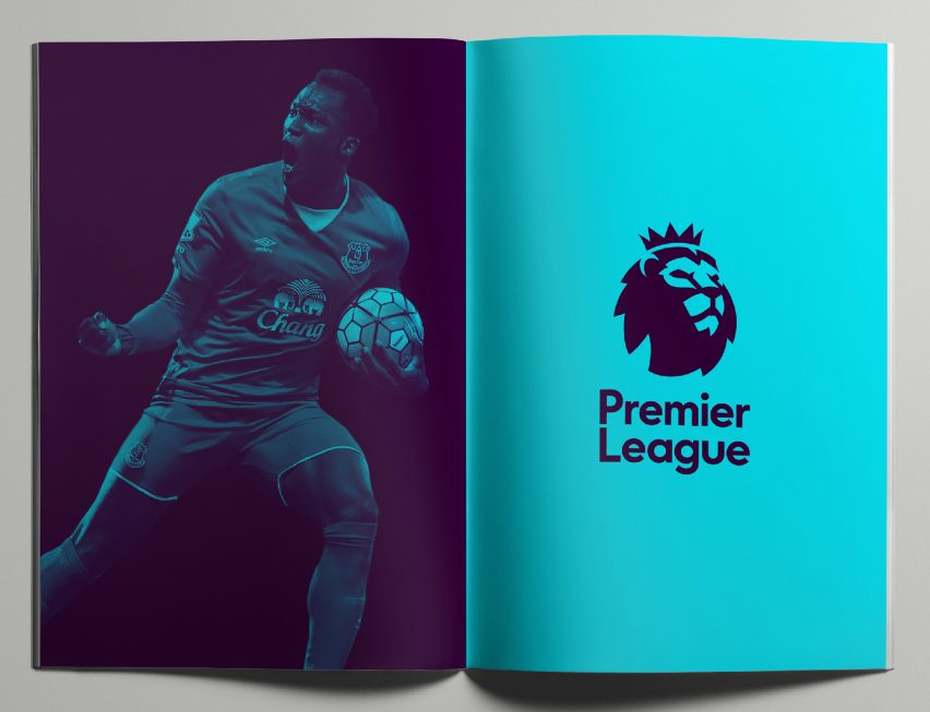
England's primary professional football competition has kicked off its 2016/2017 season with a significantly more minimal lion's head logo.
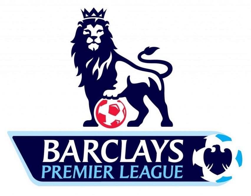
London- and San Francisco-based agency DesignStudio has evolved the league's traditional lion logo, created for its founding in 1992, into a more stripped-back form.

The Premier League's organisers tasked the studio with creating a "modern and flexible" new visual identity for the 2016/17 season – which began last weekend – and beyond.
"We are very pleased with the outcome: a visual identity which is relevant, modern and flexible that will help us celebrate everyone that makes the Premier League," said Premier League managing director Richard Masters.
The design disposes of a number of the former logo's key elements, like the football and lion's body. A crest-shaped outline was also featured on the previous iteration of the logo from 2007.
Another major omission is the branding for Barclays bank, which was made possible by the Premier League choosing not to have a title sponsor for the first time in its history.

"The overarching goal was to achieve a huge cultural shift for the Premier League, and address the misconceptions surrounding the organisation," DesignStudio founder Paul Stafford told Dezeen. "Our research concluded that opinions of the League were positive about the game, yet negative about the business."
"This is the first year of the new Premier League brand – an opportunity to shift perceptions of the game," he added.
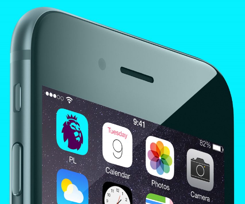
The new logo will reach a wide audience. The Premier League is broadcast in 212 territories, and the visual identity will feature on stadiums, advertising, players' uniforms, merchandise, game tickets, broadcast graphics and "1 billion Nike footballs".
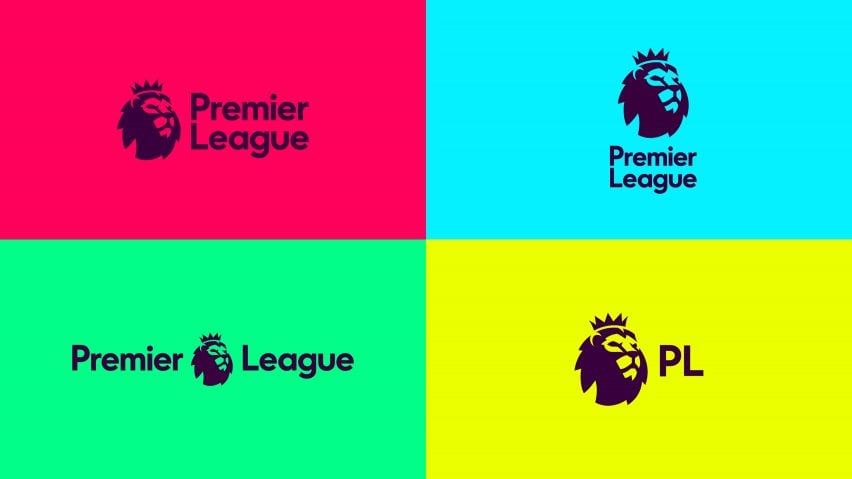
To enable this, DesignStudio presented the league with a wide-ranging "kit of parts" that can be adapted for different purposes. These include versions of the logo in different sizes, with more or less text, as well as different background colours and patterns.

"Instead of the monolithic way of communicating, we gave the Premier League a toolkit – allowing it to adapt and flex, according to who it's talking to," said Stafford.
A number of well-known brands have been moving towards more minimal design identities in recent years, in line with growing interest in more simple packaging and product design.
In 2010, consultancy Antrepo's conceptual packaging for well-known supermarket products went viral, becoming one of the earliest demonstrations of the appetite for this approach.

Mastercard is among the most recent batch of brands to have adopted this kind of minimal design. Its new visual identity, created by Pentagram, retains its iconic overlapping red and yellow circles but swaps the stripes in the central portion for a block orange colour.