Josh Penn brings awareness to dyslexia with kinetic typography
British graphic and motion designer Josh Penn has created a 60-second animation that communicates what it is like to have dyslexia.
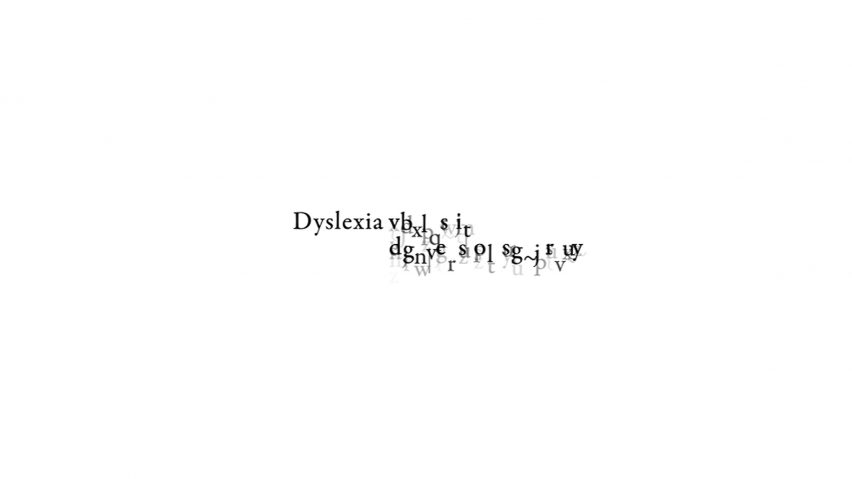
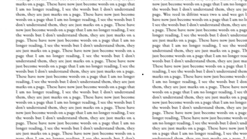
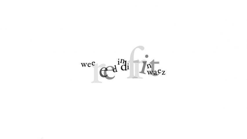
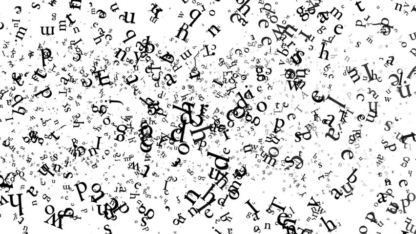
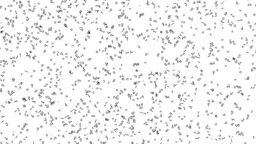
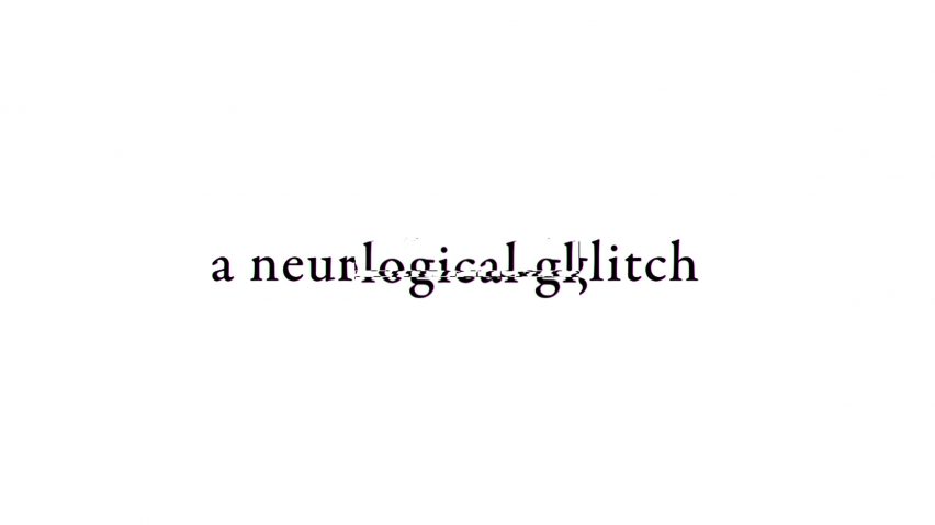
The animation, which Penn made during his final year of his Graphic Design: Visual Communication degree at University for the Creative Arts, Canterbury, sees typography moving, spinning and flickering around the screen to form jumbled words. Letters morph into each other and fade into the background to give an impression of what it's like to suffer from the reading disorder.
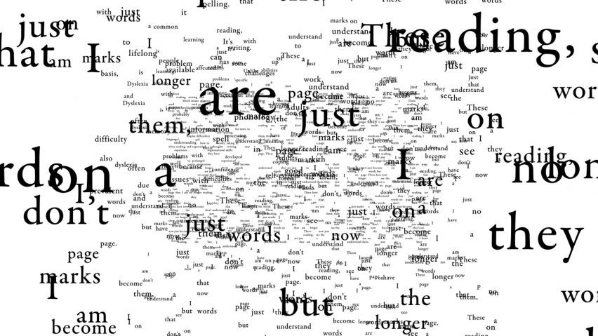
Described by Penn as an "exaggerated, kinetic typography animation", the What Is It Like To Be Dyslexic? film has garnered attention from businesses and charities, and has even been praised by Austrian graphic designer Stefan Sagmeister for its simple delivery of an impactful message.
Shared via New York-based Sagmeister's Instagram account, the renowned designer commented, "This is good. Describing dyslexia in 60 seconds is no small feat and you succeeded gloriously."
Penn created the animation last year in response to an open brief set by his university tutors.
"The brief was a self-negotiated task where we had to decide the topic, the target audience, the medium, the size, just about everything – the only thing we were given was a due date," Penn told Dezeen.
"Eventually, after finding it a challenge to discover an idea, I thought it would be best to take a personal approach. As somebody with dyslexia, I thought this would be the perfect opportunity to learn more about the neurological condition and the many ways it affect people."
Having received specialised help for his dyslexia at his primary school, Penn no longer had difficulty with reading, spelling and writing by the time he reached high school. However, he was surprised to discover that other students had been as fortunate as him and were still struggling to read and write.
"I wanted to educate and tell people what dyslexia is," Penn said to Dezeen. "I think one of the biggest issues with dyslexia is that people without dyslexia don't understand it; they don't know what it is and they don't know the many, many types."
"As far as I know, no one has ever made an animated dyslexia video, this gave me an area to explore and give people a moving image that would actually be able to educate or interest them."
Created in a week using Adobe After Effects, it is the first full narrative-based animation Penn has ever made. He previously has only created animated small logos and worked on general video editing.
"It was extremely fun and I didn't find it challenging," Penn recalled to Dezeen. "However, because it was my first proper narrative-driven animation, there was a lot of of learning to do about pace, sound and motion. But it was all worth it and has led to me create other projects since."
"The response has been incredible," he added. "It has been basically non-stop positive reception since I uploaded it to the internet."
"I have had dyslexic charities contact me, simply saying thank you and I've had parents contact me and comment on the video, saying thank you. It has been incredible and has made a real impact, exactly what I wanted but never expected."
"I recently sent it to Stefen Sagmeister for his Instagram reviews," said Penn.
"I just wanted an opinion on it from someone in the design field I didn't know, but even his response was incredible – his posting sparked another surge of eyes seeing the work as well, I think last time I looked it was 50,000 more, which resulted in more teachers, parents, charities and dyslexic people just thanking me. It's great!"
Penn, who has now completed his degree, is hoping to find a job within the industry but says that one day he will revisit the animation to make improvements.
"Nothing is set in stone but I have ideas about it," he told Dezeen. "Looking back at the animation, there are a lot of ways I could improve it and make it better but my timeframe was restricting; it is definitely something I will do in the future."
Other graphic designers who have used design to bring attention to dyslexia include London designer Dan Britton, who created a typeface that's intentionally difficult to read to simulate the problems faced by people with dyslexia.
Meanwhile designer Christian Boer presented a typeface specifically for dyslexic people at the 2014 Istanbul Design Biennial, and Henry Franks previously created a collection of "dyslexic" everyday objects.