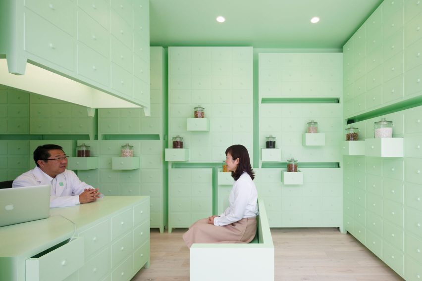
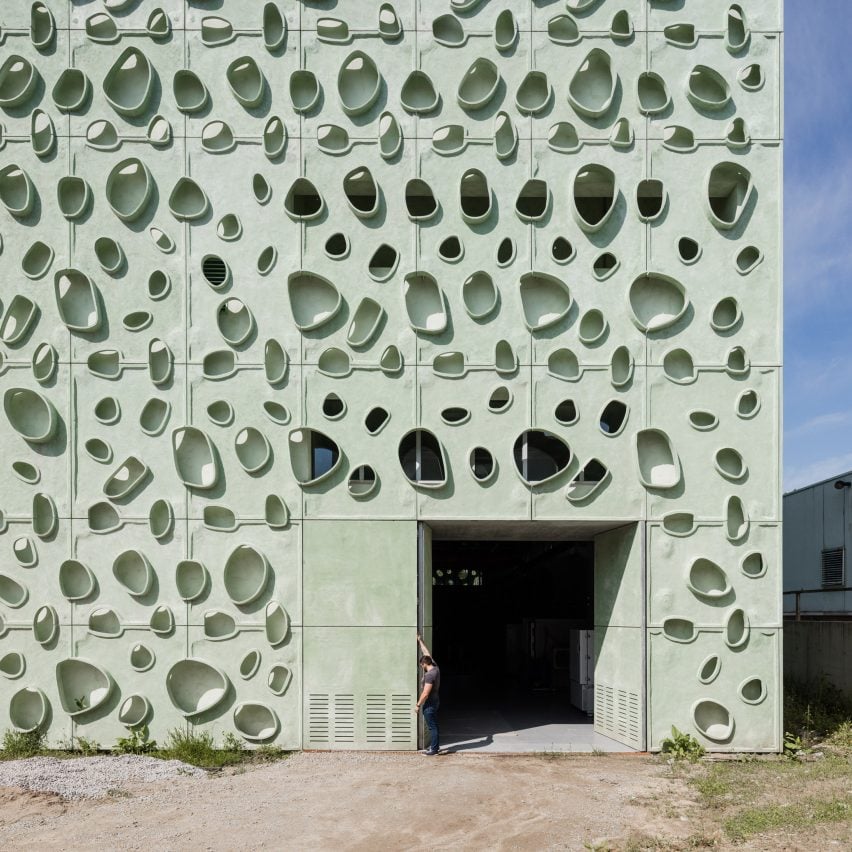
"Neo mint" will be the colour of 2020 says forecaster WGSN
Trend forecasting service WGSN has revealed that a pastel shade of green, coined "neo mint", will dominate the worlds of fashion and interiors in 2020.
According to the trend forecaster, which is headquartered in London, neo mint is a gender-neutral colour with "an oxygenating, fresh tone that aligns science and technology with nature".
The colour was picked by WGSN's team of forecasters following extensive research that included observing street fashion, big data, current affairs and social media.
"What is becoming clear is the importance of neo mint – a shade that succinctly aligns futuristic development with nature," WGSN's colour director Jane Monnington Boddy told Dezeen.
Events slated to take place in 2020 – including the completion of the world's tallest building in Saudi Arabia; the start of NASA's Mars 2020 Rover mission; and the introduction of Uber's flying taxis – helped the team to pinpoint neo mint as an important colour for the dawn of the next decade.
Telling Dezeen about the process of composing a colour forecast, Monnington Boddy explained how data harvested from online retailers is used in tandem with images posted on social media.
"Our retail analytics division, WGSN Instock, can track the sales of online retailers and analyse which colours are selling well," she explained to Dezeen.
"We're also trying to use social media as a vehicle to find out what's happening in colour. In the past we used to go out on the street and look at what people are wearing, which we still do, but now we also look at influencers on Instagram."
Colour trends, Monnington Boddy said, have a trickle-down effect. What is seen at an interior during the Salone del Mobile in Milan, or on the catwalk during global fashion weeks may not hit the high street for another couple of years.
Similarly, WGSN believes that the current political climate and images seen on the news can influence the colours we wear, with the popularity of the colour red on the autumn and winter catwalks in 2017 a result of the 2017 Women's March.
"I've already seen neo mint popping up in younger fashion-forward brands, and in a few more years time it will start to filter into high street stores. Like all trends, it will evolve and grow," she continued.
"For example I first started spotting millennial pink back in 2011. I'd seen it in a Céline collection and it really resonated," she added.
"Now it's everywhere, especially in interiors. People still really love it – when we put it on the cover of our reports at WGSN the click rates go up."
Monnington Boddy believes that millennial pink changed how colours are now seen at a mass market level.
"It seemed to open the doors for any colour to be popular among both genders, and neo mint has the softness that millennial pink had," she said. "It can be translated into any type of design."
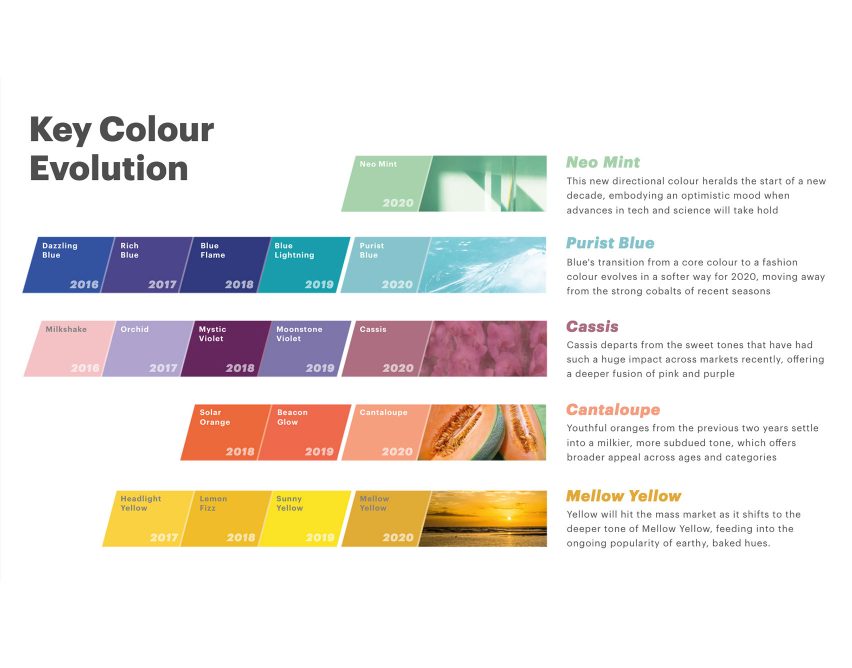
Neo mint is joined by four other soft colours in WGSN's forecast for spring and summer 2020. They are purist blue, cassis – a deep fusion of pink and purple, cantaloupe – described as a milky subdued tone with broad appeal, and an earthy baked hue called mellow yellow.
WGSN was set up in 1997 by British brothers Julian and Marc Worth, who set out to take trend forecasting – traditionally a print-based business, online. In October 2005, the company was sold to business to business publisher Ascential, formerly known as Emap, for £140m.
Other companies promoting colour forecasts for 2020 include Pantone, who predict that colours for autumn and winter in 2019 and 2020 will radiate intensity.
"From a new level of flat, painterly primaries to pastels that are more active than romantic, we embrace colour that generates multi-dimensional visual perspectives as well as down to earth utility shades, recycled hues and core essentials," said the brand in a description of its Autumn/Winter 2019/20 Colour Planner book.
"With the desire for personalized statements continuing, there is less unity and more market fragmentation."
For 2018, Pantone selected a vibrant purple shade, named ultra violet, as its colour of the year, while paint brand Dulux elected heart wood – a millennial pink shade.
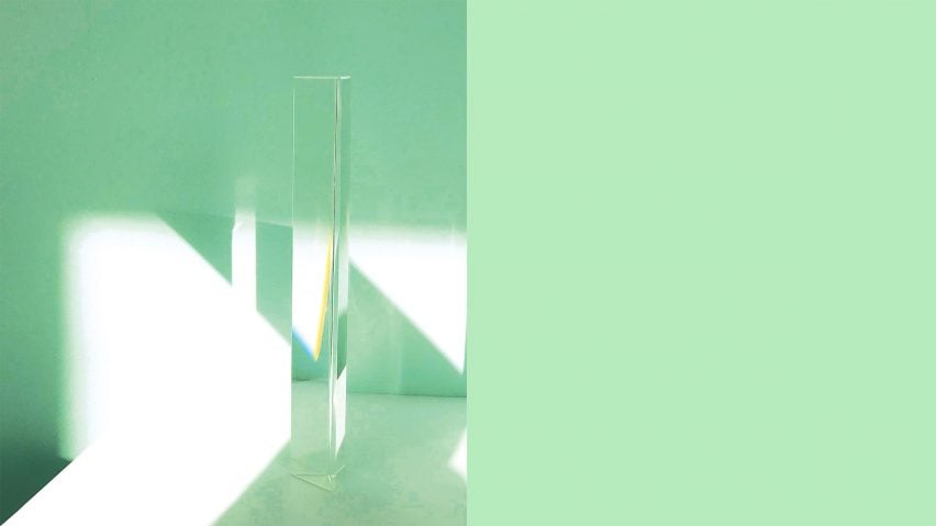
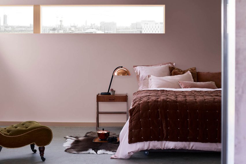
Main image is courtesy of WGSN.