Pentagram creates Flight Center font for hotel in Eero Saarinen's JFK airport terminal
Lettering used in Eero Saarinen's 1960s TWA Flight Center at John F Kennedy International Airport in New York provided the cues for the branding of the new hotel in the terminal building.
Graphic design firm Pentagram was enlisted to create the new typeface for the TWA Hotel at JFK in Queens, New York City, which is slated to open 15 May following an extensive renovation of the old terminal.
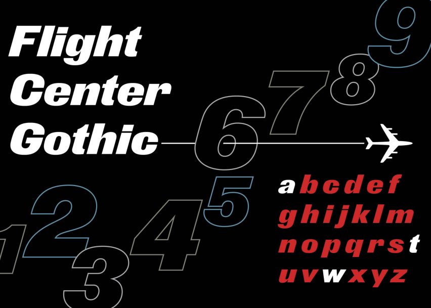
Called Flight Center Gothic, the new typeface was based on the branding and wayfinding that Finnish-American architect Saarinen designed for the airport building when it opened in 1962.
"His graphic design was one of the elements that was discussed the most," Pentagram partner Michael Bierut, who led the project, told Dezeen. "It [was] very visible when we toured the then closed Terminal."
"There was a remarkable amount of consistency of all original signs that were still there many of which were still intact at all and all those dated in the early 1960s," he continued.
The typeface comprises thick line weights and exaggerated italics that are intended to evoke the motion of flight. Curving details, meanwhile, are intended to reference the futuristic architectural elements found in the terminal building, like the wing shaped exterior, and draw on the original lettering.
"I think the appeal to Saarinen and his team was that it looks very kind of Jet Age," said Bierut in a description of the project.
"We all know what an italic typeface looks like, but that one really leans forward," he continued. "It looks like it's going 1,000 miles an hour. And very bold, very plain, chosen to go with the way that the letters TWA appeared on the planes and on the Flight Center at the time."
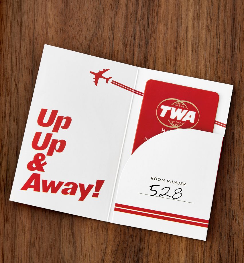
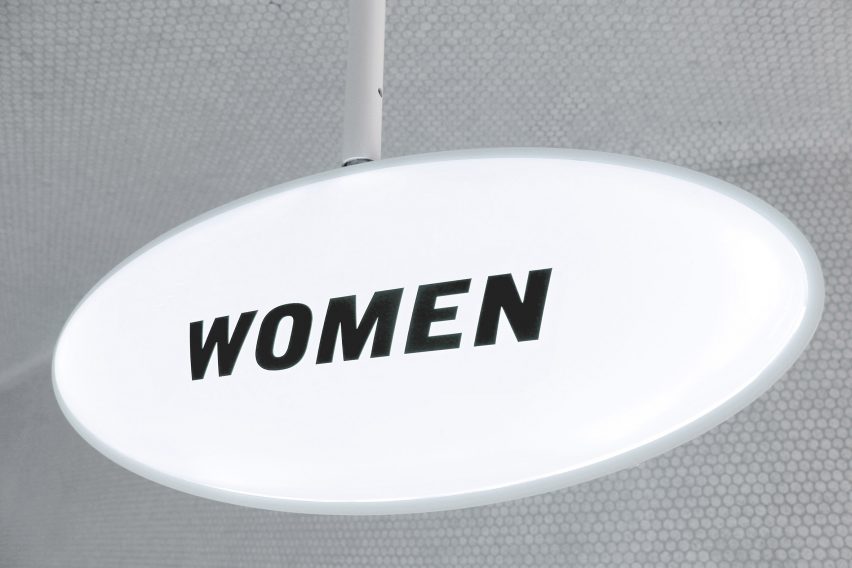
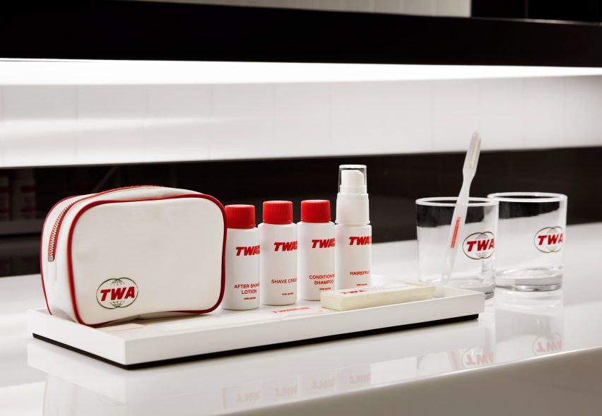
Among the challenges of the project, according to Bierut, was adapting the original type design into new branding for various elements of the hotel. From restroom signage to shampoo bottles, the new font is intended to bring guests "back to the future" by incorporating vintage details in new formats.

"Given that a hotel would have a need for all sorts of things that an airline terminal would not – including amenities in the room, advertising and promotion, a website – we wanted to find a typeface that would... be characteristic of the place itself," said Bierut.
"If you're out at the terminal, what you will see is as close as possible to what it would have looked like if someone was doing the signs and graphics back then," he added.
As part of the research, Bierut and typeface designer Nick Sherman also referenced drawings they found from Saarinen's archives in the library at Yale University.
Bierut found that the typeface Saarinen used wasn't an original, but actually dated back to the 19th century. He recognised it as a font called Derek that was commonly used in Germany, Holland and the United Kingdom at the time.
When Bierut and Sherman lined up a few different versions of stock letters from the terminal design with Saarinen's original Derek-based drawings, they found they didn't necessarily match. At the time, those stock letters were hand-drawn by members of Saarinen's team, which yielded a number of variations.
"Everything was kind of fraught with irregularities and it turned out that those irregularities gave the [new] typeface some life," Bierut told Dezeen.
Bierut and his team were commissioned by hotel owner-operator MCR and developer Morse, which are overseeing the transformation of the terminal into a 512-room hotel, following 16 years of closure.
Landmarked as an historic structure in 1994, the TWA Flight Center is among the best-known designs by Saarinen, who was born in Finland and emigrated to the United States when he was 13 years old. His other well-known works include the Gateway Arch in St Louis, which also recently received a refresh of its subterranean museum.
Bierut and his team at Pentagram, founded in 1972, have designed bespoke typefaces for major brands such as the New York Times, and created the "H" logo for Hillary Clinton's presidential campaign.
Bierut also led the team that rebranded online car shop Vroom, creating a font intended to evoke speed.
Photography and graphics courtesy of MCR.