"Jony Ive's legacy as the most important designer of the last two decades is assured"
Jony Ive became the world's most influential designer at Apple, says Owen Hopkins. His revolutionary products rescued the company from its decline and have ensured his legacy.
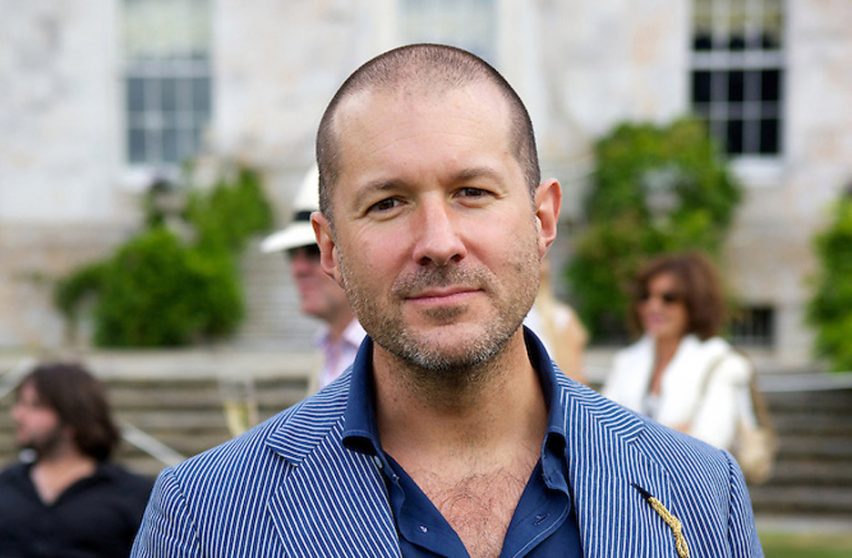
According to Apple there are currently something in the region of 1.4 billion active users of its devices. There's a good chance that you are reading this article on one of them. Given how ubiquitous they have become it is quite staggering to think that the design of every single one of those devices was overseen by Jony Ive, Apple's chief designer, who has just announced he is leaving the company to set up his own firm.
Moving from the UK, Ive joined Apple in 1992 – seven years after Steve Jobs departed the company he founded and five years before his return as CEO in 1997. Apple was already sliding into the trouble it would find itself in during the mid-1990s, but didn't realise it yet. Ive was involved with the design of several innovative though ultimately ill-fated products of that era, notably the various iterations of the Newton MessagePad and the Twentieth Anniversary Mac. But as Apple increasingly flailed around, these products never lived up to their striking designs.
Jobs' return brought discipline back to the company. He cancelled a number of product lines he felt weren't up to it or were distractions, including the Newton, and reduced Apple's overly complex range of Macs to a 4x4 grid: desktop and portable, consumer and professional. But something wholly new was needed to get customers excited again. This came in the colourful teardrop form of the iMac.
Ive's truly iconic design symbolised Apple's rebirth and return to relevance
Apple wanted the iMac to appear as ground-breaking as the original Macintosh was back in 1984, even creating images with "Hello (again)" printed on its the screen in homage to its predecessor's famous "Hello" message. But in reality, the iMac was not so different from the existing all-in-one Power Macintosh G3 when it came to its internals. What mattered, of course, was how it was packaged.
Ive's truly iconic design symbolised Apple's rebirth and return to relevance. It also sold in the millions, helping dig the company out of the financial black hole it found itself in. Its colourful, translucent aesthetic was, of course, much imitated, in everything from kettles and radios to electric toothbrushes. Few designs have ever been so influential – and certainly no computer designs, which before then rarely strayed from the beige box.
Dieter Rams is often seen as a major influence on Ive's approach to design, one that Ive has himself acknowledged. From both an aesthetic and philosophical point of view, Rams' 10 principles of good design run through Ive's work. But there are also some areas where they diverge considerably.
Most obviously, this can be seen through the realities of obsolescence, which contravene Rams' insistence that a product should be long-lasting, but is an inherent and vital part of the technology industry. More broadly, the idea that form should ultimately follow function becomes rather more complicated when that function takes place within the confines of a digital display.
Launched in October 2001, the iPod was in many ways the apotheosis of this idea
A computer – whether in the form of a desktop, laptop, phone, tablet, or even watch – is always a conduit to something else: what's displayed on the screen. So a designer has to balance the desire to get the device out of the way of the screen while creating a desirable object that will sell.
Launched in October 2001, the iPod was in many ways the apotheosis of this idea. Its clickwheel was both functional and iconic. But the real masterstroke were the white Earpods. Headphones up to that point had always been black. The white headphones differentiated the iPod and its users in a simple yet powerful way.
I was an early adopter, buying a second generation iPod in 2002, and I always remember the first time I saw someone else with the same white Earpods. From something you hardly ever see, they quickly became the height of fashion, driving iPod sales, before becoming so ubiquitous that competitors were even making their own white headphones. Today's wireless Airpods mirror this approach and trajectory. Pilloried on their launch for their strange appearance, these little white sticks poking out of your ears have become a phenomenon.
Looking across the range of products that Ive has designed one realises quite how varied they are: from the exuberant bright colours and curving forms of the iMac G3 to the pared-back asceticism of something like the Mac mini. This variety is why it makes no sense to call Ive a minimalist. Instead, his approach might be better described as strategic – always obsessed by materials and detailing but tailoring his design language to the circumstance and application.
Looking across the range of products that Ive has designed one realises quite how varied they are
This approach accounts for what some have seen as design missteps. From the apparently over-designed original iBook to the infamous "hockey puck" mouse, there are a number of examples one could cite, but few that provoked the furore of the iPhone X's "notch".
But far from being a design failure as many rashly saw it, the "notch" is clearly the result of a thoroughly thought-through decision to create a means of being able to tell an iPhone at a glance, a task previously performed by the home button which the iPhone X had eliminated.
In 2015, Ive was promoted to chief design officer, now formally responsible for all aspects of design at Apple. However, his influence had already extended into software, having led the human interface team since 2012. He was the driving force behind iOS 7's dramatic redesign, abandoning skeuomorphism – which incidentally Jobs had loved – in favour of a pared-back, almost entirely abstract design language.
Again this wasn't purely about aesthetics, but the result of strategic decisions. The original iPhone had created a new paradigm for interacting with a display, and its heavy 3D effects and borrowings from the physical were vital to it being intuitive. By 2013, when iOS 7 was released, most of Apple's customers knew how to use a touchscreen phone, and coupled with much higher resolution displays, it was now possible to eliminate the interface "chrome" and allow more room for content.
When Steve Jobs died in 2011, many observers saw Ive as the heir apparent, carrying the torch for decades to come
Latterly it's appeared that Ive has entered a kind of Baroque phase with thinness becoming an end in itself. Where before thinness was strategic, distilling the iPhone and iPad down to their very essence as simple sheets of glass, it's now being taken to an extreme, almost becoming an over-exaggeration.
Most users would probably be happy for their device to a bit little thicker and heavier if it gave them more battery life. But such compromises are rare in Ive's work, which at its best – and it usually is – is design as polemic.
When Steve Jobs died in 2011, many observers saw Ive as the heir apparent, carrying the torch for decades to come, though perhaps admitting the golden years that yielded the iMac, iPod, iPhone, and iPad were over. So now Ive has left, the question is, what next for Apple? Given that the design team works years ahead, it will be a while before we get a glimpse of Apple post-Ive.
My guess is that they will probably carry on as before, so fully have Jobs and Ive instilled their ethos into the spirit of the company. But whatever Ive himself does next, his legacy as the most important designer of the last two decades is assured.
Photography is by Marcus Dawes.