OlssønBarbieri designs Snåsa water bottle and visual identity
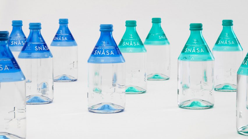
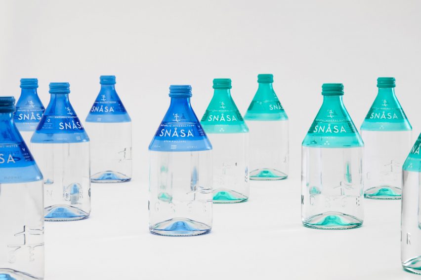
Oslo-based design studio OlssønBarbieri has created the visual identity and bottle for water brand Snåsa, which is made from materials that are easy to recycle.
The Norwegian mineral water company asked the studio to "reflect a new idea of luxury" in both the bottle and visual identity.
In response, OlssønBarbieri has designed a glass water bottle that considers the needs of "a society where sustainability and social awareness is becoming the new luxury".
The studio also deliberately formed a strong connection between the bottle's shape and its graphic elements, which reference local indigenous culture.
"When it comes to the environmental impact of a product, especially bottled water, brands and the industry have a responsibility to help materials re-enter a closed cycle more easily," explained the design studio.
"The choice of materials and production are as important as the brand story and values," they added.
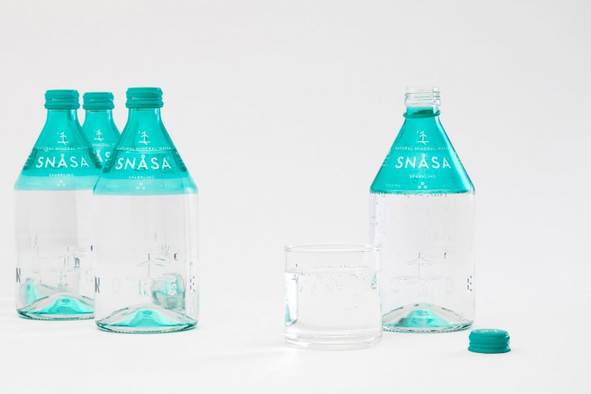
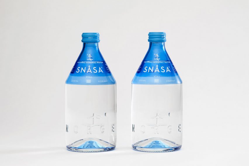
The studio therefore chose to make the bottle using glass with a screw top aluminium lid, as both materials can be easily recycled.
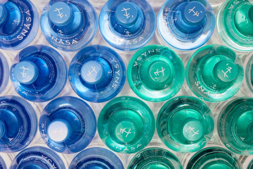
Through close collaboration with a glass factory, the studio was able to spray-paint and screen-print directly onto the glass.
This alternative method of labelling means that the bottle can be directly recycled without the user having to remove a glued-on paper label beforehand.
The merging of coloured glass is inspired by an artisanal glass technique known as incalmo, which involves fusing two or more blown-glass elements.
It creates refractions of colour and light at the base of the bottle, once it is filled with water.
"We wanted the Snåsa bottle and brand design to be emblematic of a modest, mindful lifestyle and a growing sensibility towards our role in the natural habitat," said OlssønBarbieri.
The studio named the water after the Norwegian municipality of Snåsa in South Trøndelag, close to the origin of the source, in a bid to inspire ownership and pride in the local community.
Snåsa has a population of 2,000 and is surrounded by more than 2,500 lakes. It is also home to the indigenous people of northern Europe, called the Sami.
"The brand identity and the shape of the bottle are inspired by the Sami people, who are known for living in harmony with nature," said the design studio.
"By referencing the Sami culture, we hope to remind people that we live in a symbiotic world where the wisdom of nature is available to us if we listen and observe," they added.
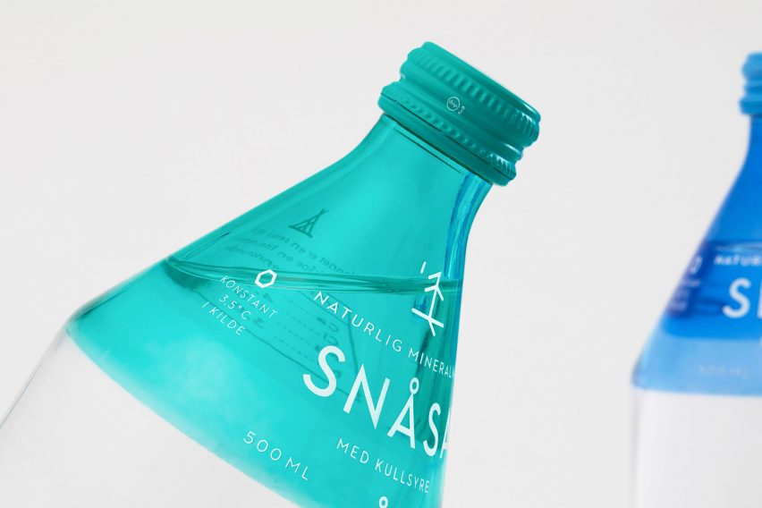
Whilst the bottle's conic neck resembles the form of a nomadic Sami tent, OlssønBarbieri has also incorporated the runic alphabet into the Snåsa bottle's design.
According to the studio, the Sami people decorate objects, including drums, with ideograms from the ancient runic (pre-Latin) alphabet. These artefacts are used in shamanic rituals to communicate with nature.
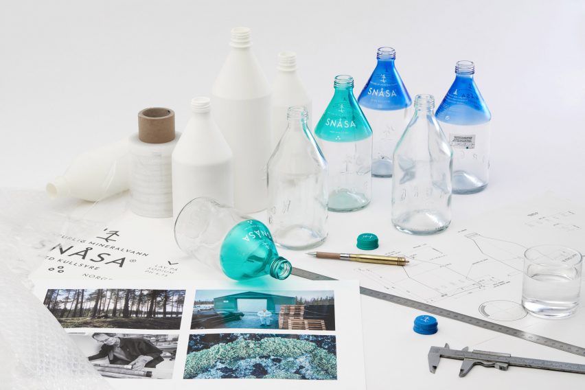
After consulting with a professor of runic inscriptions at the University of Oslo, OlssønBarbieri constructed their own ligature symbol, which looks like a tree.
Each rune, or character, in the ligature (set of two, joined characters) has its own symbolic meaning.
"The tree shape was actually a lucky surprise, since the source is located in the forest," they explained.
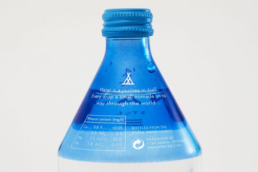
Each bottle also has a section of a poem that the studio commissioned for the Snåsa project written on the back.
The Snåsa bottle and branding has been shortlisted in the graphic design category for this year's Dezeen Awards. Other projects up for the award are the packaging for contact lens subscription service Dimple and the visual identity for the Re:publica conference.