Visual identity for Re:publica rebels against digital culture with reams of text
Fertig Design has created a visual identity for the Re:publica conference that uses lengthy passages of text and typography instead of conventional graphics to pay "homage to the written word".
The annual conference is the largest aimed at the digital and internet society, and saw its thirteenth edition this year in Berlin.
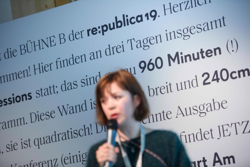
This year's theme and visual identity focused on TL;DR – an abbreviation meaning "too long; didn't read" – which is used to respond to overly long pieces of writing on the internet.
Commonly found at the end of a text, the shorthand notation is usually followed by a summary that readers can scan, rather than spending time studying the main text in detail.
Through the visual branding, which has been longlisted in this year's Dezeen Awards, the conference organisers aimed to make their audience aware of the dangers and miscommunications that can stem from shortening information online.
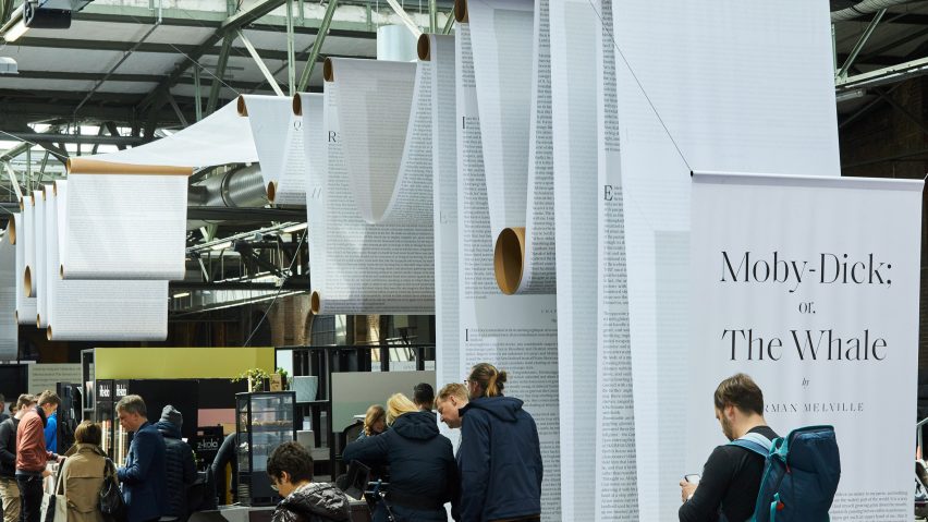
Re:publica's manifesto for the event was printed on all the conference materials, whilst an installation based around the notoriously long novel Moby Dick adorned the halls.
"Misinformation is so easy to transmit when everything is shortened," said Norman Palm, art director at Fertig Design. "Radical opinions thrive within 140 characters."
Palm told Dezeen that users can often find themselves overwhelmed by rapid-fire information, resulting in a lack of concentration and rushed discussions.
The studio intentionally used analogue and non-virtual aesthetics to slow visitors down, and contrast with the digital topic of the conference.
"We didn't want to fill the conference space with screens and technological spectacles as we rather wanted to see the digital as part of the 'real' world," said Palm.
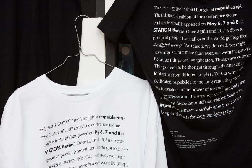
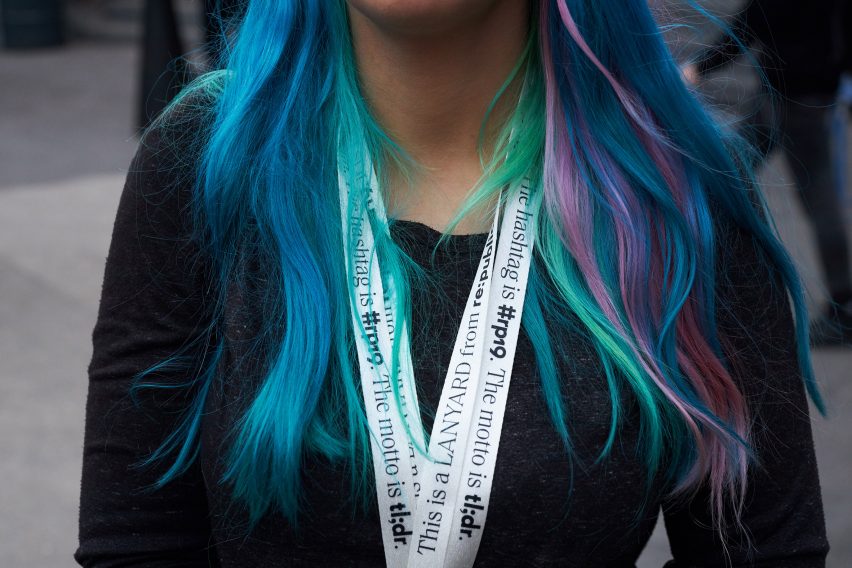
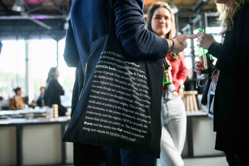
Each item was printed with a simple description of what it is and and the conference statement in a serif font, followed by a contrasting bold sans-serif font for the conference hashtag and motto.
Items also declared what materials they were made from. On the lanyard, for example, wearers were informed that it was made from recycled polyethylene bottles, whilst the tote bags and t-shirts stated that they were made from 100 per cent organic cotton.
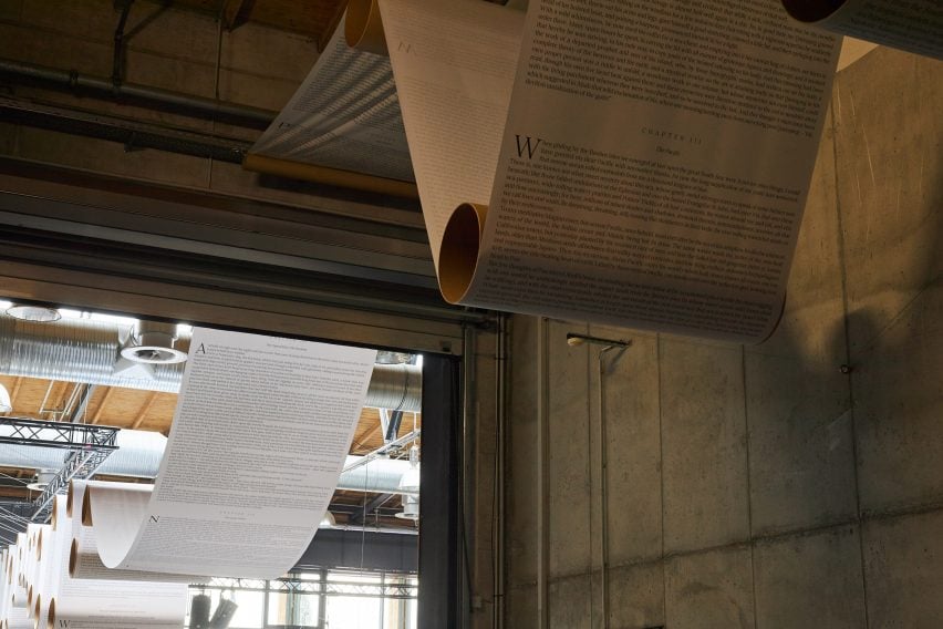
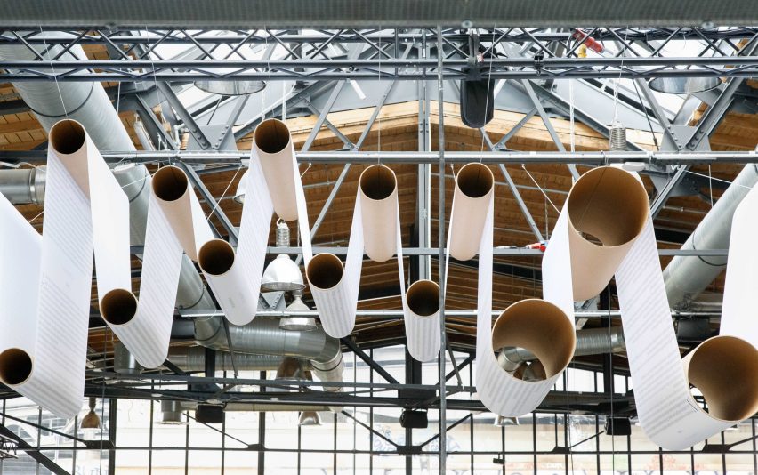
In addition to the printed materials, conference attendees were greeted with an installation based on the 1851 novel, Moby Dick, by Herman Melville.
Chosen by the studio as the "ultimate example of a long read", the 135-chapter novel was printed on a continuous ream of paper.
Measuring 450 metres, the paper scroll was hung around the halls, mimicking the production line at a printing press. To achieve this, hollow cardboard tubes were hung from the ceiling at staggered heights. The paper was draped over these tubes to form an undulating canopy.
The opening page of the book marked the entrance to the conference, with the closing passage at the exit.
The installation was created to provoke a discussion about whether our ability to understand long, complex pieces of writing will eventually disappear.
Whilst Fertig Design chose analogue print over digital technology, South African designer Daniel Ting Chong collaborated with AI to create the visual identity for Design Indaba conference earlier this year.
Other branding projects feature in this year's graphic design category longlist, which was announced in July.
Project credits:
Identity and graphic design: Fertig Design
Architects (Moby Dick installation): Mathias Lücking, Pia Steinhardt
Animators: Toby Cornish, Johannes Braun at Jutojo
Sound design: Owen Lloyd