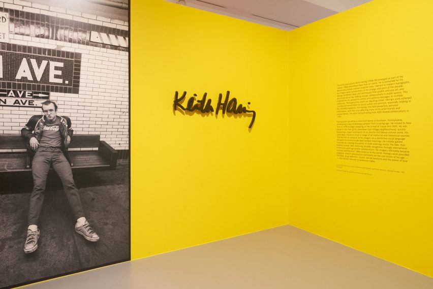
InterestingProjects evoke 1980s New York for Keith Haring exhibition design
For the exhibition design of Keith Haring's first major show in the UK, design practice InterestingProjects has taken heed from the distinct material and countercultural context of 1980s New York City.
The show, which is on display at Tate Liverpool until 10 November, features more than 85 works, following Haring's development from a young artist to a pop icon and finally a political activist.
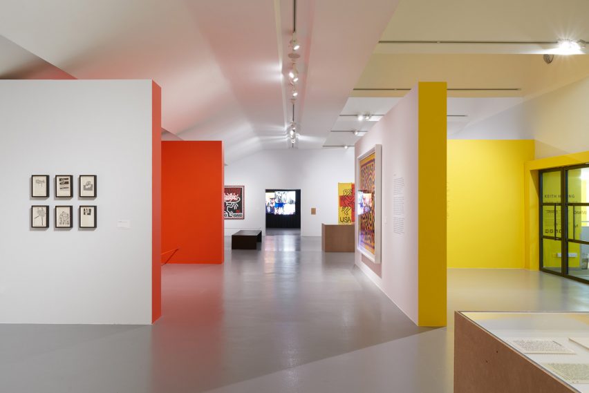
For Joana Filipe and James Mason of InterestingProjects, the key was to pick up some of the elements that characterised the distinct look and feel of Haring's New York without being too on the nose.
"At the time, the city was almost bankrupt," Filipe told Dezeen. "Police officers were being let go, crime levels were rising, there were strikes and protests – the city was slowly and visibly being left to perish."
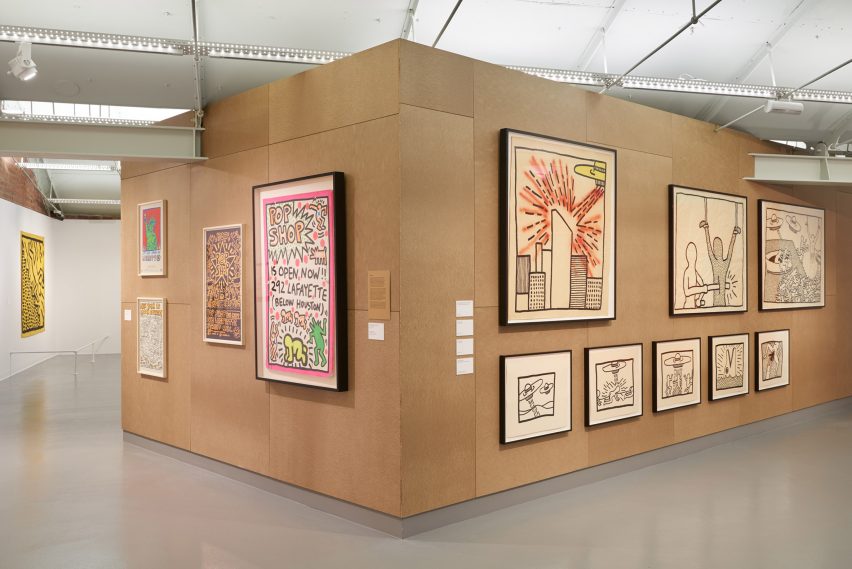
"We wanted to create a backdrop to his work that used the same sort of language without using 'aged materials'. That's why it felt right to use materials like corrugated metal and chipboard, both of which are linked to the idea of temporary construction and help reflect the transitory stage the city was going through at the time."
A similarly measured approach was necessary when referencing Haring's instantly recognisable style within the exhibition's design.
"His style is very iconic and bold, so we felt it was crucial to play along with this without overshadowing it," said Filipe.
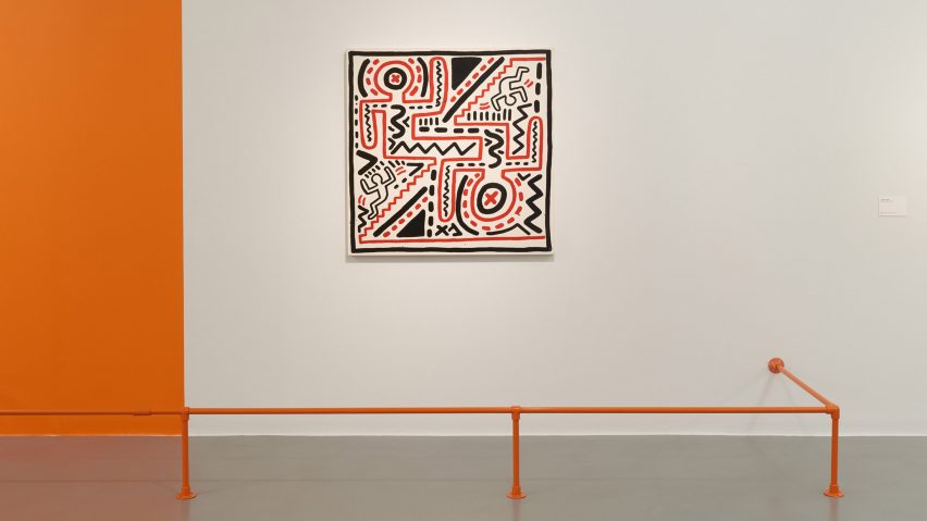
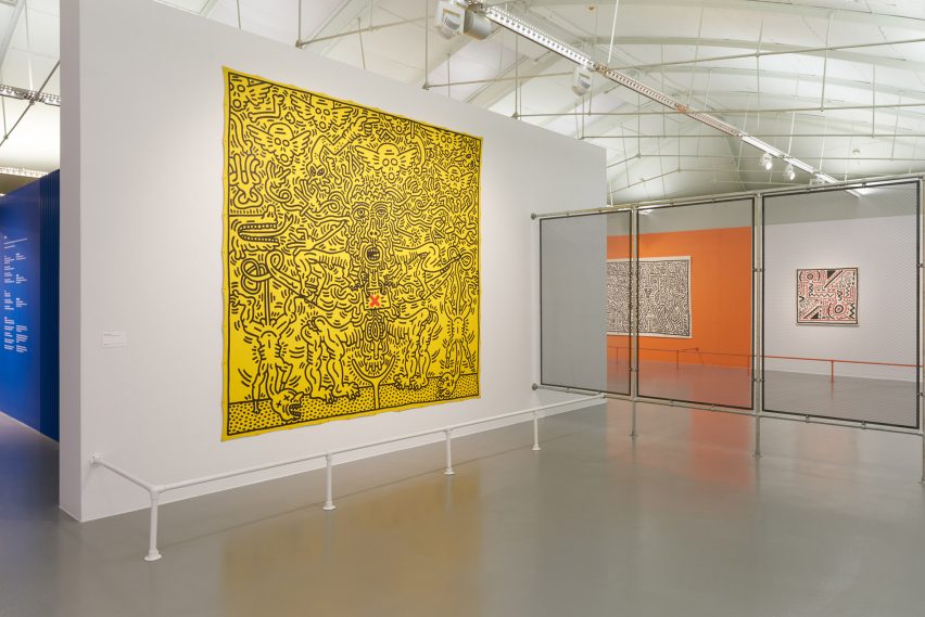
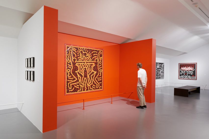
"From the start we decided that colour blocks would be key to defining the different section of the exhibition, because Haring's use of colour as part of his work was so distinctive."
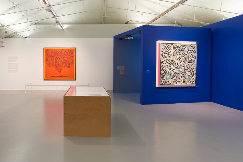
Colour coding also allowed the designers to highlight the dynamic nature of the Haring's work.
"We wanted the exhibition design to incorporate his diversity of expression, performative drawings and evolution to avoid it feeling static," explained Mason.
"To ensure visitors experience these different nuances, the political spaces were designed to be more open, while other areas were designed as more intimate experiences, and this informed the colours we selected for each piece."
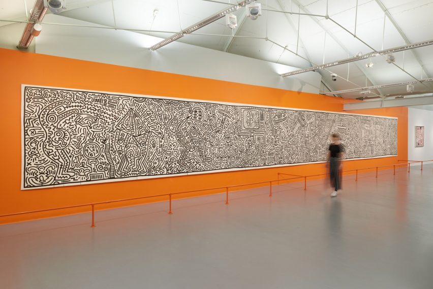
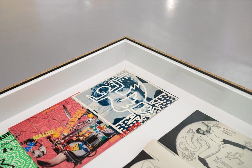
The first section features some of Haring's earliest works – chalk drawings he made on expired adverts in subway stations, which had been pasted over with black paper.
These rare pieces, which were likely cut off the walls and taken home by commuters at the time, are complemented in the exhibition by matching blocks of black. Haring's characteristic, thick lines are taken up in the exhibition, too.
"When he showed his work at Tony Shafrazi Gallery, he used the whole space as an installation, adding his characters, painting lines and frames around his exhibits," said Filipe.
"This is reflected in the black outline we added to all the chipboard vitrines."
Thanks to the low rents at the time, '80s New York bore witness to a rising countercultural movement and a thriving, sexually liberated club scene. This made space for a meeting of minds – and artists in particular.
For Haring, who was deeply engrained in the pop art scene, this was a prolific time during which he collaborated with the likes of Andy Warhol and Jean-Michel Basquiat.
In this part of the exhibition, old TV monitors show archive footage of Haring dancing to The Cure or painting his distinct glyphs onto the naked body of Grace Jones.
"We tried to recreate this incredibly energy in the exhibition by adding oversized seating that could have doubled up as an improvised stage at one of the clubs, and a dark, narrow corridor which leads visitors to the black light room," said Filipe.
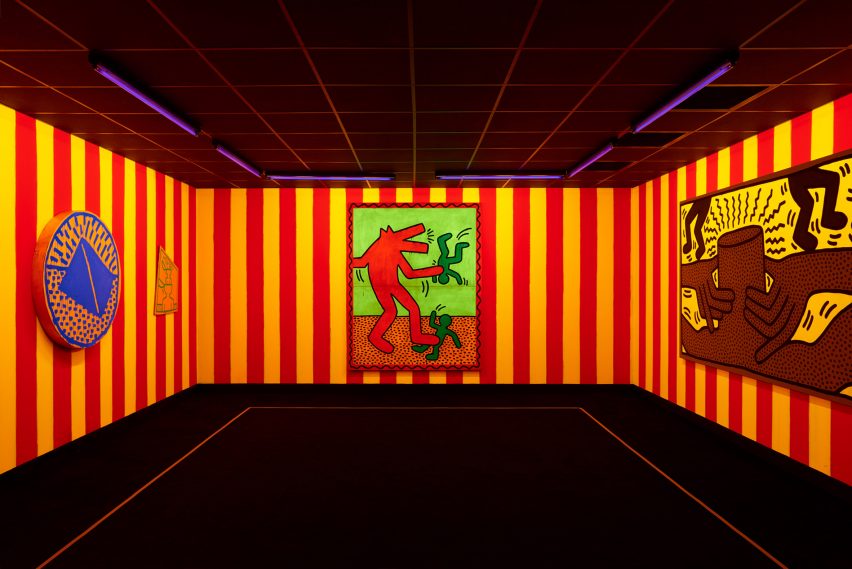
The black light room, is a recreation of the artist's 1982 installation of the same name. It shows his fluorescent works presented under a UV light, on a backdrop of neon painted stripes and accompanied by an authentic hip-hop soundtrack from the time.
Haring was openly gay and a staunch human rights campaigner, rallying against apartheid and nuclear war, as well as raising awareness for AIDS, which ultimately caused his untimely demise in 1990.
"In the final section of the exhibition, which focuses on Haring's commitment to social justice and public art, we used metal-mesh barriers to reference how he elevated the street into a platform for debate and political protest through his large murals," said Mason.
"Ultimately Haring was an artist who mobilised people and threw himself behind the urgent issues of his time," added Filipe, "and that attitude feels as relevant now as it did then.”
The artist, who would have been 61 this year, lives on in his distinctive artwork which continues to grace everything from Adidas Stan Smith's trainers to Uniqlo t-shirts and Modernica's Case Study chairs.
This latest exhibition follows another first for the UK art world, which in 2017 played host to its first large-scale display of artworks by Jean-Michel Basquiat – Haring's contemporary and collaborator. It was the most popular show in the history of London's Barbican Art Gallery.
Photography is by Theo Christelis.