Top three wallpaper designs announced in Samsung and Dezeen's mobile design competition
Dezeen promotion: the top three wallpaper designs in the Samsung Mobile Design Competition have been revealed, and their designers have shared the thinking behind their work in interviews with Dezeen.
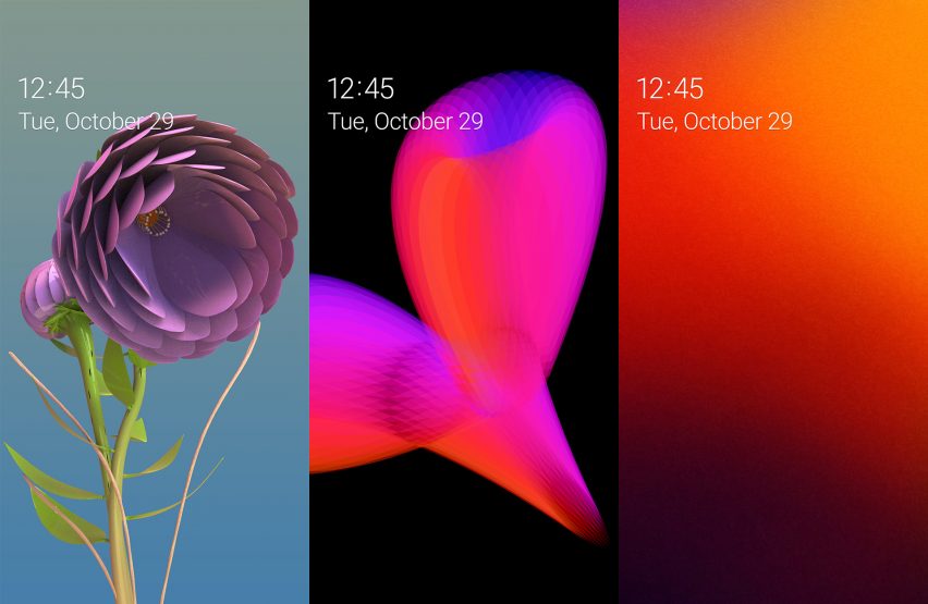
From a longlist of five entries in the Next Mobile Wallpaper Paradigm category, the judges chose Kalle Järvenpää's Garden of Galaxy, Guan Hong Yeoh's Blossom of Galaxy and André Cardoso's Approachability of Galaxy for the final shortlist of three.
The competition asked entrants to design new ideas for wallpapers for Samsung Galaxy devices such as smartphones and tablets.
The jury of designers Stefan Scholten and Paul Austin, executives from Samsung's IT and Mobile Communications division, and Dezeen editor-at-large Amy Frearson considered all five of the finalists' projects in a live judging session in London in September.
The top three contenders will now travel to the Samsung Developer Conference from 29 to 30 October in San Jose, USA – along with the top three finalists in the Next Mobile + category, which focused on mobile accessories – where the winners will be announced. The top three mobile accessory designs were also announced on Dezeen today.
As well as the awards ceremony, mock-ups and artworks of all ten longlisted works will be on display in San Jose.
Read on for interviews with the top three designers about their designs below.
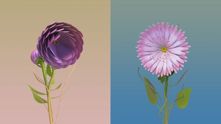
Kalle Järvenpää, designer of Garden of Galaxy
How would you describe your Samsung Mobile Design Competition design in a sentence or two?
The essence is easily summed up with just one sentence: a unique flower that grows in each Galaxy device.
What made you take part in the competition?
Two things really caught my fancy. Firstly, the prospect of working with a brand with the size and exposure of Samsung was naturally thrilling. Secondly, I was positively surprised that the humble wallpaper, a quintessential yet often overlooked part of the user experience, was finally given such importance.
What inspired your design?
Something of a cliche for designers as it might be, nature is most often my source of inspiration. I am also fascinated by the possibilities of mimicking natural processes with computation.
At first, I thought of different abstract visualisations using the vast trove of real-time data collected by the smart device, but I quickly realised that this is not what I would want from my device's wallpaper. I wanted something peaceful, something that offers one a respite from the constant buzz that apps generate.
Within this frame of thought, the choice of flowers came quite naturally, if you will, as it also hints at the connection with nature that digital devices are something of an antithesis to. Moreover, in terms of scale, flowers would not be incongruous on a smartphone or tablet's screen.
What emerging trends or technologies does your design embrace?
The flowers are algorithmically generated, which is not a new thing in itself, but in this field of design it is somewhat novel. A titillating possibility is also to use an AI trained on pictures of real-world flowers to adversarially validate the combinations of randomised "genes" (numbering 100 in the proof of concept) that define the appearance of the flowers. This, however, is yet to be tested.
Nonetheless, technology is not the proposal's essence. The main driver is to afford a brief refuge from the deluge of data, demand for attention and hectic pace of change that characterise modern smart devices. And the second is to offer us a reminder, even if artificial, of the beauty and importance of nature.
How would you describe your design philosophy or approach?
Especially now, the designer of a commercial product bears a great responsibility. How to justify designing yet another product onto a market already overflowing with an abundance of products? To me, the answer is to design products that not only last, but create a lasting emotional bond between the user and the product.
To evoke that emotional response, the design needs to communicate with the user. And communication is the transfer of ideas, which the form or behaviour of the object facilitates. I am not the first one to mangle Louis Sullivan's famous refrain this way, but I readily second that "form follows emotion".
Moreover, communication, especially on a global market, is a fickle thing. Thus, I find it best to work with simple, universal concepts, such as nature, natural phenomena or basic human interaction. A necessary (although not sufficient) criterion for a successful design often is that it can be summed up in one sentence.
Describe your process for this design.
After having come up with the basic concept, I studied different ways of producing the proof of concept, and decided to work with parametric modelling software and coding in Python. The first objective was to study flower morphology and produce flowers for which I defined the parameters myself.
For the final presentation in London, I expanded the system to randomly generate flowers based on artificial genes. A great deal of the work was then to work out how the genes should depend on each other. The next steps from this proof of concept are to rework the system to operate on Android, expand the range flower generation and program user and social interactions.
What are you working on next?
In October, I'm excited to take part in two further design competitions, one for stationery and the other for wood furniture. I'm also working on my master's thesis on AI-generated typography at Aalto University, Finland.
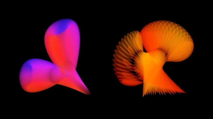
Guan Hong Yeoh, designer of Blossom of Galaxy
How would you describe your Samsung Mobile Design Competition design in a sentence or two?
Blossom of Galaxy is a visual representation of energy, motion and organic forms inspired by nature. It brings our heart into a new world of senses.
What made you take part in the competition?
The competition is exciting and intriguing. I always search for new solutions to engage our digital life with the love of nature, which is a good challenge to try to achieve in this competition.
What influenced your aesthetic choices?
Understanding natural forms and elements mostly influenced my aesthetic practices and choices. It did help me to look deeply into how nature brings value into my design work and philosophy.
What emerging trends or technologies does your design embrace?
My design is focusing on our sensory experience – awakening our senses through a new way of interaction/interactivity and generating a new kind of emotional experience while engaging with the new technologies.
How would you describe your design philosophy or approach?
My design philosophy is focused on design that is able to create "moments of engagement". Design is about bringing such intangible emotional experiences or connections to us. It is a mixture of form, function and values that also allows us to engage with new kinds of interaction at the same time. Design should be a good inspiration for us all in our everyday life.
Describe your process for this design.
My design process begin with a research study on nature's forms, colours and performance/interaction. I continued with idea and concept sketches development before turning to the computer for graphical visual creation and adding touch interaction to make it "alive". The final design has unique responsive visual organic elements that embrace communication in a virtual world through our touch senses. The colour and shapes of the organic forms will change to match the time of day.
What are you working on next?
A nature photography book project.
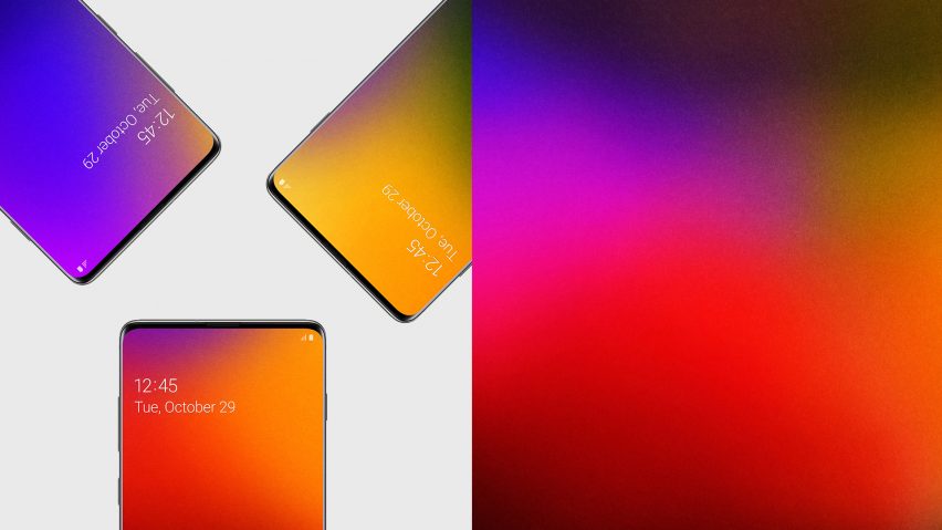
André Cardoso, designer of Approachability of Galaxy
How would you describe your Samsung Mobile Design Competition design in a sentence or two?
Approachability of Galaxy is an evolving wallpaper conceived to bring people closer. When multiple Samsung Galaxy devices are near, their screen colours interact with each other over time until, eventually, they all show the same hue.
What made you take part in the competition?
I'm very passionate about conceptual art, future technology and innovative user experiences. The Samsung Mobile Design Competition immediately aroused my curiosity because it was looking for creative approaches to Galaxy mobile devices' future use. As an architect, I'm particularly interested in social dynamics. The opportunity to use my interests and professional references to produce a concept for such a remarkable and innovative brand as Samsung was simultaneously challenging and attractive.
What inspired your design?
The design for Approachability of Galaxy was the result of a reflection on the current state of digital art in electronic devices intersected with principles suggested by the physical universe of "palpable" art. Works by renowned artists Krista Kim, Felipe Pantone and Daniel Eatock highlight the expressive potential that simple colours have when they meet and interact in a variety of processes. Colour, time and proximity were the essential principles identified and transposed to the scope of the contest, then combined to generate a "more human" and evolving wallpaper.
What emerging trends or technologies does your design embrace?
Approachability of Galaxy embraces generative design principles. It changes based on the user's surroundings by allowing interaction between screen colours of neighbouring Samsung Galaxy devices.
How would you describe your design philosophy or approach?
Nowadays, physical interaction between technology users is increasingly scarce. Social interaction can take place when something special but unexpected happens. As we move to the fusion between technological and physical worlds, new approaches on social relationships should also be considered. Since our devices are always with us, social encounters have an extraordinary potential for interaction.
Describe your process for this design.
As colour perception is not only to do with physical elements, but mainly with the psychological association, colour can manifest a certain state of mind and set of emotions. So each user can choose the colour gradients that suits their identity the best.
A grained texture is then added to make the gradients feel smoother and visually more appealing. Because natural processes take time, adding the time factor is essential to the colour gradients' behaviour. Instead of a flat graphic, the wallpaper is in a continuous but subtle movement, a latency state, which indicates that something more can happen at any moment.
By approaching Samsung Galaxy devices with different wallpaper colours, permeability is naturally triggered. Progressively both colours start to mix in a fluid interaction. After a while, both devices share the same hue. When moved away, each device retains the mixture for a while and then progressively starts to go back to the original user's colour. Combining colour, time and proximity principles, the final result is not static but in constant evolution.
What are you working on next?
I'm elaborating other concepts for technological approaches that could facilitate daily life activities and enhance the relationship between people and technology. I plan to continue to explore the emotional level of design on its many scales, as a way to improve the user experience.