"Would consider this in the top five sexiest buildings of the last year"
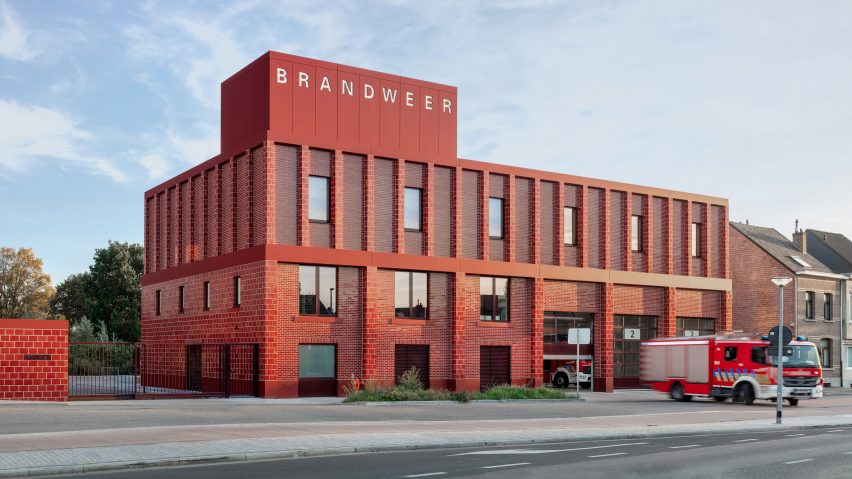
This week, readers have been won over by a fire station in Antwerp which looks exactly like a fire station.
Red hot: a fire station in Antwerp designed by Happel Cornelisse Verhoeven has caught readers' attention thanks to its glazed red bricks.
"Would consider this in the top five sexiest buildings of the last year," praised Hugo. "Constructivist, honest and functional paired with beautiful materials and attention to detail."
Orangikaupapa agreed: "Very, very satisfactory. I am taken immediately to the endless hours of childhood playing with Bayko bricks."
"The red is a bit kitsch but the more I look this over, the better it gets," continued JZ. "Classical proportioning with enough variation in the rhythms to create interest. It contributes contextually and is a robust build, it seems."
Apsco Radiales was also impressed: "Credit to the architects. They made a fire station look like a fire station. Old Chinese proverb: make the thing look like what it is, not what it is not."
As was this commenter:
What do you think of the fire station? Join the discussion ›
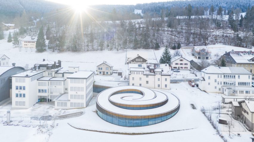
Clockwork: readers have likened a spiral-shaped building in Vallée de Joux, Switzerland, to edible delights. Musée Atelier Audemars Piguet was designed by BIG for the watchmaker to house its collection of timepieces.
"Looks like a frosted Danish possibly with cinnamon and raisins inside," said Ben Chow. "Yummy."
"Mmm, Cinnabon," added E.T.
"Really?" continued Benny. "A Swiss roll, in Switzerland no less? New low for the crew at BIG."
"It’s not a Swiss roll," replied Geof Bob. "But a spiral like a watch spring – before batteries. Oh, you knew that, so why the negative comment? Ah, because it’s BIG."
This reader felt similarly:
Do you think Musée Atelier Audemars Piguet looks good enough to eat? Join the discussion ›
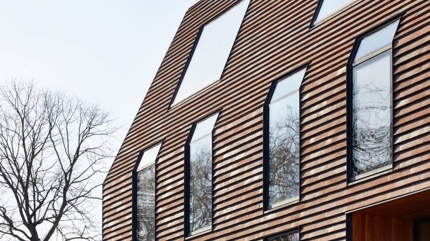
Less is more: commenters are divided over this apartment building in south London, which features a rust-red facade and an abundance of wood in its interior. Tikari Works designed the building to have a "sibling relationship" with neighbouring properties.
"Quite a nice design," said Dariusz Boron. "Although it seems no London architect has ever had to use their kitchen. The wooden backsplash is going to get quite grungy near the sink."
"A splash of paint and some wallpaper inside wouldn't go amiss," added Alfred Hitchcock.
Chris D had some reservations too: "Nice external design, but the public realm at ground floor is ugly with all the concrete, and grey brickwork would have been a better choice. The interiors make me feel queasy – you can't turn away from knotty pine wherever you look."
Geof Bob was more positive: "Pleasing mix of angular volumes, textures and shades, outside and in. These non-identical twins stand up for themselves, without needing another 'sibling relationship' with neighbouring properties."
This reader also gave the thumbs-up:
Are you a fan of The Rye Apartments? Join the discussion ›
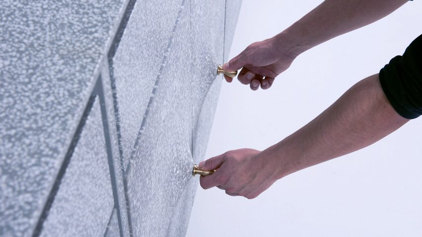
Stretch appeal: architecture studio Allthatissolid has designed a cabinet with rubbery doors that stretch and form breast-like shapes when pulled open and readers can't get enough.
"What a giant load of fun," said JB. "And faux materials are always delightful."
Spadestick agreed: "Silicone stone – wow!"
"This is so wrong, yet so right," added Logomisia.
"What a fun surprise!" concluded David Braha.
This reader summarised the doors in one word:
Are you equally excited by the stretchy cabinet doors? Join the discussion ›