Graphic designs by York St John graduates pay homage to Yorkshire
From a zine profiling Yorkshire's best designers to a bike share branded in local dialect, this VDF school show features projects created by York St John University students to celebrate the UK's northern region.
The 18 projects presented here were created by graduates from the university's BA graphic design course, based at the School of Art, Design and Computer Science.
Some are responses to self-imposed briefs, while others answer prompts given to the students as part of their degree – such as using design to combat the plastic waste crisis or creating the branding for a bicycle hire scheme that has a distinct sense of place.
BA Graphic Design, York St John University
University: York St John
Course: BA Graphic Design
Tutors: Simon Harrison, Andrew Byrom, Warren Fearn and John Temperton
Course statement:
"The projects on display here demonstrate the breadth, diversity and dedication of our third-year students. The students have explored a broad range of themes including sustainability, gender, branding, identity and social experiences.
"They have all completed a challenging, thoughtful, flexible and creative journey to complete these projects. Their creativity and originality are a testament not only to the effort and energy they have invested in their projects but also to the value of design education in culture and society."
Graphic Design in Yorkshire by Beth O’Neill
"This editorial project celebrates Graphic Design in Yorkshire. It features interviews with eight leading designers based in Yorkshire, offering insights into what it is like to work in the industry, what Yorkshire has to offer designers and where to find inspiration.
"The project showcases the designers' work as well as sharing background information on the companies they work and collaborate with. With thousands of students studying design in Yorkshire every year, the aim of this project was to encourage more to consider staying in the county after graduation."
Paul McCartney by Samuel Nicholson
"This project is an investigation into how editorial design can be used in the context of an archival project and how it can be used to create a narrative.
"It considers how the subject of a publication – in this case Paul McCartney – can inform its design and format. The outcome is a 300-page hardback coffee table book, which collates hundreds of photos from throughout the artist's career and displays them in dynamic ways which intrigue and inspire the reader."
Email: [email protected]
Instagram: @
nicholson_graphics
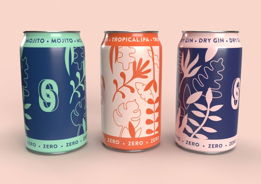
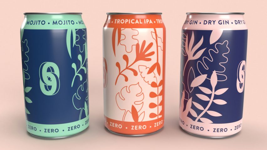
Zero by Bronte Rockliff
"This project aims to create a brand of zero per cent alcohol, which promotes a healthier lifestyle and reduces the social stigma around sobriety. The aim is to bring together the world of drinkers and non-drinkers, providing opportunities for people to take part in social events from which they would otherwise have felt left out.
"The resulting brand, Zero, is a plant-based, alcohol alternative aimed towards 22 to 30-year-olds. The bold, vibrant colour scheme evokes a sense of fun and youthfulness. The logo represents two interlinking 0's, which not only represent the word zero but portray a sense of togetherness and community."
Email: [email protected]
Website: bronterockliff.co.uk
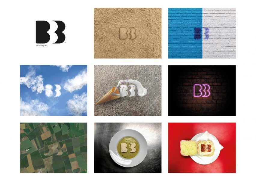
Bridlington by Jordan Slater-Hall
"The town of Bridlington has no uniform brand identity, and all town departments and projects have their own varying logos. The only consistent identity element is the Bridlington crest, which comes with its own restrictions and challenges in terms of usability.
"By rebranding Bridlington, I wanted to create a fresh, new brand identity that respects the past while also being modern and timeless. The identity needed to be adaptive, responsive and versatile.
"The Bridlington logo was designed based on the most recognisable Bridlington symbol, the traditional triple B crest. The new logo was designed to be adaptive and responsive to various content."
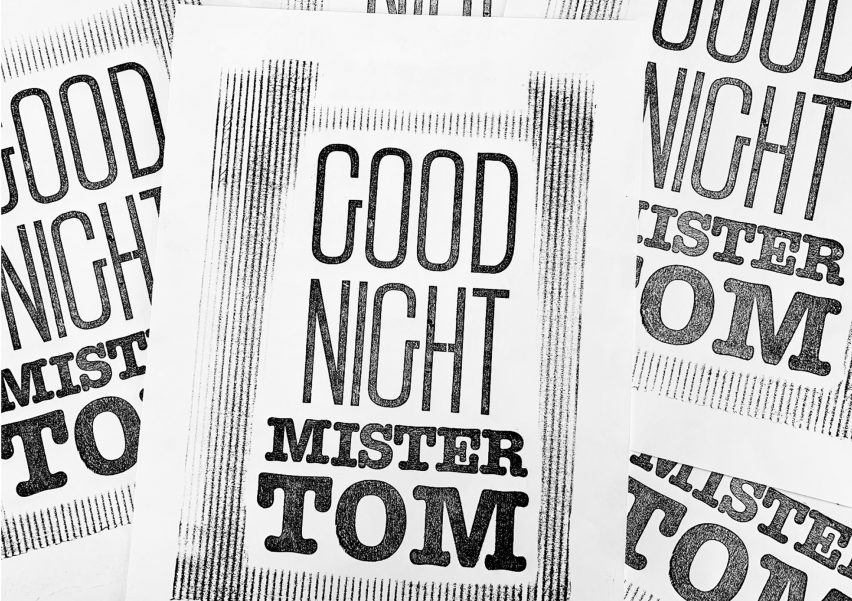
Goodnight Mister Tom by Charlotte Lillian Scott
"This letterpress-printed cover for the novel Goodnight Mister Tom by Michelle Magorian aims to capture the process used when creating ad hoc signage and posters during World War II. The bespoke typeface was designed to reflect the bold, sans-serif typography commonly seen on these posters.
"Meanwhile, the oak and beech wood used to create the letterpress typeface reflects the two main characters of the book – William Beech and Tom Oakley. The design and style of the two typefaces mirrors their personality traits, with William presented as shy, slim and deprived, whereas Tom Oakley was large, strong and confident."
Email: [email protected]
Website link: charlottescott2.wixsite.com
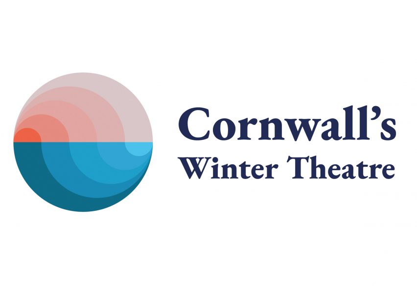
Cornwall’s Winter Theatre by Clara Fullerton
"This branding and identity for the Minack Theatre in Cornwall aims to capture the scenery, colour and grandeur of Cornwall's outdoor theatre experience.
"Introducing pop-up theatres across three popular Cornwall holiday destinations allows visitors to experience theatre like they never have before. The experience is set against a scenic, coastal backdrop, while viewers are both protected from the elements and immersed in them."
Email: [email protected]
Website: clarafullerton.wixsite.com
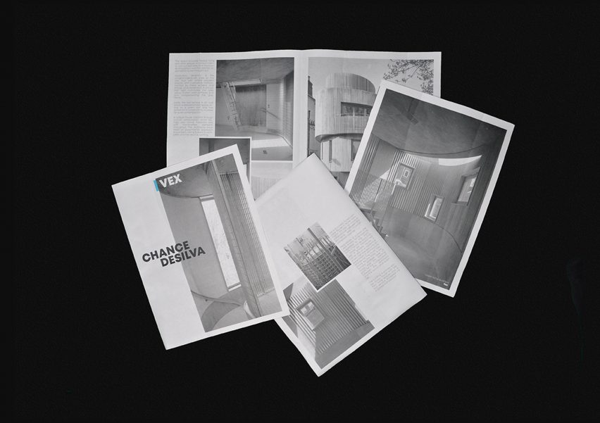
Vex by Devon Chance
"Vex is a RIBA award-winning, concrete house, completed by Steven and Wendy Chance alongside a set of contractors and musical composer Scanner. Sound samples from the project were taken to create a piece of music to accompany the house.
"To accompany the feeling of this home, a piece of promotional material was produced not only to advertise the house but also to encapsulate the tactility of the property. The editorial design was printed on paper similar to newsprint, which gives tactile feedback that is similar to that of concrete."
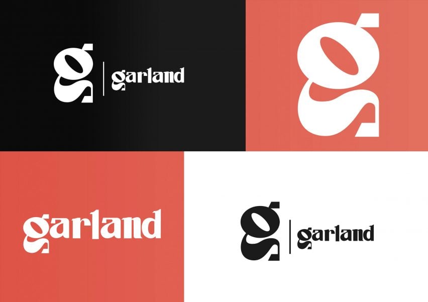
York Garland by Dominic Rowlands
"This project consists of the branding and brand identity for a York-based LGBTQ+ bar. The name Garland was inspired by Judy Garland – one of the most popular gay icons.
"The logo's bespoke, sans serif typeface adds to the originality and creativity of the bar, without looking out of place in York. The colour palette is influenced not only by the LGBTQ+ flag but uses red as the primary colour to create stand-out and complement the browns and yellows of the buildings around York."
Email: [email protected]
Instagram: @dominic_rowlands
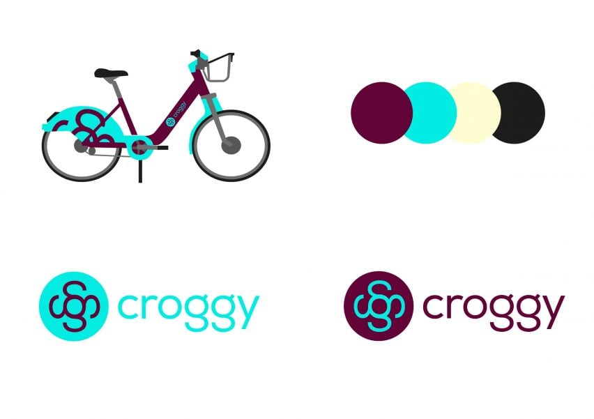
Croggy: Hull Cycle Hire Scheme by Georgia Hannant
"This project imagines a unique identity for a cycle hire scheme in Hull. Hull is a city steeped in history, with a quirky and unapologetic personality. The branding of this new scheme captures the unique personality of this city and the locals.
"All cities have their own dialect but Hull's is extremely unique, so the city's tone of voice should be captured within the brand identity. The name Croggy is a local phrase that means to get a lift on someone's bike.
"The logo type has a quirky and modern personality as seen in the unique form of the double story G. This has been used to create the logo mark, which can represent a bike wheel or a propeller. The use of all lower-case letters creates a welcoming tone of voice, which balances the harsh sound of the name."
Email: [email protected]
Instagram: @georgiarhannant
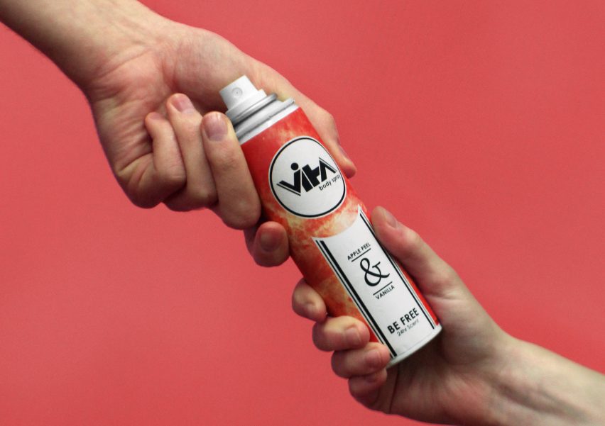
Vita by Billy Armstrong
"Vita is a product designed for everyone – no matter your gender, race, style or status. Those in the LGBT community who feel like modern marketing fails to represent them should worry no longer.
"No longer do our essential products need to be categorized by what society says we should conform to. The branding, identity and packaging aim to capture this idea within an original, visually engaging and intriguing product."
Email: [email protected]
Instagram: @dslrmstrong
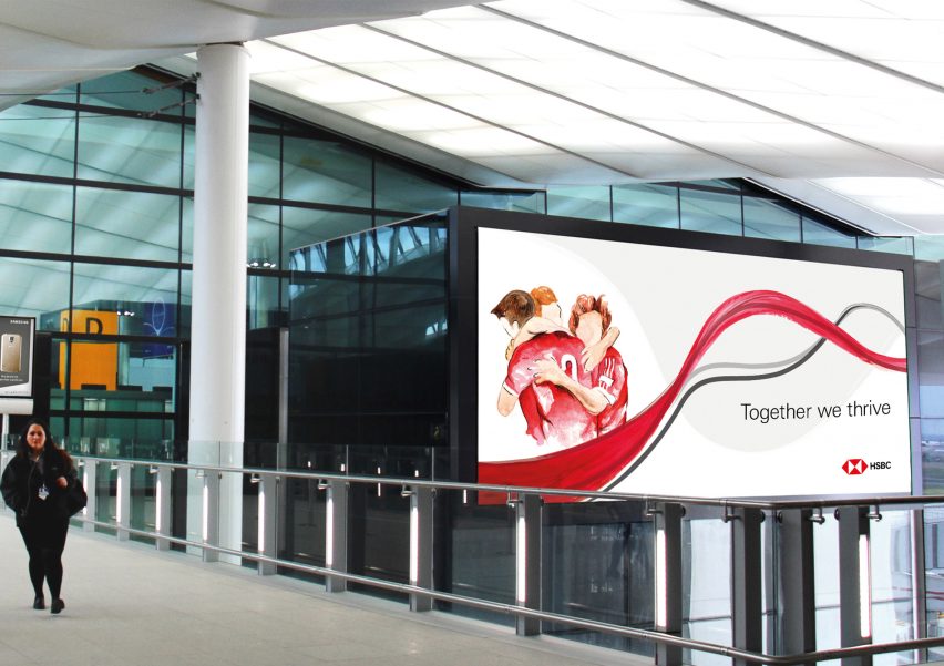
Airport Emotions by Hannah Ford
"The advertising campaign Airport Emotions showcases the feelings we share when passing through an airport. The illustrations are brought together by the brand values of HSBC, demonstrating their ongoing, dependable support for their customers.
"The heartfelt nature of the design is intended to evoke emotions among its chosen audience, helping them develop a strong relationship with the brand. The message 'together we thrive' is integrated throughout the campaign to bring individuals closer, alongside illustrations which showcase the brand's dependability and support in an airport setting."
Email: [email protected]
Website: fordhannah.wixsite.com
Instagram: @hannxh_design
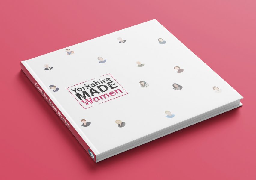
Yorkshire Made Women by Jo Humphriss
"Yorkshire Made Women was a self-initiated brief that grew out of the research I undertook as part of my dissertation, looking at how women have been portrayed in British posters in the last hundred years.
"The focus of my project was the book Yorkshire Made Women, a pictorial record of inspirational women from a range of fields all united by being born in Yorkshire. Each woman is profiled in a dedicated double-page spread, which features an illustration and a brief description of her achievements."
Website: kororadesign.uk
Email: [email protected]
Instagram: @kororadesign
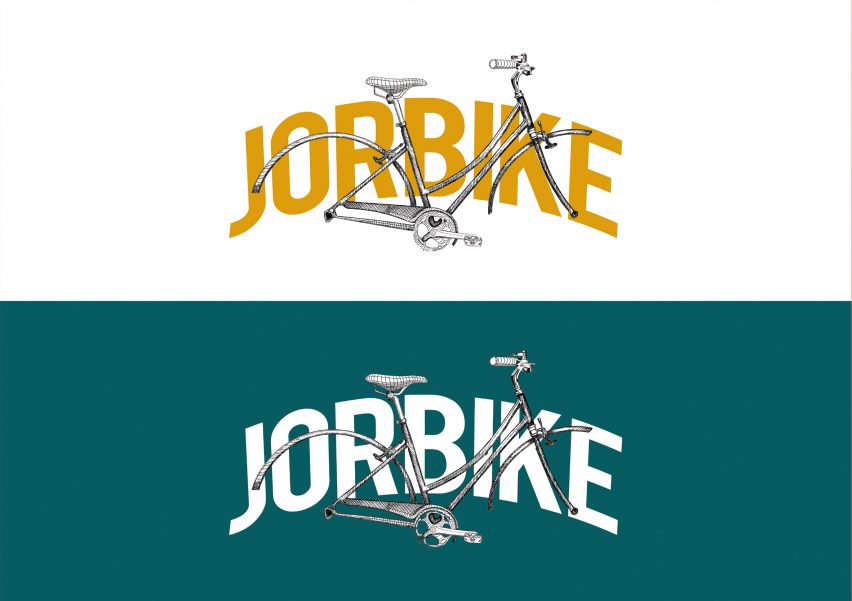
Jorbike by Lilli-Tiger Thomason
"This project was created in response to a brief, which called for the creation of a brand for a bike-hire scheme that reflects the culture and appearance of the city where it is based.
"The choice of city was left up to the designer and I selected York, as potentially the UK's first zero-emission city. The brief also called for the creation of some kind of wayfinding, which could help promote the brand."
Email: [email protected]
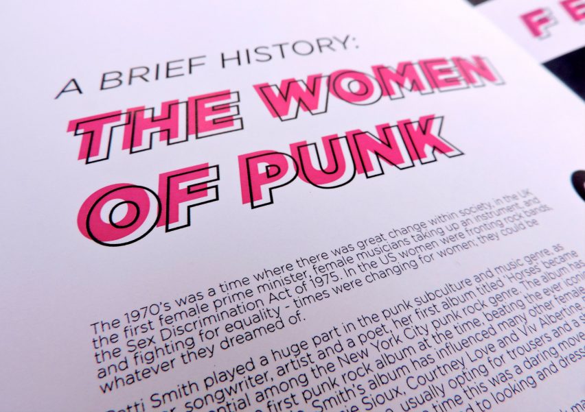
Vive Le Rock zines by Molly Hartley
"Vive Le Rock publications circulate nine times a year. The zines created in this project would replace the accompanying CDs for four out of nine of those publications through the integration of QR codes, which direct readers to separate playlists specially curated for each individual zine.
"By including a brief overview of the women who are often overlooked within alternative music subcultures and collaborating with artist and jewellery designer Mimi Stevens, this would encourage young people with alternative tastes to get involved with Vive Le Rock."
Website: mollyhartley.wixsite.com
Email: [email protected]
Instagram: @m.hartley.design
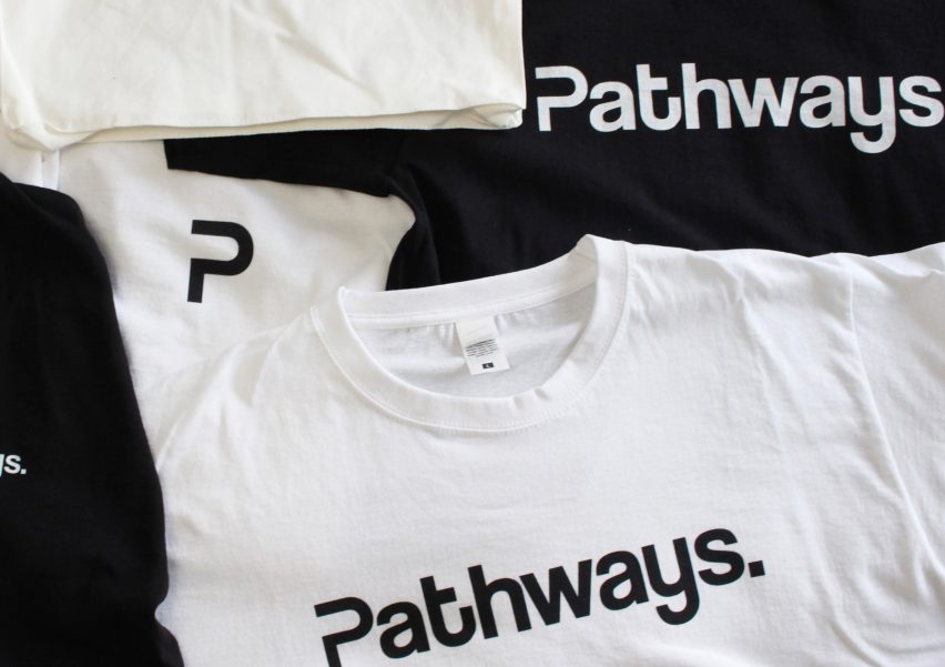
Pathways by Morgan Gardner
"Pathways is a minimalist streetwear clothing brand, created in response to a self-initiated brief. The brand is based on the idea of feeling lost and not knowing what path to take in the future, whether that be in terms of a career or life in general.
"This idea is represented throughout the entire identity, from the fluidity in the letterforms to the photography. The aesthetics of direction were influenced by the road sign system and how it portrays directions and instructions through simple shapes and colours."
Email: [email protected]
Website: mygxdesign.wixsite.com
Instagram: @mygxdes
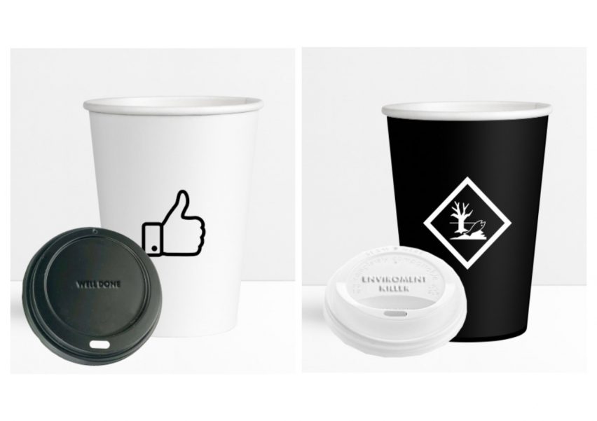
Cups by Natasha Newall
"This project is a response to the question of why there is a problem with disposable, plastic cups and how the public can be encouraged to opt to reusable ones instead.
"The result is a campaign that focuses on two cups – one reusable cup which has positive language and symbology on it, the other is a disposable cup with negative words and symbology."
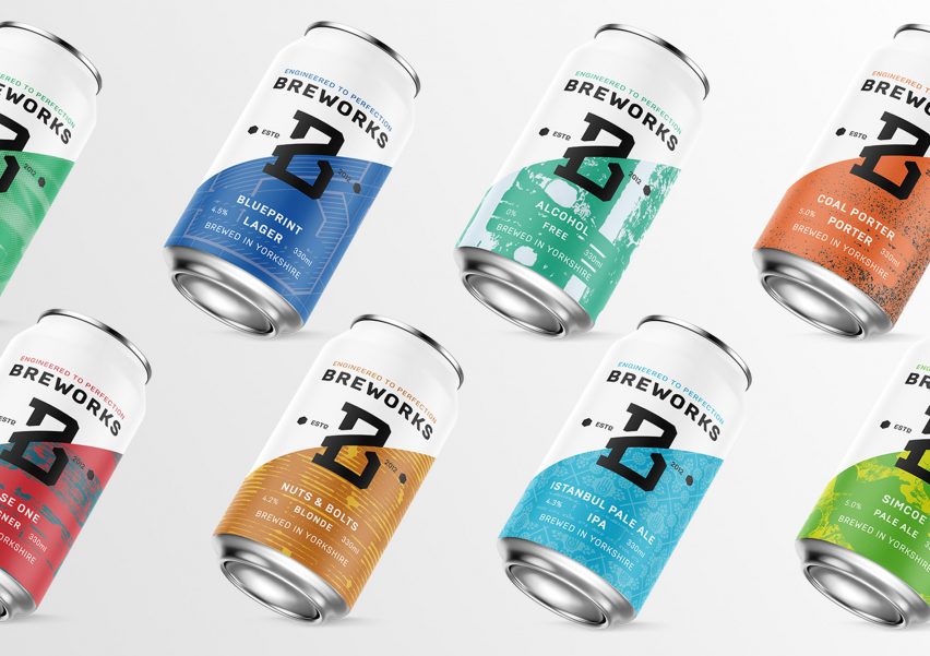
Breworks by Nick Jones
"The project was a complete rebrand of Breworks, maintaining only the name and the engineering theme. The brand was looking for a more modern and professional identity to help them enter new markets.
"I designed the logo and presented it to the client along the way to ensure they were happy with the process. I also designed the packaging, creating a simple template that can be easily updated with the release of new flavours. The packaging design features illustrations and prints taken from engineering tools found in their workshop at the pub."
Email: [email protected]
Website: designnickjones.wixsite.com
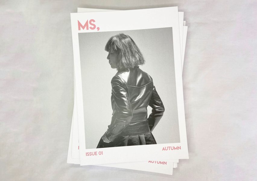
Ms. Magazine by Ruby Glendinning
"Ms. Magazine is an all-female fashion magazine promoting jobs within the fashion industry. Ms aims to encourage young women who are thinking about their future career paths to choose a job within the female-focused industry, which prides itself in being liberal and inclusive.
"It is often argued that to feel powerful, women have to succeed in 'typically masculine' jobs such as science, engineering and maths. This can, of course, be a positive thing but why just aim for that? Women can be equally as powerful and successful within an industry that they are in control of anyway."
Email: [email protected]
Instagram: @beegee__design
Virtual Design Festival's student and schools initiative offers a simple and affordable platform for student and graduate groups to present their work during the coronavirus pandemic. Click here for more details.