Ten interiors with pastel colours that freshen up the home for spring
For this lookbook, we've rounded up ten home interiors decorated in pastel tints that show how ice-cream colours can give spaces a fresh, calming look.
The selection from our archive, which includes bathrooms to bedrooms and kitchens, shows how pastels – made by adding white to pure colours to make them more luminous and less saturated – can create a spring-like feeling.
Never really out of fashion, pastels have strong psychological associations with new life with their pale, cheery tints representing a midway stage between the darkness of winter and the full-blown colour of summer.
This is the latest roundup in our Dezeen Lookbooks series providing visual inspiration for the home. Previous articles in the series feature rooftop gardens, bright kitchens, interiors with statement plants, terrazzo kitchens, and stylish home offices.
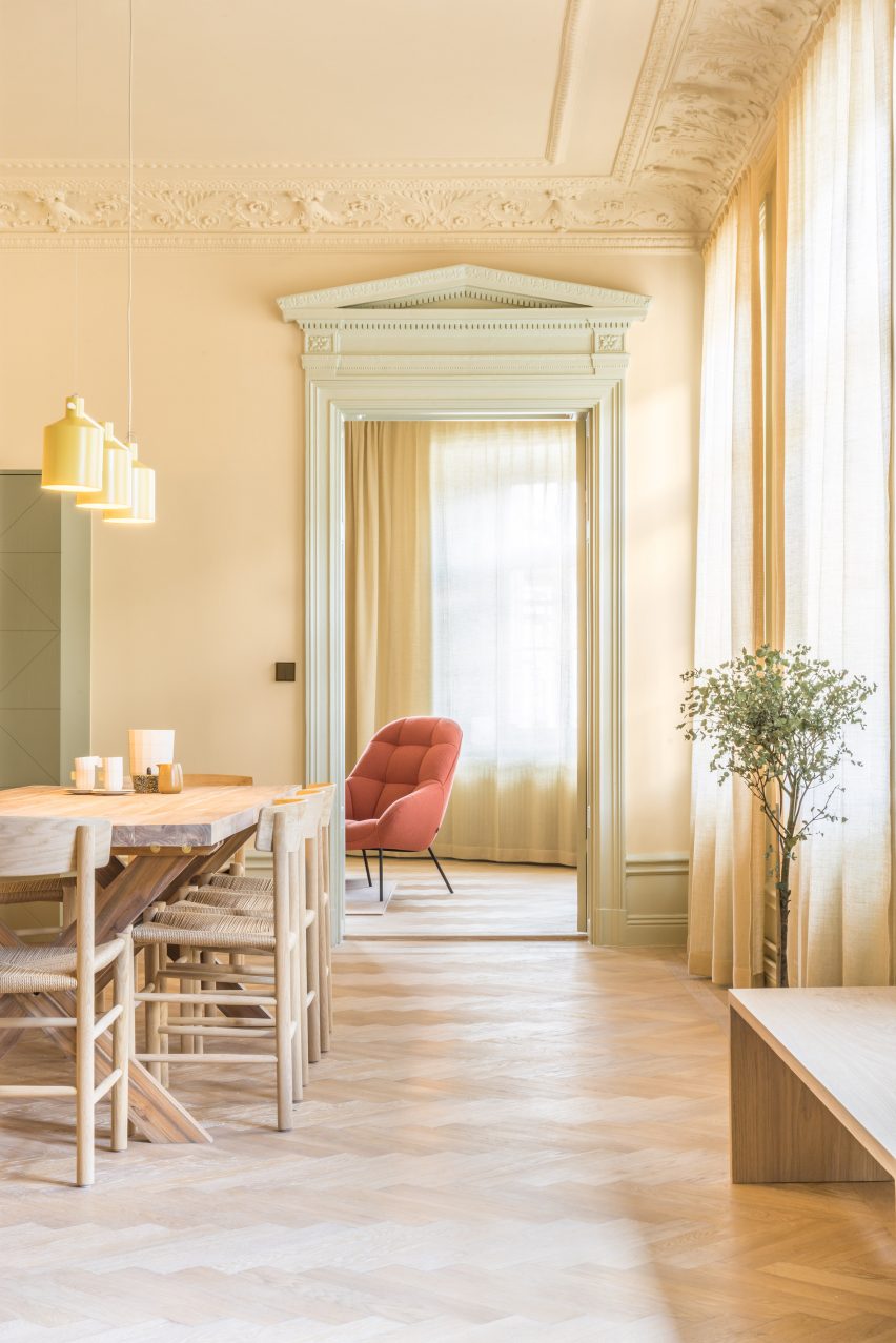
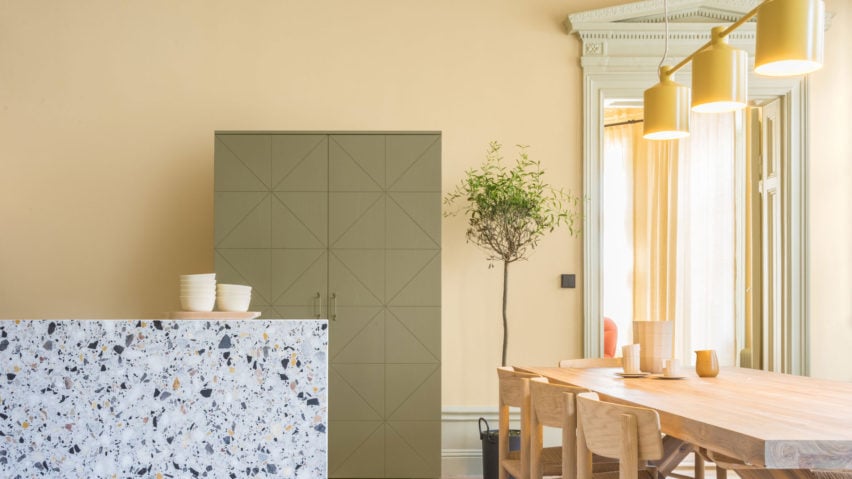
Hidden Tints, Sweden, by Note Design Studio
A warm, yellow tint covers the walls of this Stockholm apartment designed by Note Design Studio, which is filled with different pastel colours. A pale, spring-like green complements the yellow and is picked up in the plants dotted around the space.
Wooden furniture matches the gleaming wooden floors, while a pale orange Mango lounge chair by Note Design Studio for Wendelbo adds a touch of colour. The light above the table is SILO Trio by Note Design Studio for Zero.
Find out more about Hidden Tints ›
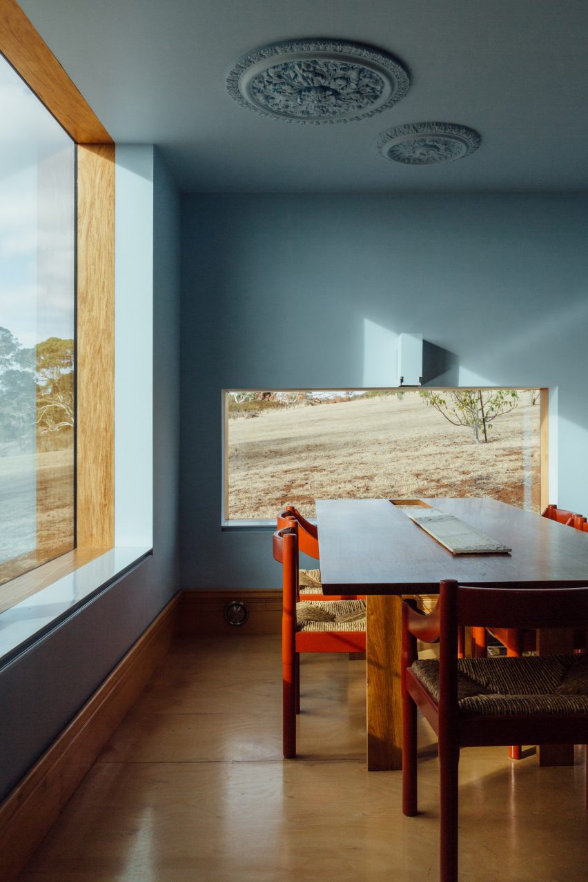
Longhouse, Australia, by Partners Hill
The dining room of this shed-style home in Australia has been decorated in a pale blue colour that contrasts with its wooden floor and wooden door frame, as well as the rolling plains of bushland outside the windows.
Tomato-red dining chairs give the room a contemporary, vibrant feel and stand out against the soothing blue walls.
Find out more about Longhouse ›
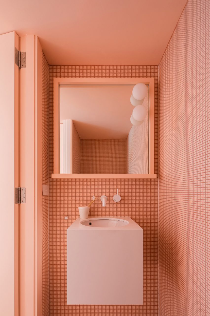
Suburban Canny, Australia, by Tribe Studio
Each bathroom in this Sydney home is tiled in a different colour – pink, teal and blue. The almost apricot-pink shade of the tiles is matched with a pale pink, wall-hung basin as well as the door and door frame.
The geometric shapes of the small tiles create a graphic pattern on the wall that adds interest to the monochrome interior.
Find out more about Suburban Canny ›
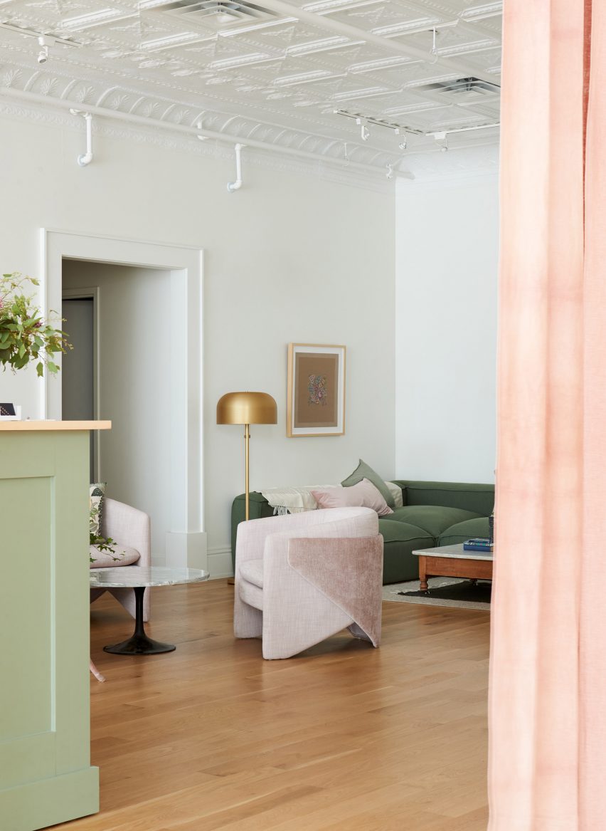
Co-working space, US, by Beauty Shoppe
While the walls have been kept a discrete grey colour, pastel colours were used for other parts of the interior in this Cleveland co-working space. A Tulip side table by Eero Saarinen for Knoll sits between two of West Elm's Thea chairs in a very pale pink shade.
Green and pink is used throughout the space, on a reception desk in pistachio green and the apricot-coloured curtains, as well as a comfy green sofa accessorised with a pink pillow.
Find out more about the co-working space ›
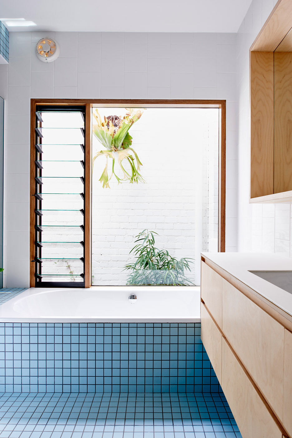
Melbourne extension, Australia, by Dan Gayfer Design
A banana-leaf ficus (ficus maclellandii) peaks in from the courtyard at this tile-clad blue bathroom in Melbourne. The tiles match the exterior of the house, which is also clad in pale blue tiles.
White-tiled walls and wooden drawers complete the clean, simple interior of the bathroom.
Find out more about the Melbourne extension ›
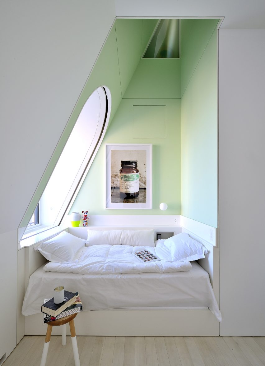
Skyhouse, US, by David Hotson and Ghislaine Viñas
This comfy sleeping nook in a Manhattan penthouse has been livened up with a very pale, almost pear-green colour that creates a peaceful feeling.
Light streaming in from a large window in the slanted wall adds to the fresh, crisp feel of the space which has been decorated with a small, practical stool as well as selected art pieces.
Find out more about Skyhouse ›
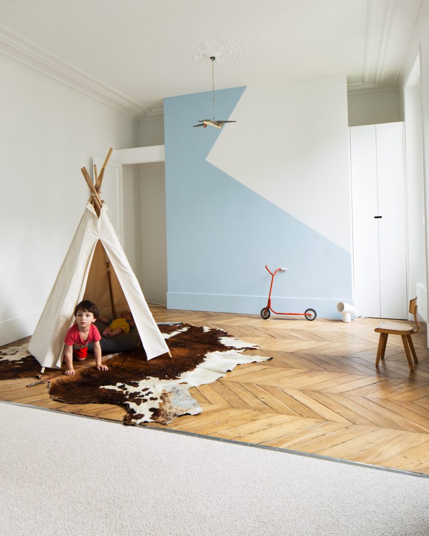
Paris apartment, France, by Les Ateliers Tristan & Sagitta
Colour was used generously throughout this Paris flat and used in a clever way to divide the children's room for two brothers.
One side of the space has pale blue paintwork and beige carpet, while the other has white walls and wooden floorboards laid in a zigzagging pattern. The same pale blue was also used on the side with white walls to create a decorative geometric design on the wall.
Find out more about Paris apartment ›
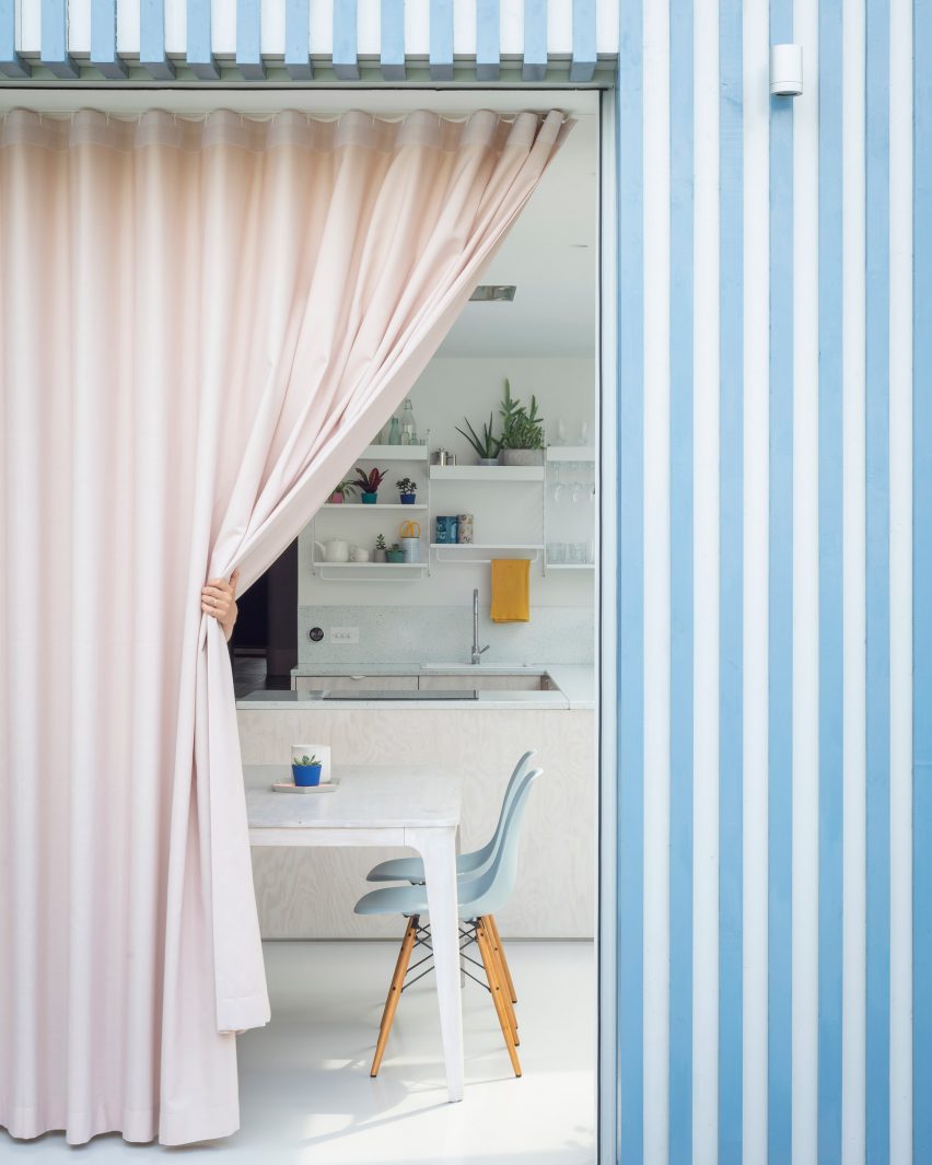
Architecture studio CAN added a blue and white striped extension to a Victorian terrace in London and used a pastel pink curtain to give added privacy to the kitchen and dining space inside.
Pale turquoise Eames DSW chairs are set around a white dining table, with the colour picked up by the speckled sink splashback and the blue accessories on the shelves above it.
Find out more about A Brockley Side ›
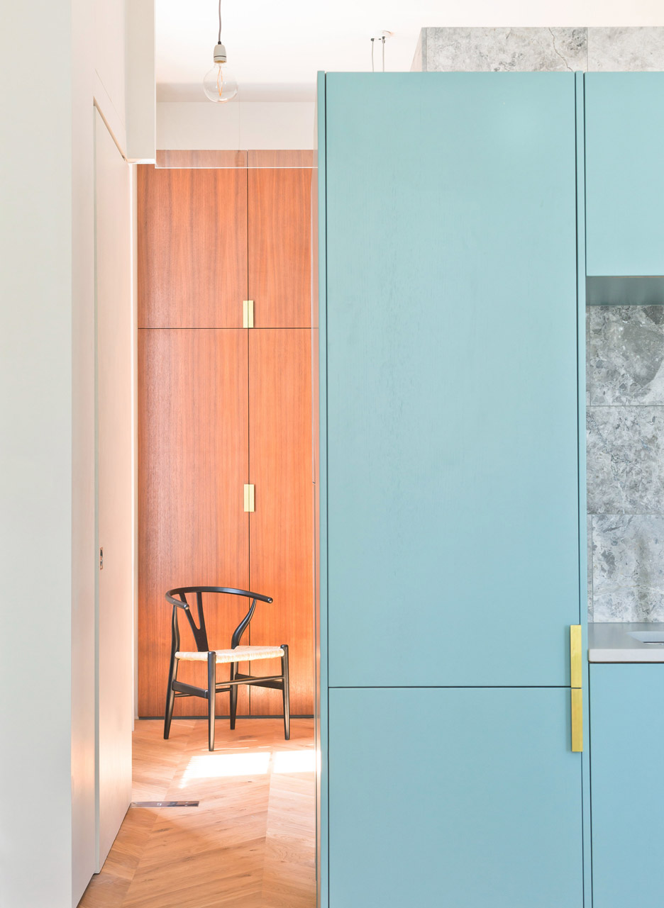
Hans J Wegner's sculptural Wishbone chair for Carl Hansen & Søn functions almost as a piece of art in this bedroom in a London flat, which has wooden fitted wardrobes and a fold-down bed.
The kitchen and dining space next to it has colourful turquoise cabinetry and a grey marble wall, which adds a luxurious touch to the space.
Find out more about London flat ›
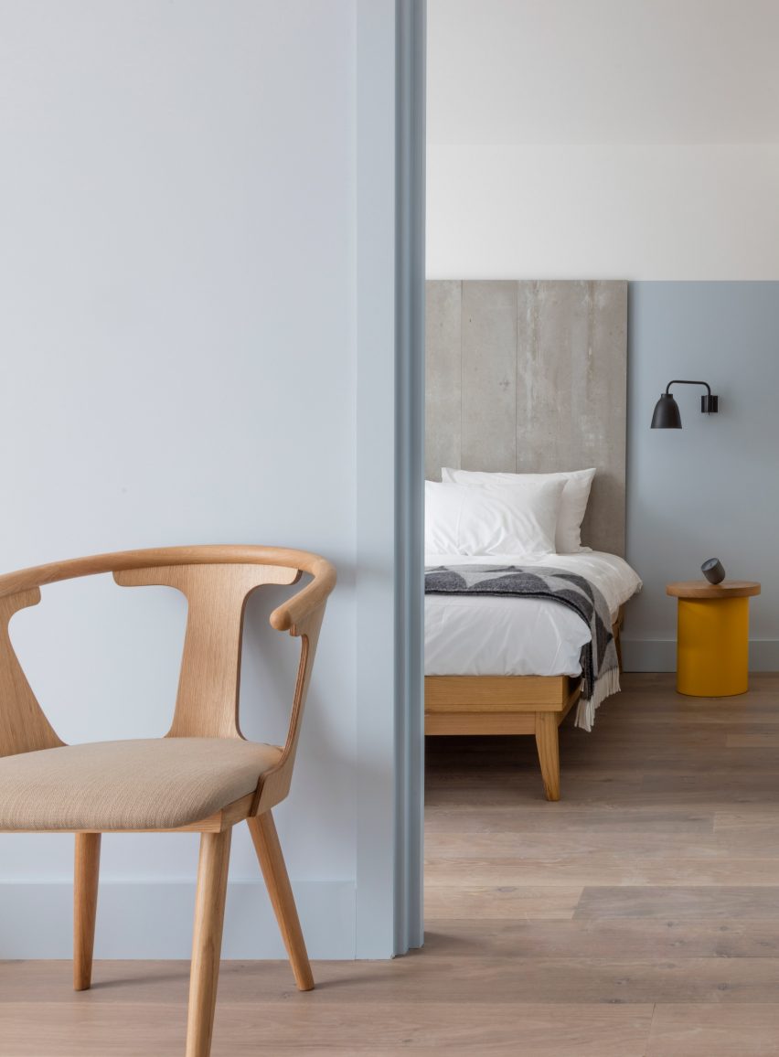
Leman Locke, UK, by Grzywinski + Pons
Pale blue was used in this bedroom of the Leman Locke hotel in London, which was designed to bridge the gap between a home and a hotel stay.
Sami Kallio's In Between chair for &Tradition matches the elegant wooden bed, and the natural wood – which is also used on the bedside table – gives the sleek space a more organic feel.
Find out more about Leman Locke ›
This is the latest in our series of lookbooks providing curated visual inspiration from Dezeen's image archive. For more inspiration see previous lookbooks showcasing peaceful bedrooms, calm living rooms and colourful kitchens