Autex Acoustics reveals new design-led visual identity
Dezeen promotion: New Zealand-based Autex Acoustics has relaunched its branding, transforming "a tired, corporate identity into a modern, design-led brand".
Founded in 1967, Autex Acoustics designs and manufactures architectural textiles for the built environment and has operating units in the United Kingdom, USA and Australia.
The company has recently invested in a new brand identity, to better reflect its belief in designing spaces that look good and positively influence occupants' wellbeing, health and productivity.
"From humble beginnings more than 50 years ago, Autex Acoustics has grown to serve over 18 export markets, with manufacturing and finishing networks in four countries," said the company.
"The old branding failed to reflect our position as a global design company."
Autex Acoustics worked with Marx Design, a strategy and communications studio, to reinvent its branding – placing acoustic solutions in the spotlight to highlight "the beauty of acoustic design and the spaces it inhabits".
The scope included redesigning Autex Acoustic's logo to reflect the company's commitment to contemporary design.
"While each acoustic product carried the bold, innovative spirit of our founders, the branding was stuck in the past," said Autex Acoustics. "The flat and dated logo felt out of place for a company committed to creativity and contemporary design."
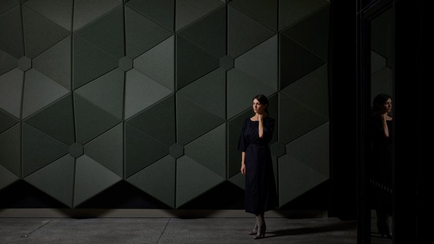
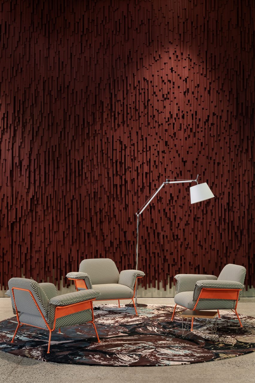
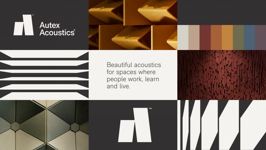
According to Autex Acoustics, their new branding "juxtaposes simple elements and a refined palette with bold, textural photography".
The new brand’s two primary colours—black and white—were chosen because, "trending colours change season to season, but black and white are timeless".
For Autex Acoustics, this creates more space for their product's texture and colour to "shine through the photography".
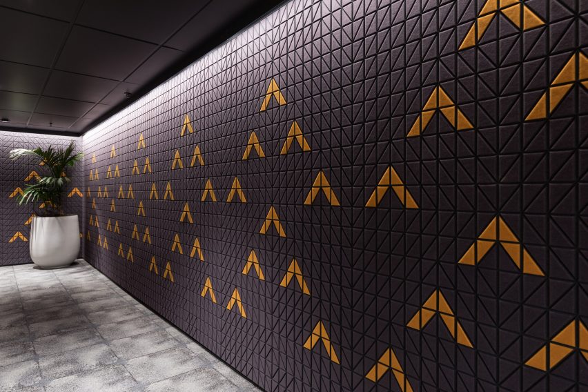
"The new logo depicts two modular acoustic panels forming an abstract 'A' shape," said Autex Acoustics.
"The panel shape has been used to create bold, graphic patterns that represent the product and function – visually referencing acoustic panels and audio sound waves."
As part of their relaunch, Autex Acoustics has redesigned their packaging and collateral to feature the new logo and brand aesthetic.
Find out more about the visual identity and the company's range of products by visiting Autex Acoustic's website.
Partnership content
This article was written by Dezeen for Autex Acoustics as part of a partnership. Find out more about Dezeen partnership content here.