

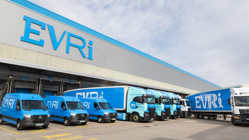
UK delivery company Hermes has been given a new name, Evri, and a multi-font logo with thousands of variations in a sweeping rebrand devised by the creative agency Superunion in collaboration with type foundry Monotype.
Superunion created the name, brand strategy, visual identity and logo for Evri, which wanted a rebrand to signal that its business was transforming and to introduce a new "customer-centric business strategy, powered by technology."
"They acknowledged the need for a ground-breaking brand to signal this transformation, and clearly set out their mission to create responsible delivery experiences for everyone, everywhere," Superunion UK CEO Holly Maguire told Dezeen.

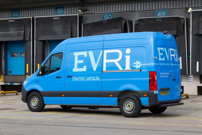
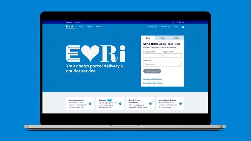
Hermes' signature blue brand colour remains, but the new name, Evri, is meant to represent variety and individuality.
That message is reinforced typographically, with a variable font logo where each character is stylistically distinct.
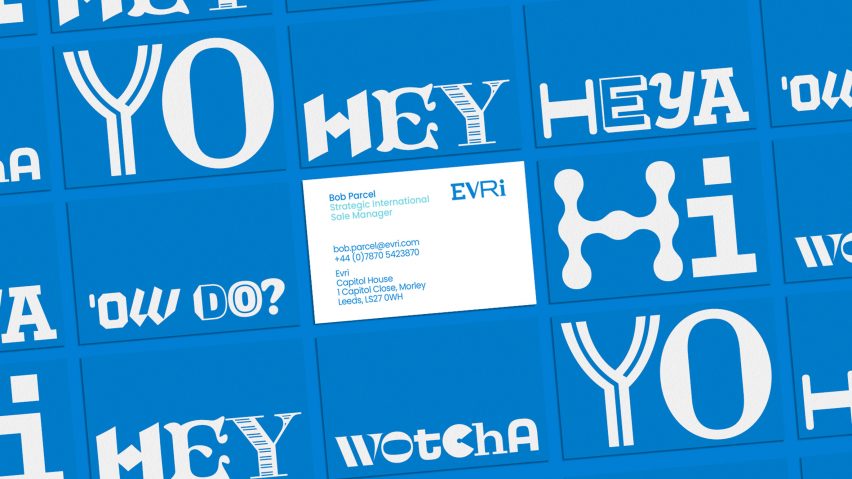
Superunion and Monotype created a logo typeface with many different character options for each of the four letters of Evri, as well as a generative tool to produce combinations at random.

In total, there are a total of 194,481 possible logo variations – enough for theoretically every vehicle in the 5,000-strong Evri fleet to sport its own logo.
"The new Evri brand is for 'Evri one', 'Evri where' – so the idea of a ground-breaking typography-led identity where 'Evri' character is different was an exciting answer to the rebrand," Superunion senior creative director Mark Wood told Dezeen.
The generative tool allows the user to create a random combination of four letters, and then either accept this design and output it as a logo artwork, or tweak it.

"If they wish to change a letter, for example because it is too expressive or too similar to the letter it sits next to, they can use the tool to choose another alternate," said Wood.
Superunion and Monotype also produced an Evri headline typeface for company materials, which works in a similar way but uses glyphs to provide alternate versions of each character in the alphabet.
Each character has 20 OpenType alternate glyphs, while each number has four variants and punctuation is confined to a single set.
Superunion said that an OpenType style-alt typeface of this scale "pushes the limits of what is technologically achievable and is very rarely seen". Its UK office worked with its creative technology team in Hong Kong and Singapore to realise the project.


Evri, as Hermes, has tripled in size over the last five years, partly due to the pandemic boom in package deliveries.
The company was criticised for the "paltry" sick pay it offered to isolating workers in 2020, but has continued to grow and now delivers more than 700 million parcels a year, including for many of the UK's major retailers.
Superunion is a subsidiary of the advertising company WPP and is headquartered in London. The agency has previously worked on the branding for Notpla, a company making edible, biodegradable packaging.
Monotype's previous work includes redesigns of the the popular font Helvetica and the London Underground's Johnston typeface.