Typotheque typography project aims to protect Indigenous languages from "digital extinction"
Type foundry Typotheque has created a series of new typefaces and proposed changes to the way that digital characters are encoded to make it easier for Canadian Indigenous communities to write digitally in their own languages.
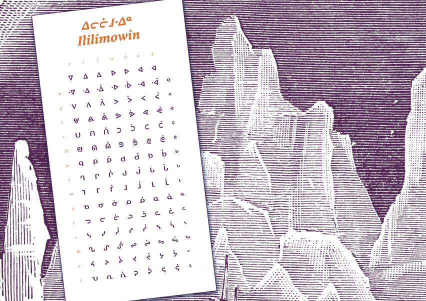
The North American Syllabics project saw the Dutch studio work in close collaboration with groups that use Canadian Aboriginal syllabics – a family of writing systems, also known simply as syllabics, that were developed in the 1800s for the region's Indigenous groups.
This has resulted in three new syllabics typefaces, alongside crucial interventions into how the Unicode Consortium encodes the languages for digital use via the Unicode Standard character coding system.
"The Unicode Standard could be thought of as language infrastructure for digital text exchange on our everyday digital devices," Typotheque typeface designer Kevin King told Dezeen.
"When it doesn't contain characters in a given language's orthography, it is not possible for that community to accurately use their language on digital text platforms and exchange emails, text messages or digital texts in general with other users."
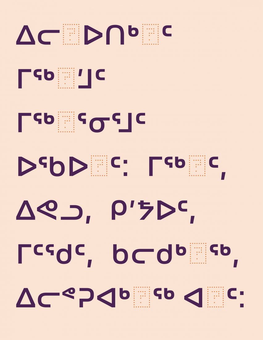
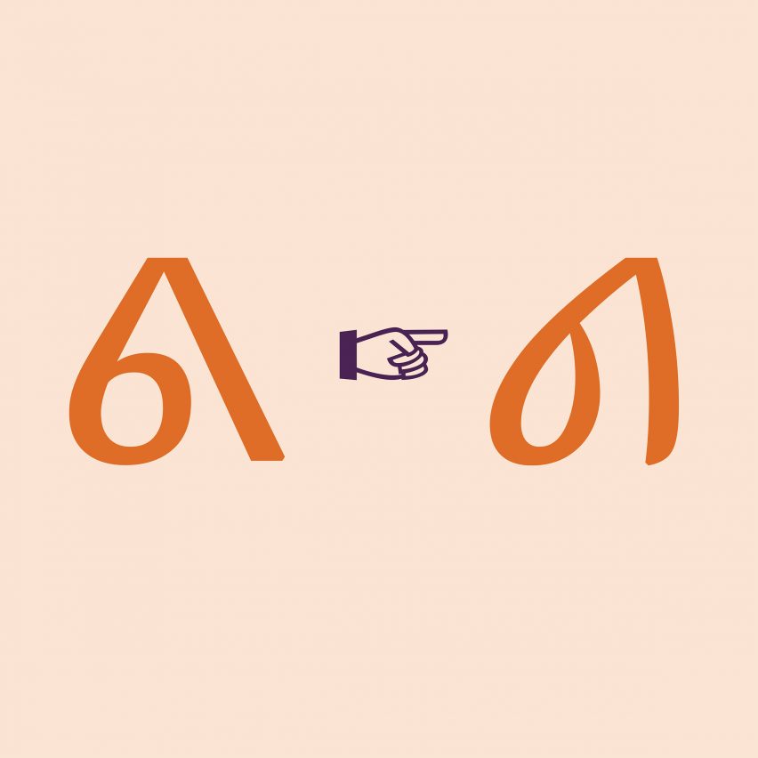
Typically, syllabics users encounter errors such as "not defined" boxes appearing in place of missing characters, or typefaces that are not very legible due to inaccurate character heights or shapes.
Errors such as these inhibit the speakers of those languages from being able to participate easily in sharing emails and using social media platforms like Twitter or Instagram in their preferred writing system, according to King.
"In many cases, users will switch to a majority language such as English, which puts that minority language at risk of digital extinction," he added.
Working with Indigenous leaders in Canada, Typoteque made two applications to the Unicode Consortium to correct these errors — one in relation to the Nattilik and one to the Carrier language communities.
Both were successful and will mean all future syllabics typefaces should be more legible, King explained.
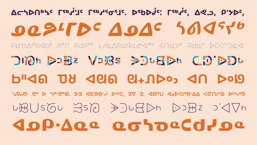
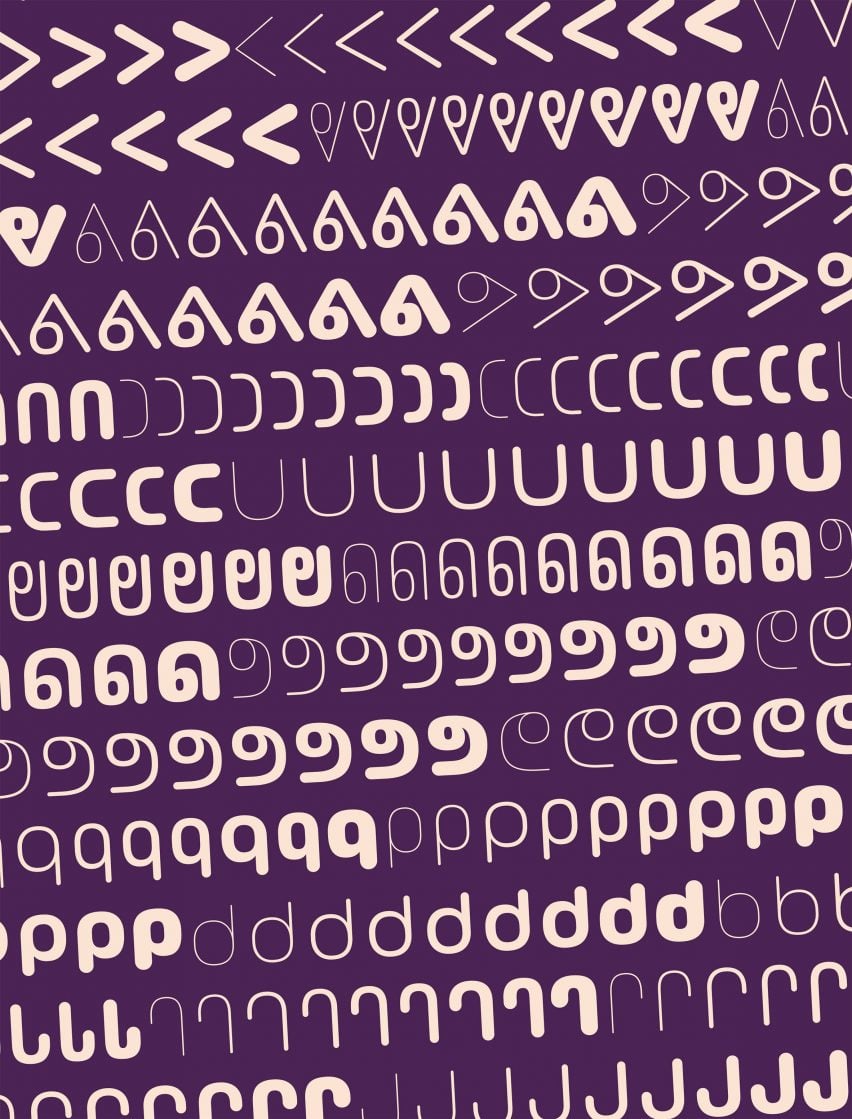
Typotheque also created three new syllabics typefaces: Lava, November and October. All three were designed by King and are versions of typefaces originally created for the Latin alphabet by Typotheque founder Peter Bil'ak.
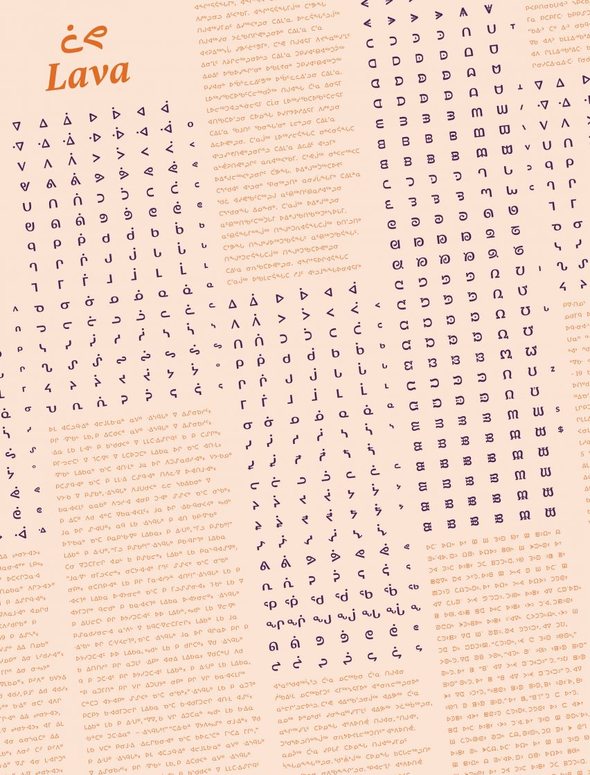
Lava was originally created with magazine printing in mind. But Typoteque describes it as a good all-purpose typeface that offers extreme legibility even at small sizes.
The typeface includes a secondary cursive style to allow for emphasis and other forms of expression. This was a particular challenge for King given that cursive styles are often derived from historical manuscripts, which don't exist for syllabics as Canada's Indigenous groups have an oral tradition.
The November typeface is designed primarily for wayfinding and information systems, although Typotheque says it also works well for long text. October is a rounded style described as having a "friendly character" and working well for signage, information displays, packaging and branding projects.
The typefaces all include a number of stylistic sets designed to cater to different communities, as some use more square forms of syllabics and others more round.
Typotheque worked closely with Indigenous communities throughout the process, first to discuss and understand the issues they were having with digital communication, then to build the Unicode proposals together and finally to test the fonts during their development.
"They always had an influence on the resulting typefaces, ensuring that the resulting tools would overcome barriers that their community faced, and perform to their expectations of how their syllabics should work and look," said King, who is himself based in Toronto, Canada.
Typotheque was founded in 1999 by Peter Bil'ak and aims for its typefaces to support as many of the world's writing systems as possible.
One of the studio's other typefaces is Oli Grotesk, which Indian graphic designer Shiva Nallaperumal has adapted for traditional Indian scripts.