Peter Saville updates Ferragamo brand identity with custom typeface
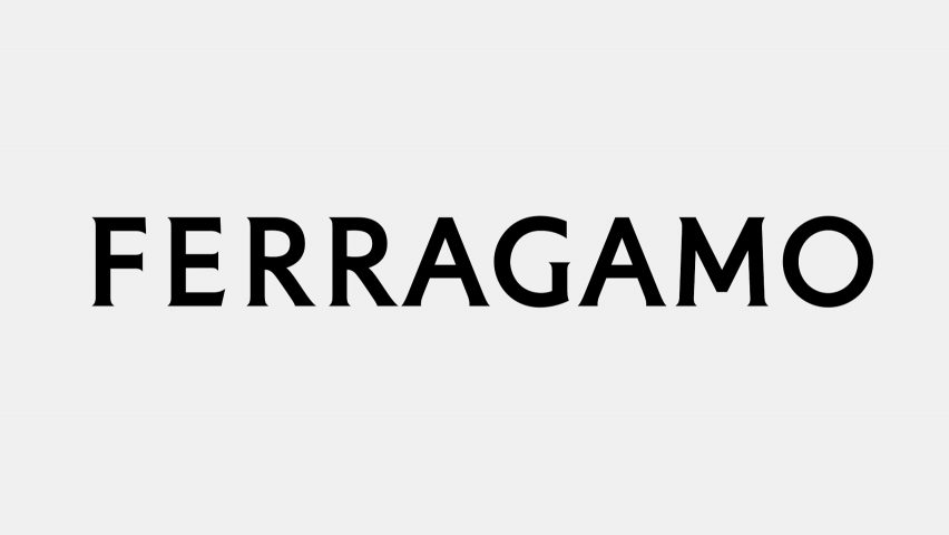
British graphic designer Peter Saville has created an updated brand identity for Italian fashion house Ferragamo, transforming its handwritten logo into a custom serif typeface that references stone inscriptions.
The fashion house revealed its new name and logo by means of an Instagram post that was captioned "Salvatore Ferragamo becomes FERRAGAMO."
The updated single-word logotype, which was designed by famed British graphic designer and art director Saville, was presented against a deep red background.
Savilled created the custom typeface for Ferragamo by translating its former handwritten logo into a serif font.
"[Peter Saville] conceived a modernist take on a classic font, recalling the classical stone inscriptions that inspired Renaissance artists," said Ferragamo.
"The founder's handwriting is translated into a serif font that is impactful, refined, affirmative as evidence, in taut tension between classicism and modernity."
View this post on Instagram
The updated brand identity was revealed on Instagram
Saville also drew on the history of Ferragamo, which was founded in Florence, when designing the logo.
"The equity of Florence is in the culture of the company: that led me to the choice of a classic font," said Saville of his design. "The vision is exacting and modern. Thereafter, the font is reduced and becomes modernist."
"Then there is the craft that is quintessentially Ferragamo, which is condensed in the idea of an inscription set in stone," he continued. "Within this tension lies the new logotype and the complex balance it expresses."
The updated identity also saw "Salvatore" omitted from the company's name, signifying a new era for the 95-year-old fashion house formerly known as Salvatore Ferragamo. It was first revealed ahead of creative director Maximilian Davis presenting his debut collection at Milan Fashion Week.
Ferragamo's former logo, which identified the brand from 1982 to 2022, was a take on its founder Salvatore Ferragmo's personal signature. It was created from a custom typeface and featured a cursive hand-written look.
"History is an immense treasure for a house that owns it," said Ferragamo CEO Marco Gobbetti. "The new Ferragamo logotype contains and expands both history and the now."
"Far from being just a logo, it is a program, which will frame and direct the new chapter that is about to be written."
The simplification of brand logos forms part of a trend in branding that has seen many fashion brands and tech companies implement more simplified, sans serif logotypes.
While at French fashion house Saint Laurent, French fashion designer and Celine creative director Hedi Slimane quickly changed the brand's logo, dropping Yves from its name and introducing a sans serif typeface.
The new logo was informed by the brand's Rive Gauche ready-to-wear line that was launched by Yves Saint Laurent in 1966. Slimane was also responsible for dropping the accent from Celine's logo to better resemble its original 1960s design.
In 2018, shortly after Ricardo Tisci was appointed creative director of British fashion house Burberry, Saville worked with the house to develop a new graphic identity that included a new logo and monogram.
Saville replaced the brand's Burberry Equestrian Knight logo that used the bespoke font Bodoni, which had been by the brand used since 1901, with a sans serif type.
Image is courtesy of Ferragamo.