OlssønBarbieri plays with Bordeaux wine rules in Château Picoron rebrand
To reflect the restrictive winemaking regulations in the French region of Bordeaux, Norwegian studio OlssønBarbieri set itself constraints when coming up with a playful brand identity and packaging design for the winery Château Picoron.
Established in 1570, Château Picoron was recently bought by an Australian family who wanted to change everything about the brand identity but the name. They wanted the graphic design to break with the traditions of Bordeaux, while also bringing up issues of climate change and the region's future.
"Home to some of the world's most prestigious wines and strictest self-imposed regulations, Bordeaux has begun to lose its appeal to new generations," said OlssønBarbieri. "The goal was to create an inclusive brand identity by shaking the snobbery of the region, making wines more fun while honouring their legacy."
To meet this challenge, OlssønBarbieri decided to reference the strict rules that winemakers need to meet to use the Bordeaux appellation – such as using particular grapes, harvesting methods and length of maturation – by imposing some of its own constraints on the design, which has been shortlisted in the graphic design category of Dezeen Awards 2022.
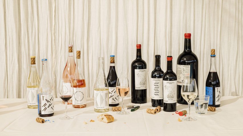
Firstly, the team used only one font: Bourrasque by the French type foundry Bureau Brut. OlssønBarbieri picked it because it can slant 45 degrees in both directions, giving the studio ample room to play with shapes while creating an "effortless flair".
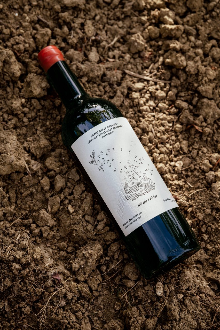
Secondly, the studio decided to use only names that are palindromes (words or phrases that read the same backwards and forwards) for the different wines, and create meaning through that limited choice.
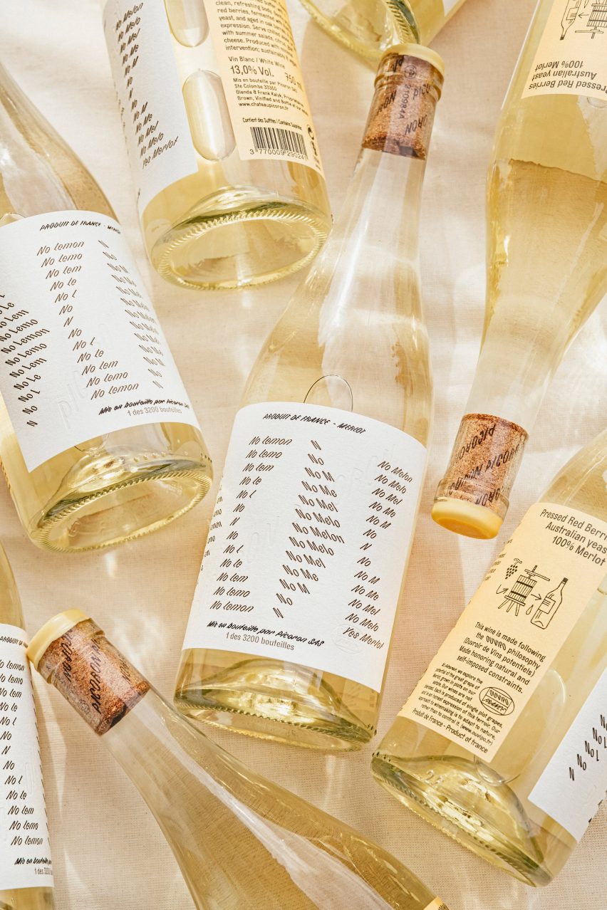
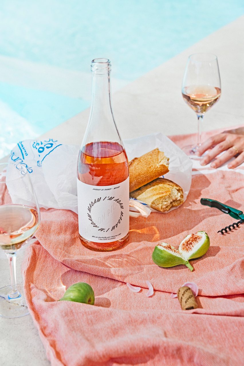
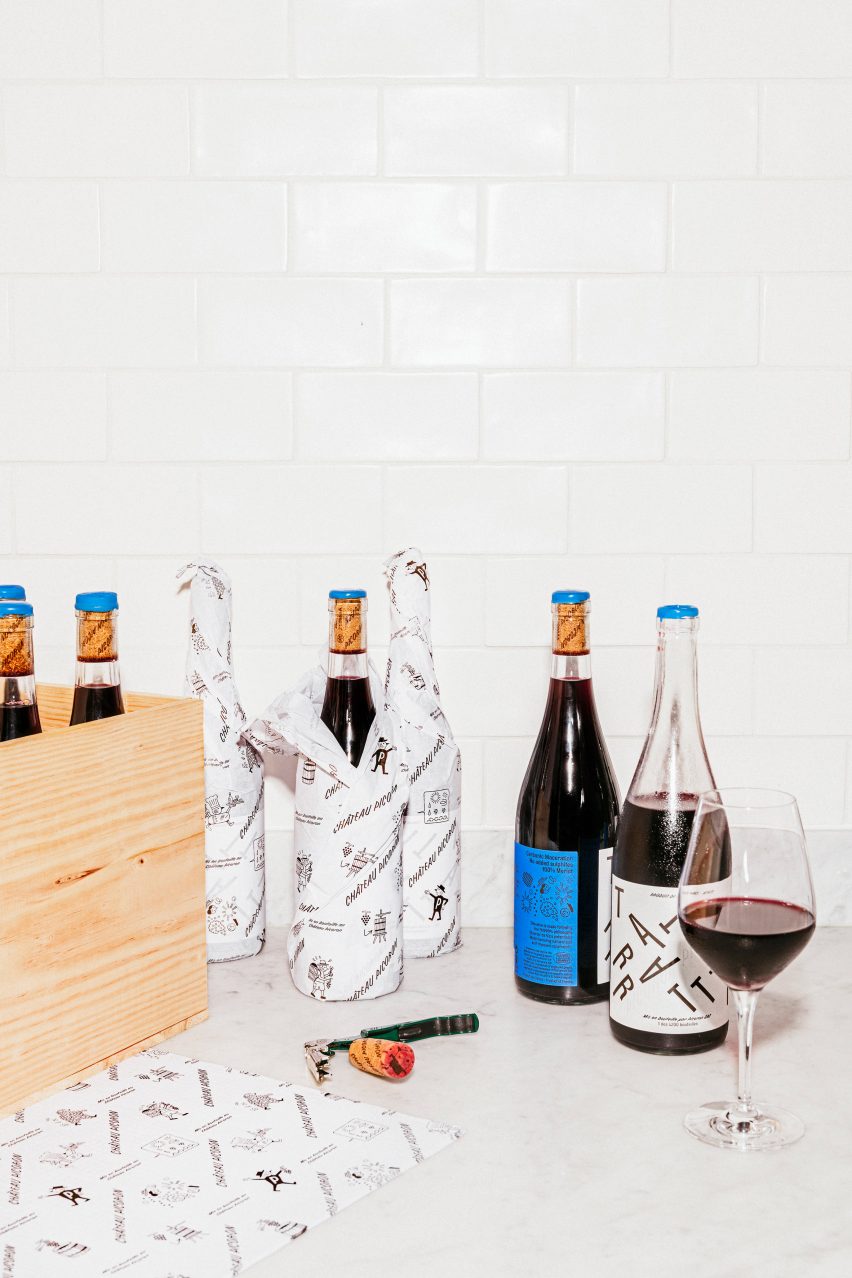
They went with French palindromic names for the three top-of-the-range wines in the Château Picoron portfolio that have the Bordeaux appellation — Le bon Nobel, Ne de l'Eden and Mon Nom — and English ones for the three "younger" and more experimental wines, Tattarrattat, Madam I'm Adam and No Lemon, No Melon.
The result are several labels that play with typography. One of the wines, Tattarrattat, has a natural fizz created through the process of carbonic maceration, so OlssønBarbieri mirrored that in the label, which sees the letters scattered like bubbles.
In the Madam I'm Adam label, the letters slant forward and form a circle, while No Lemon, No Melon plays with negative space. The Ne de l'Èden label takes a slightly different approach in order to incorporate another theme of the graphic design: the bird.
All of the wines are based on the Merlot grape, which is named after the Merle blackbird, so OlssønBarbieri adopted this bird as the mascot, logo-mark and "brand's storyteller". The Ne de l'Èden bottle features an illustration of this bird in dot-to-dot.
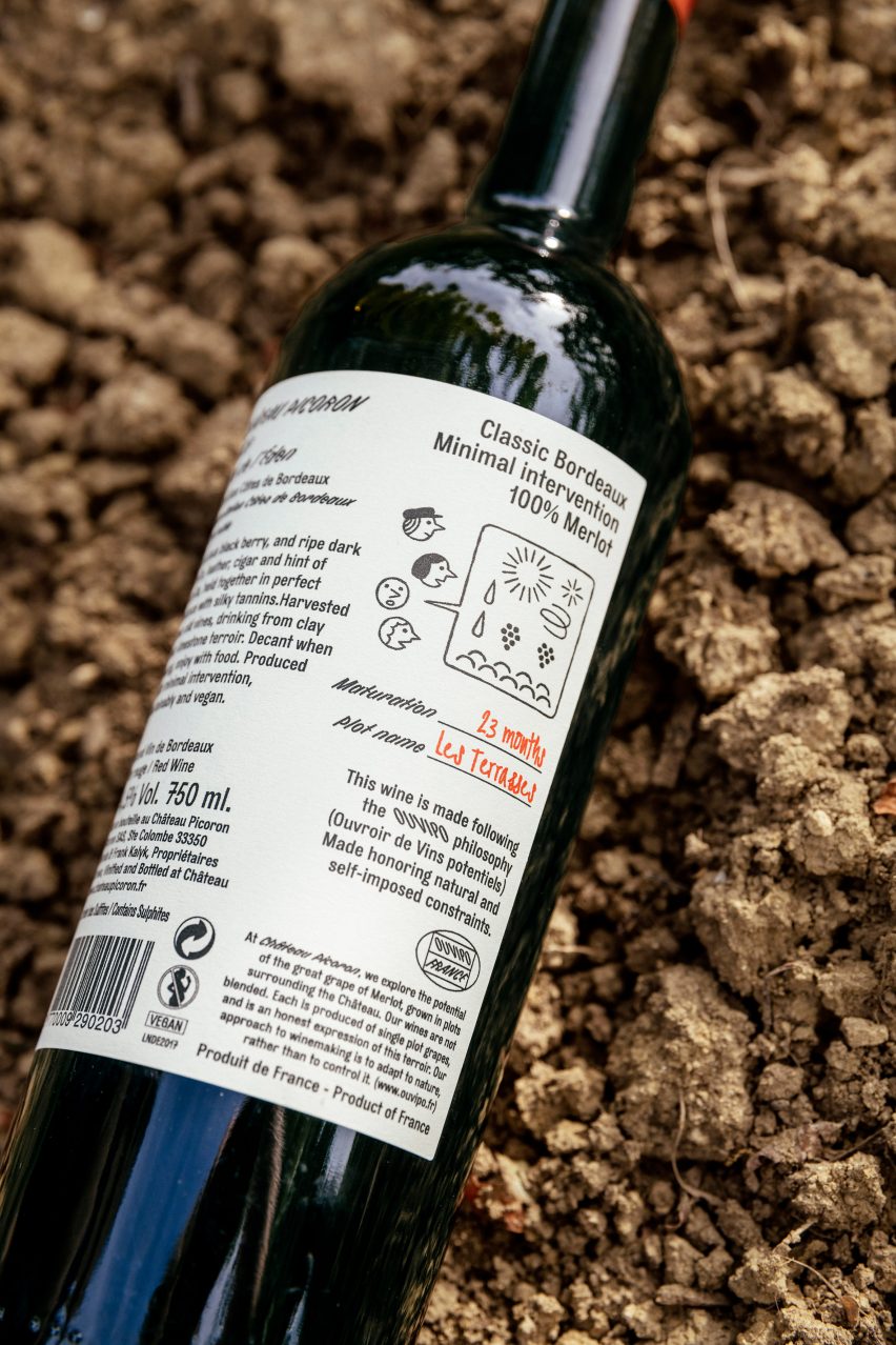
Illustrations are used elsewhere too, all created in collaboration with French artist Jochen Gerner. Small ones on the reverse of the bottle describe the winemaking constraints that went into that style. For instance, on the Ne de l'Èden, the illustration focuses on minimal intervention.
This also presented an opportunity to initiate discussion on climate change and the future of Bordeaux wine, as OlssønBarbieri says the warm summers of the past years have made it difficult to control the sugar level and therefore alcohol content of the wine.
"The Bordeaux regulation says that you can't irrigate and you should harvest in a certain window of time, so you are really at the mercy of the climate and that is what makes this wine difficult to produce, since the climate is warmer and drier," OlssønBarbieri managing director Henrik Olssøn told Dezeen.
"Here the illustration shows people observing and worrying about the climate itself," he added. "For Mon Nom, we wanted to illustrate the cold ferment process, with the Merle mascot dressed in leaves, and for Tattarattat, a more effervescent and almost explosive process created by the carbonic maceration."
As part of the rebrand, OlssønBarbieri also created a concept and mark for a new community centred around Bordeaux winemaking called Ouvroir de Vins Potentielles (OUVIPO, or "workshop of potential wines").
Founded in 2012 by Olssøn with Erika Barbieri, the studio has previously created an engineering-inspired, plastic-free chocolate packaging design for CF18 Chocolatier and the visual identity and bottle for water brand Snåsa.