7UP rebrands with fresh look that is "all about being uplifting"
Beverage company PepsiCo has unveiled new branding for soft drink 7Up, which aims to reinforce the uplifting nature of the brand.
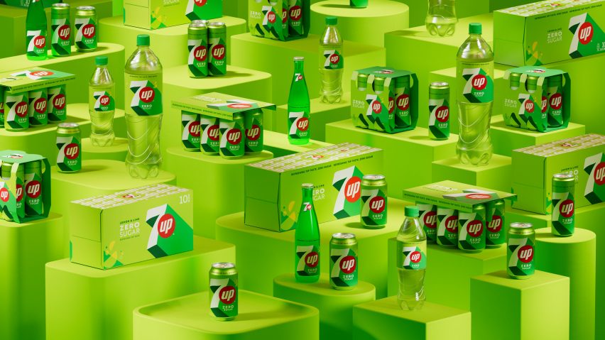
Created as the first major rebrand of 7Up for seven years, the redesigned logo will be rolled out on cans, bottles and merchandise.
PepsiCo aimed to give the new branding more energy, playing into the idea of soft drinks being uplifting.
"We wanted to create a new fresh look that was more aligned to the time we live in and the positioning of the brand that is all about being uplifting," said PepsiCo chief design officer Mauro Porcini.
"Obviously this plays with the up in 7Up," he told Dezeen.
"This kind of soda is usually something you drink in a joyful moment, so with 7Up it's always been part of the energy of the brand."
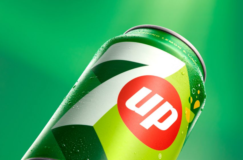
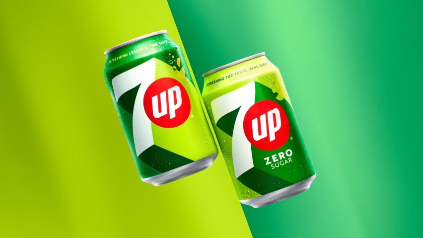
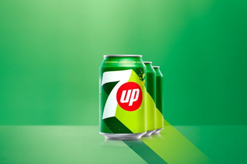
The redesigned branding retains all of the core elements of the previous iteration – the colour green along with a large number seven – but aims to be more dynamic and have "new energy".
While green was retained, a brighter tone was chosen and paired with a neon green. For 7Up Zero, the colour combination is reversed.
"On one side we needed, and wanted, to respect the visual heritage of the brand – the green and seven as a visual protagonist," explained Porcini.
"The first challenge was to play with a green. Green is not an easy colour to play with – in one direction it's like a Christmas tree and in another its sustainability," he continued.
"So we played with the heritage green, added this yellowish kind of green and had them playing together to build a good level of new energy on the pack."
The brighter green was used to create a 3D effect for the seven and give it a sense of movement, while the word up was incorporated into a red dot that has long been part of the drink's branding.
According to Porcini, the aim was to draw more attention to the uplifting nature of the drink.
"We took the up that is really part of our positioning and part of the history of the brand," he said. "We scaled it up to be more of the protagonist."
Porcini hopes that the branding will mean that 7Up, which was launched in 1929 and first branded as 7Up in 1936, remains part of pop culture.
"Every time I look at a brand in the company, the ambition is to elevate the brands above and beyond the category," he said.
"I don't want those brands to be just a snack or a beverage, I want those brands to be part of life, be pop culture, be lifestyle," he continued.
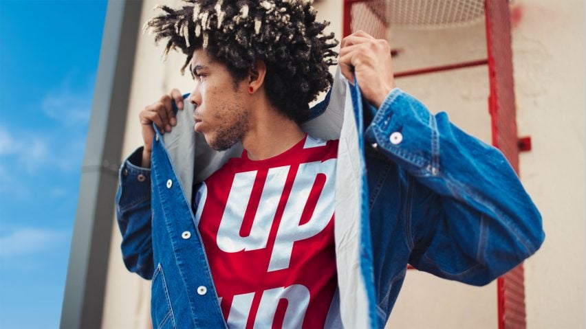
"Brands like 7Up or Pepsi or Gatorade are already there – one of the filters I use is thinking 'could you wear this brand on a t-shirt?' and 7Up is one of those."
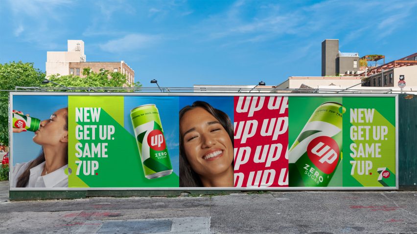
Like the majority of rebrands, PepsiCo aimed to create a design for 7Up that would not just work on its physical products and branding, but also in the digital world.
Porcini explained that the company also aims to consider how these two worlds will interact in the future with the "phygital world" rapidly developing.
"There is a fine balance between the very tangible physical product and the digital world, and more and more we have to consider the phygital world – the connection between the two worlds," he explained.
"Today it is still happening in silos, but in the near future, you will go in front of the can and point your camera and something will happen on your phone," he continued.
"So when you design a brand, you start to think about what is going to happen in the hybrid world because the branding is not going to change for the next seven, eight, nine, 10 years, and with the acceleration we have today I am 100 per cent sure that there will be animated or augmented reality."
Other recent rebrands featured on Dezeen include illustrator Peter Horridge's logo for The National Portrait Gallery in London, Peter Saville's "subtle but necessary" rebrand of Aston Martin and Burger King's first rebrand in 20 years.