Siegel+Gale creates "authentic" branding for US Army
American agency Siegel+Gale has updated the logo and branding of the United States Army for the first time in more than 20 years.
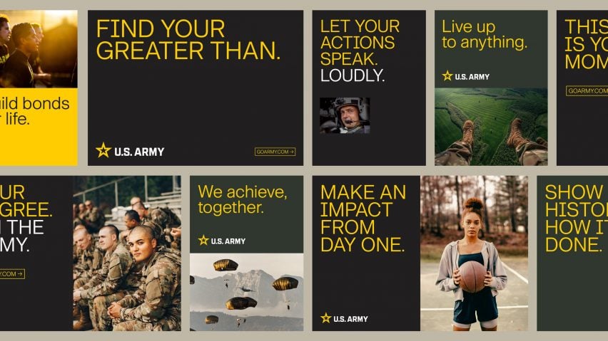
The rebranding includes the logo, fonts, iconography and the reimplementation the tagline "Be All You Can Be", which the military also used in the 1980s and '90s.
Siegel+Gale, a member of a consortium called Team DDB that holds the design contract with the US Army, was tasked with updating all aspects of the organisation's outward facing branding.
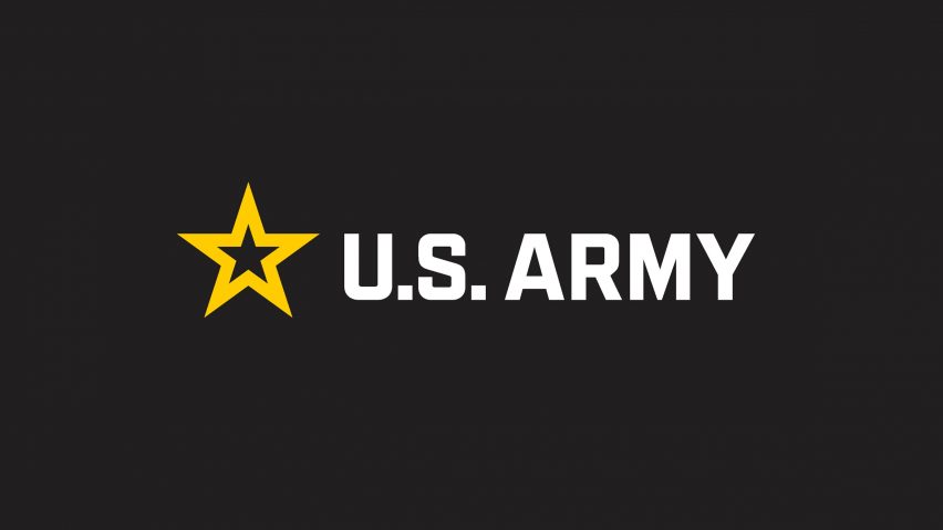
The logo removes the yellow star, which formed part of the precious logo, from the box that previously enclosed it and places the words US Army alongside it.
In line with the refreshed tagline, the removal of the box was supposed to symbolize an "unboxed state without limits or boundaries" for members of the institution.
According top the organisation, these changes were made to give the branch of the US military greater appeal to a digital audience.
"The objectives of the project were to build on the equity of the legacy Army star, optimizing it for performance and relevance in a digital-first world and imbue it with meaning connected to the Army's culture and purpose," Siegel+Gale told Dezeen.
"The star has long been a symbol of American culture, dating back to the 13 stars on the first American flag," it continued.
"The new US Army Logo is an evolution of the legacy Army star, modernized for use in digital media."
According to the agency, the logo is the result of a multi-year process that involved focus groups including "youth influencers", as well as current and former soldiers.
This resulted in a perceived need to "bridge the youth knowledge gap and drive relatability, trust, and culture as tenets of consideration".
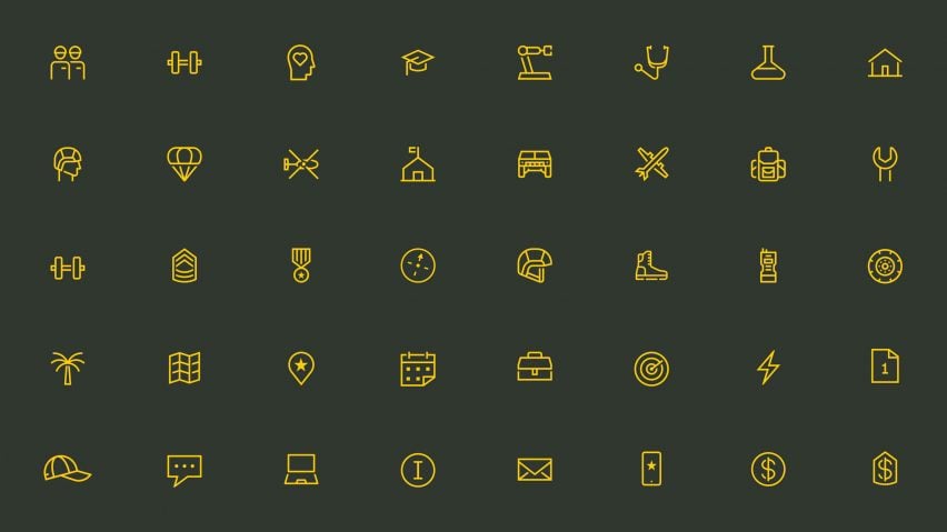
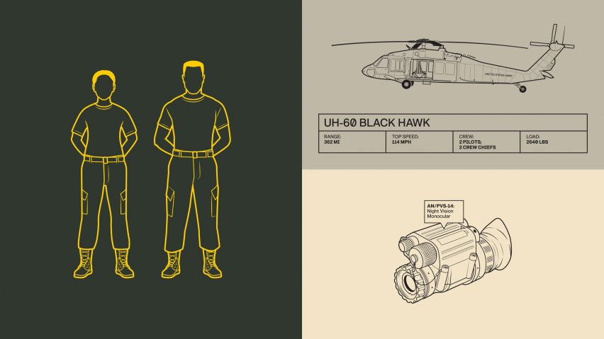
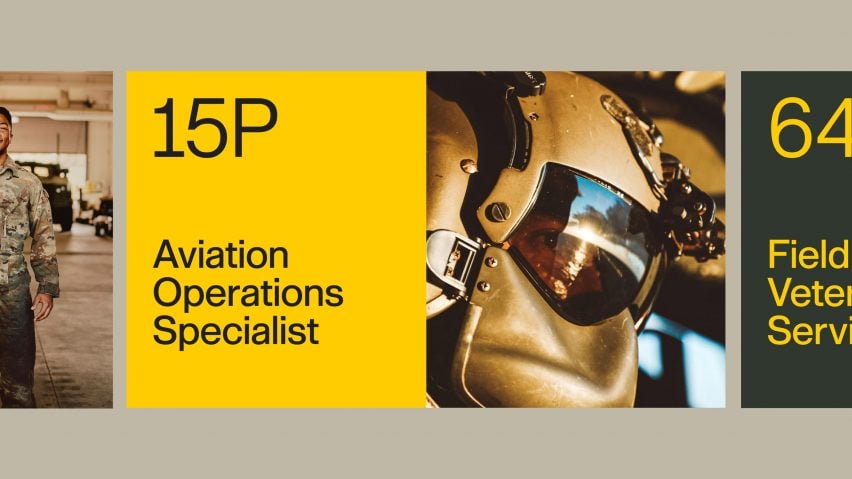
On top of the logo design, the rebrand included a new set of photography, graphics and iconography that represent the specialities of different people and teams within the organisation.
These updates will be applied to all aspects of the Army's brand, including memos and marketing materials. The graphics and iconography take on the same minimal approach to the logo, with outlined symbols and sans serif fonts.
"The resulting brand resulted in an authentic and contemporary representation of today's Army through both the visual and verbal brand identity," Siegel+Gale told Dezeen.
"The new Army brand emphasizes the organization's clear, confident, and human nature to maximize the brand’s value and lifespan in a modern era," the firm continued.
This year has seen a number of redesigns of logos from high-profile institutions, including a campaign to refresh the classic "I ♥ NY" logo and a series of redesigns for British royal iconography looking forward to the coronation of King Charles III in the United Kingdom.