"Surprising colour combinations" define Raw Color's IKEA collection
On the heels of a two-year research process, Dutch studio Raw Color has released an IKEA collection in which no item features less than two colours to explore how our perception of a hue can change based on its context.
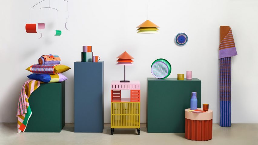
Under the name Tesammans, which means together in a Swedish dialect, the range incorporates 15 different colours across 18 pieces of furniture, homeware and lighting.
This makes it the most colourful collection that IKEA creative leader Maria O'Brian has seen in nearly a decade of working at the Swedish furniture giant.
"It's really lovely, the way that Tesammans has combined colours in the same object," O'Brian told Dezeen. "I don't think there's anything that's uni-coloured in the collection and that's often how we've used colours historically."
By focusing primarily on smaller furniture pieces and homeware, Raw Color hopes to offer shoppers an easy and accessible way to "embrace colour instead of keeping everything black, white and grey".
"Somehow, people are quite afraid of colour," said Daniera ter Haar, who founded the studio together with Christoph Brach. "Not everyone, of course, but we're talking about the mainstream."
"I think people are not really taught anymore how they can use or bring colour into their home."
Raw Color's research-heavy approach involved a lengthy process of selecting 15 distinct shades for the collection. The studio then paired them in different ways for different products to create "surprising colour combinations".
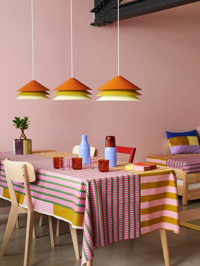
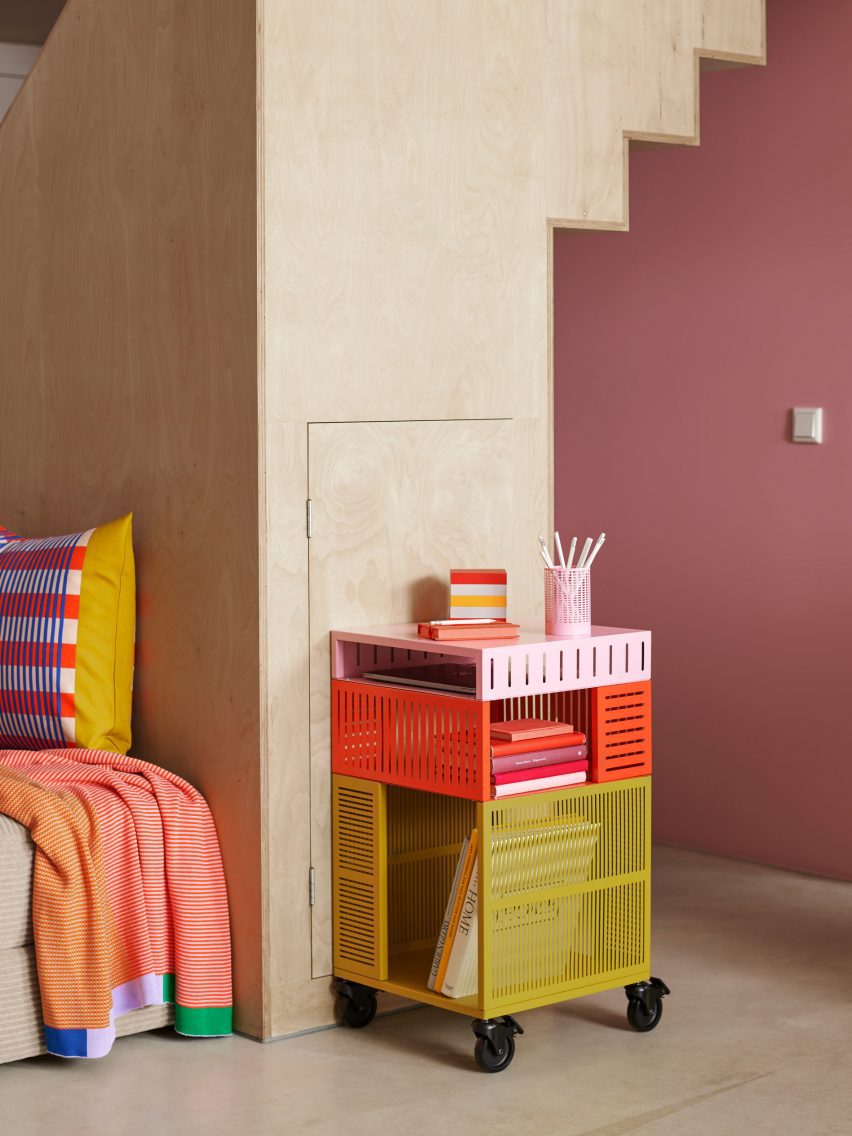
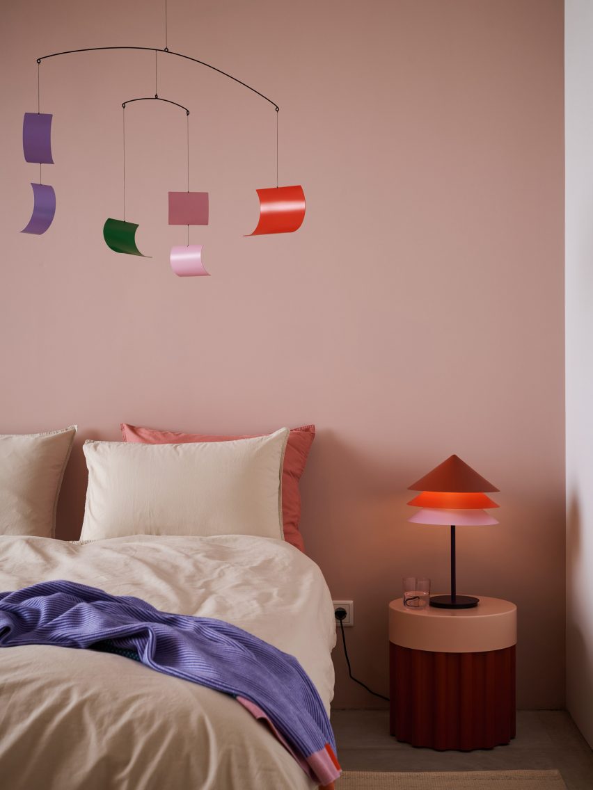
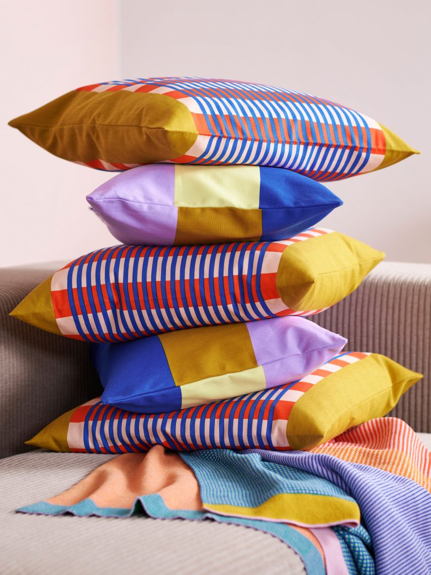
The result is a collection of "not the most typical home objects", including a sculptural mobile and a gridded trolley that casts varying shadows depending on the position of the sun. It also features rugs and throws designed to create optical illusions.
Reminiscent of the studio's Temperature Textiles, these appear from afar to feature blocks of colour but in reality, they're composed of alternating lines of two different tones.
The two lamps in the collection have tiered metal shades finished in three different shades of the same colour, with the lightest at the base where the light is strongest.
Ceramic pots and vases are decorated with large strips of colour and can be rotated to foreground different shades depending on how they complement or contrast with a given plant.
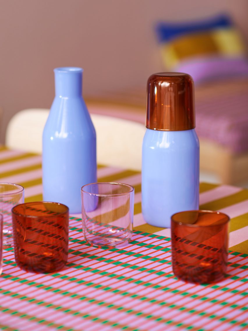
Several of the objects consist of multiple parts that can be combined to different effects, among them a glass carafe with two different coloured cups that double as lids and gridded metal trays that produce different patterns when layered together.
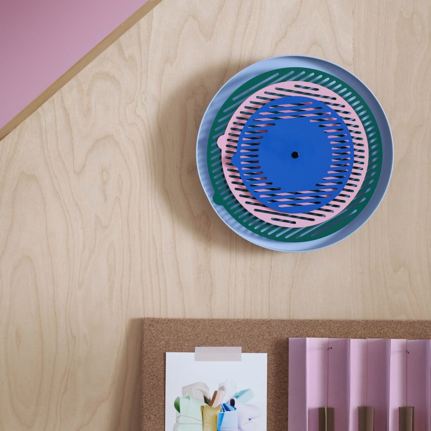
This same layering technique was also used to form an abstract wall clock, composed of three concentric circles that spin independently to show the time and create shifting patterns throughout the day.
"People think oh, it's just a clock," ter Haar said. "But a clock is very difficult to make."
"I'm super happy that it's in the collection because we've already made some clocks during our career and most of them, in the end, we never managed to get as a working type that really got sold."
Raw Color was born in 2008, shortly after ter Haar and Brach graduated from the Design Academy Eindhoven.
Their work explores the nuances of how colour works and how it can be used to convey information, which the duo explored in a dedicated exhibition at Aram Gallery for the 2016 London Design Festival.
Despite the studio's affinity for colour, the Tesammans collection with its many different products proved a challenge due to the need to colour-match across various materials.
This was down to the fact that the same Pantone swatch will look very different as a yarn, a ceramic glaze or a metal powder coating, ter Haar explains.
"Colour makes everything more difficult," she said. "It can be this love-hate relationship at that moment. Like oh my god, why don't we do everything in black and white?"
"It's what we are and it's what we love to do but of course, sometimes it can give you a hard time."
The Tesammans collection is being launched as part of the IKEA+ exhibition at Paris Fashion Week today, alongside a photo series captured by the company's first-ever artist-in-residence Annie Leibovitz.
IKEA+ will take place on 28 Rue de Lappe, Paris, from 29 February to 3 March. For more worldwide events, exhibitions and talks in architecture and design, visit Dezeen Events Guide.