Alien by Gus Wüstemann
Alien is a new headquarters for media agency Mediaxis at Schlieren in Switzerland, designed by Swiss architect Gus Wüstemann.
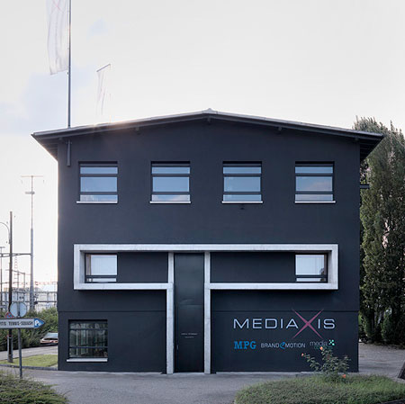
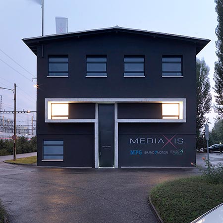
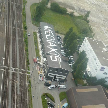
The offices, in a converted factory next to the railway station, feature a "huge alien of concrete" at the entrance (below).
The following information is from Gus Wüstemann:
--
An alien for Mediaxis
The alien
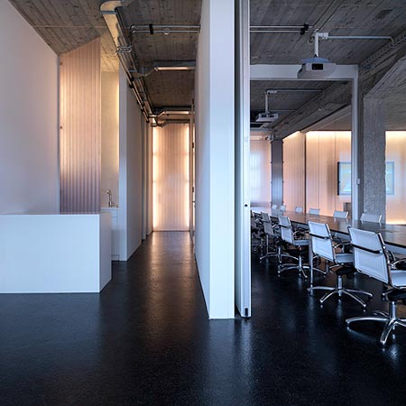
The project was to convert an old factory next to the train station in Schlieren in Switzerland, into a new high tech media agency for Mediaxis.
Peter loved the atmosphere of the station as a metaphor of his high tech media lab, seeing the rails like channels of information, taking you to a next step of the internet. So we created a space station where you already meet the techniques of the future.
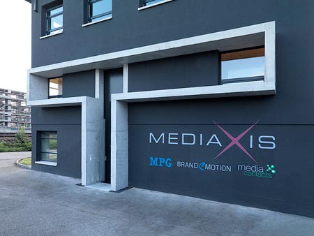
As the entrance we built a huge alien of concrete. The face was actually tracing the old façade of the building; two old windows serve as the alien eyes. The alien stands for an icon you can refer to and get to liking it. In architectural terms, it gave the old building a modern, cubistic façade, which now is stronger than the old factory shape.
The logo aiming at space
To pursue the alien message we painted the logo on the roof for other aliens or just in case Google takes new photos from space for the Google map.
High tech and anarchy
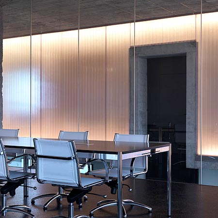
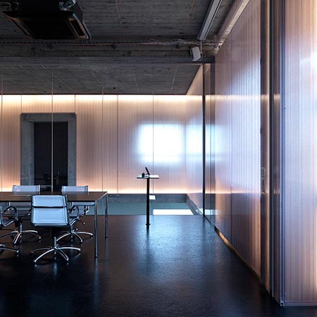
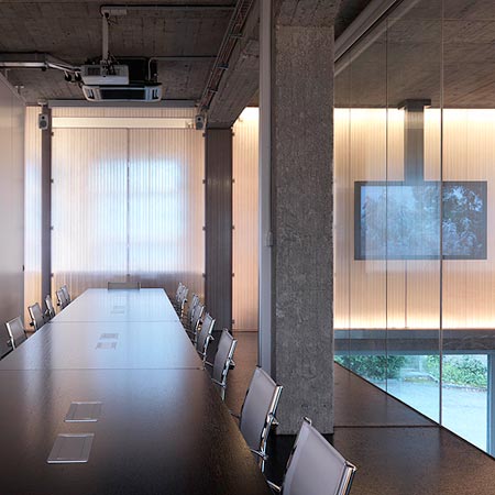
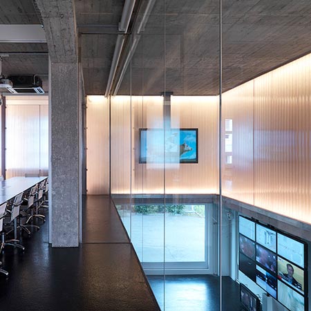
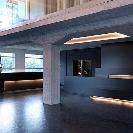
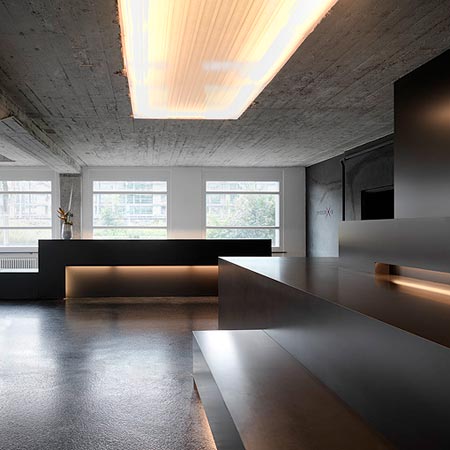
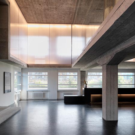
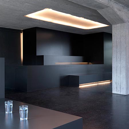
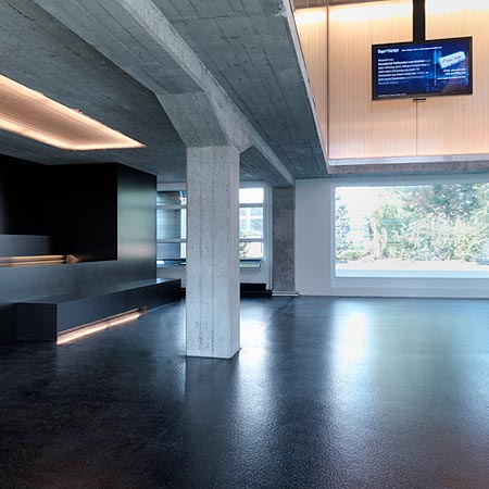
We created the high tech media lab with all the latest technologies in a very rigid old factory space. We cut a huge slab out of the concrete ceiling to get a high entrance hall with the meeting room on its gallery.
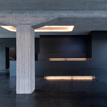
The act of cutting the concrete and let it be visible stands for the ancient times of physical presence, which we call anarchy.
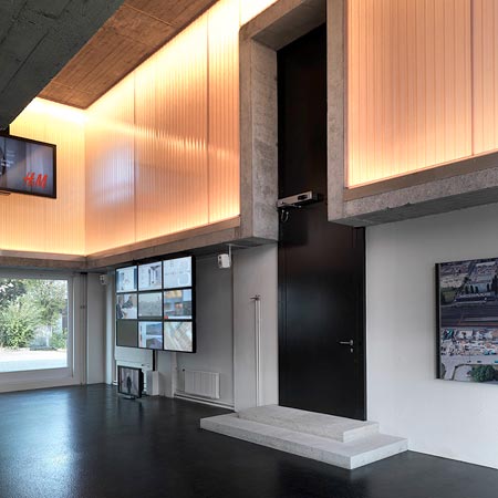
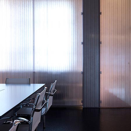
Around the upper part of this space we set a very fine and precise light façade, actually a light space, floating above and in between all this old concrete.
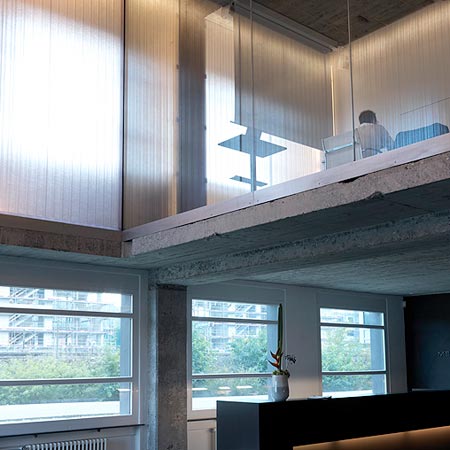
This inner light façade represents precision and gives the whole space station a warm atmosphere.
As the architecture budget was fixed (luckily not too tight) we focused on where and how to intervene. We sanded all the old concrete surfaces and just put the light façade in front of the old façade.
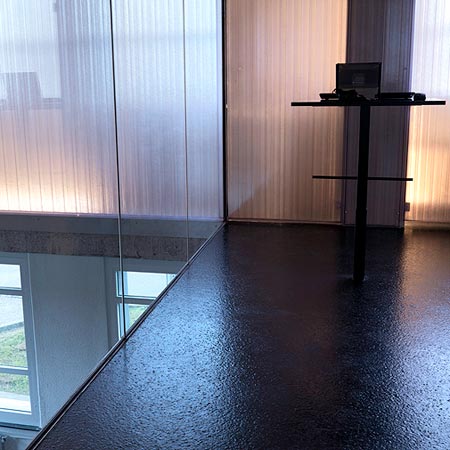
The floors are made of asphalt to give it an urban feeling and the light façade are made of scobalit.
Architecture: Gus Wüstemann
Project team: Marta b.goñi
Year: 2008
Location: Schlieren, Switzerland
Floor area: 300 m2 media lab
Photographer: Bruno Helbling
Client: Mediaxis-MPG AG