
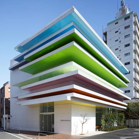
Horizontal layers of colour protrude out from the facade of this bank branch in Tokyo by Tokyo-based French architect Emmanuelle Moureaux.

By night each of the twelve colour bands of the Sugamo Shinkin Bank are brightly illuminated.

Three wide light-wells punctuate the interior of the building, which is furnished with coloured furniture and dandelion motif graphics.

Photography is by Nacasa & Partners Inc.

More Japanese architecture on Dezeen »

The following information is from the architects:
Sugamo Shinkin Bank / Shimura branch - open 2011/3
Client: Sugamo Shinkin Bank
Concept: Rainbow mille-feuille

Sugamo Shinkin Bank is a credit union that strives to provide first-rate hospitality to its customers in accordance with its motto: “we take pleasure in serving happy customers.”

Having completed the design for branch outlets of Sugamo Shinkin Bank located in Tokiwadai and Niiza, we were also commissioned to handle the architectural and interior design for its newly rebuilt branch in Shimura. For this project, we sought to create a refreshing atmosphere with a palpable sense of nature based on an open sky motif.

12 layers of color
A rainbow-like stack of coloured layers,
peeking out from the façade
to welcome visitors.
Reflected onto the white surfaces,
these colours leave a faint trace over it,
creating a warm, gentle feeling.
At night, the colored layers are faintly illuminated.
The illumination varies according to the season and time of day,
conjuring up myriad landscapes.

A piece of the sky
Upon entering the building, three elliptical skylights bathe the interior in a soft light. Visitors spontaneously look up to see a cut-out piece of the sky that invites them to gaze languidly at it. The open sky and sensation of openness prompts you to take deep breaths, refreshing your body from within.

Fuzzy puffs
The ceiling is adorned with dandelion puff motifs that seem to float and drift through the air. In Europe, there is a long and cherished custom of blowing on one of these fuzzy balls while secretly making a wish. Bits of fluffy down gently dance and frolic in the air, carried by the wind.

ATMs, teller windows, consultation booths and an open space laid out with chairs in 14 different colours are located on the first floor.

The second storey houses offices, meeting rooms and a cafeteria, while the third floor is reserved for the staff changing rooms.

Three long glass airwells thread through the first and second levels of the building, flooding the interior with natural light as well as “blowing” air through it.

Credits
Architecture: emmanuelle moureaux architecture + design
Space Design/Sign Design: emmanuelle moureaux architecture + design

Project Outline
Location: 1-17-15 Azusawa Itabashi-ku, Tokyo 174-0051 Japan

Use: Bank Office
Structure: Steel Structure

Site Area: 762.53m2
Floor Area: 699.67m2 (1F/329.10m2 2F/312.56m2 3F/58.00 m2)

Design Period: January 2010 - June 2010
Construction Period: July 2010 - February 2011
Open: March 18, 2011

Material Information
Exterior Finish: Aluminum plate Fluoro-resin paint finish
External floor: deck
Floor: carpet, vinyl flooring

Wall: PVC Film + adhesives coloured films
Ceiling: AEP paint + adhesives coloured films
Lighting: base down lights, base lights, Bracket
Click above for larger image
See also:
.
![]() |
![]() |
![]() |
| Sugamo Shinkin Bank by Emmanuelle Moureaux |
Educational Centre by Alejandro Muñoz Miranda |
Stick Chair by Emmanuelle Moureaux |


looks nice but how do you clean it and why do the coloured layers not penetrate the interior?
exactly what i thought…maybe because they where more preoccupied with giving the bank a 3D business card.
I think this is the result when architects think of the image first .. then the actual building … what do all those canopies do ?
Oh, relax, enjoy the estetic! lovely concept for a bank!
pathetic and lame comments. What an exciting building.
I think its great that the building is most effective from the perspective of a person on the ground walking, they've assigned value to the human scale. I do however think the colourful dandelion puffs a bit of a fail.
yes! i think for the current surge of cold/ alien looking architecture, this is really beautiful architecture.
that's gorgeous.
the pigeons will be flocking to live on those designer bird condos.
wish my bank was that colorful!
I think this is a lovely piece of urban sculpture, playful and unique in expression as an architectural object. The interior is perhaps a bit cutesy for a bank, in the teller area at least, more like a kindergarten really, but it's still pretty wonderful – banks can be such drab places! I particularly like the Ito-esque light wells, they work very well both in terms of function and aesthetics, providing natural light and ventilation whilst also being interesting geometric features. More buildings should be like this!
NICE!
Re what the canopies do?:
they look great. that's what they do. (and also protect from rain and sunshine (south and west facade)) what more can you ask for?
also great interior. it's one of the nicest banks i've seen.
the colours might be a bit unusual for western countries, but this is in japan and it suits very well.
Perfect estetic for kindergarden :)
well: this is the first time i see japanese architecture on dezeen actually having colours! LOVE IT!!
@nofelix: you can clean with water…
exciting, colorfull, daring!
unfortunately, architects now runs after the shadow but loss the substace. This has loss identity, looks more like an institutional buildinding ( PRIMARY SCHOOL ) or more of art studio than a comercial building.
great idea, only that the building had no identity, its' more of an institutional building than commercial building.
its gorgeous… made me smile anyway
What a great concept. I love how colorful it is. But will all these bright colors make me feel so happy and young that I won't really be focus at the matter at hand…my money? Colors are known to stimulate different emotions, do you think if this bank was real, people would be more prone to do business with them upon entering and spending some time in the building?
take a look at the sections! do you think the concept is true for itself?
it seems like two good (!) architects designed the interior and exterior, but they didn't cross each other's line. however it's a nice and interesting experiment!
I'll quote Jadakiss:
"Why?"
C'est superbe!! Bravo!!!!
If only more people dared to move away from conformism the world would be a brighter place.
Nice bank, nice design, but better architecture! And the construction is very good finished. Congratulations Emmanuelle!
It doesn't make sense, why waste al those materials on a duodecuple-canopy?
The colours could have been integrated otherwise… It looks great and really happy but the building consists of some ideas added al up together, it's a pitty.
as AbdoHaD SS said:
I think this is the result when architects think of the image first .. then the actual building … what do all those canopies do ?
Lovely building indeed …
But I agree that it does not stand to its identity. It is too cute to be a bank…. !
It could be best used as a studio i believe.
But anyways, lovely work !
Wanna get a card from this bank! So cute.