Peter Saville colour-codes London's Tate Modern ahead of extension opening
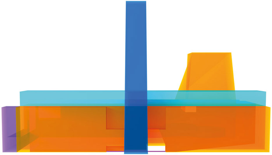
British graphic design legend Peter Saville is behind the Tate Modern art gallery's updated graphic identity, a colourful model of the complex that includes the new Herzog & de Meuron extension.
Saville worked with long-time collaborator Paul Hetherington and animation, graphic and product-design studio Morph to create the animated visual, which depicts the former power plant and its adjacent spaces as translucent volumes.
Each section or department is designated its own hue. The Tate Modern's iconic chimney is displayed in blue, the underground Tanks space is coloured red and the public areas on the top floor are highlighted in turquoise.

An orange-yellow tone is used to depict both the main exhibition space and the new twisting brick extension, which is set to open on 17 June 2016.
The graphic is being used on publicity material ahead of the event, and has also been turned into souvenirs sold in the museum's shop.
Saville and his team decided to animate the visual so it rotates on a white background, allowing the different elements of the complex to be seen more clearly.
Part of the intention is to help visitors understand the gallery's layout, which has grown and changed numerous times since it opened in 2000.
Swiss architecture studio Herzog & de Meuron initially renovated the main building, which was formerly the Bankside Power Station. It was designed by Giles Gilbert Scott in 1952 and is located on the south bank of the River Thames.
The firm's extension, which sits at the southwest corner of the building, was originally granted planning permission in 2007 but revised two years later.
Named the Switch House, it comprises an angular brick tower built around part of a former electrical substation on the site.
Herzog & de Meuron also returned in 2012 to uncover three underground concrete tanks, creating more spaces for art and performance.
Saville's graphic presents all of these spaces and their relationships between one another.
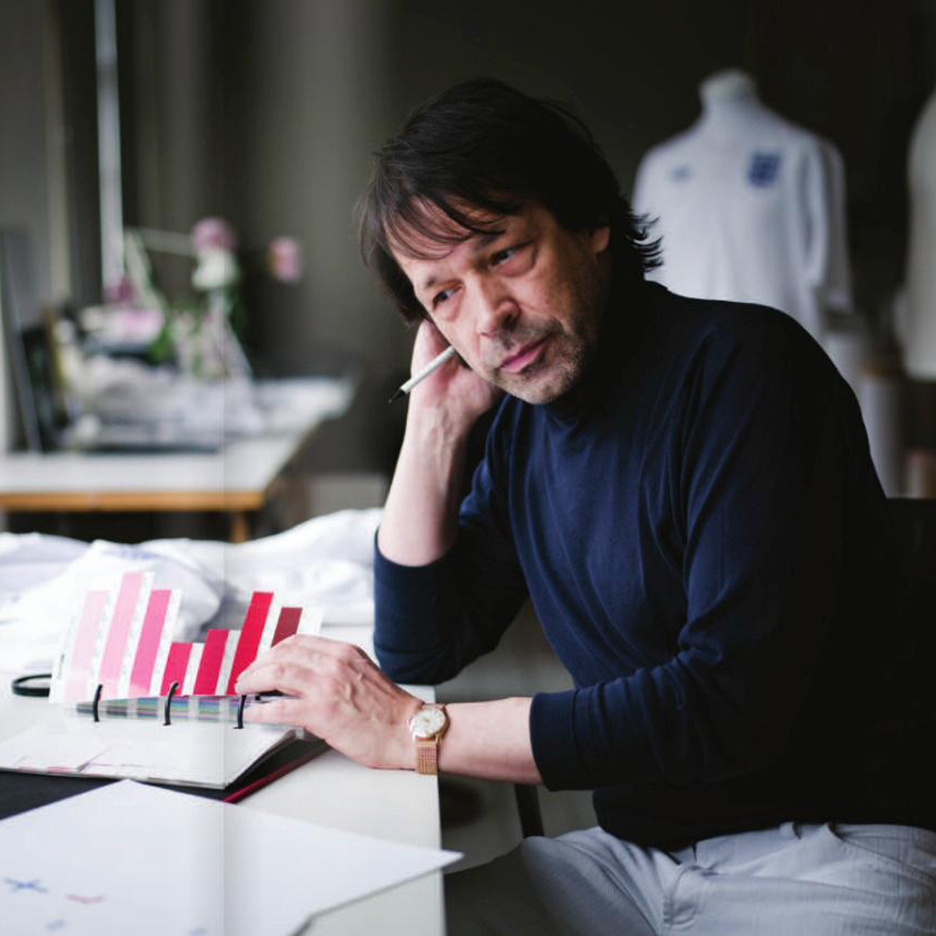
The designer rose to fame while creating artwork for Factory Records in Manchester during the 1970s. After moving to London, his clients included department store Selfridges, record label EMI and fashion houses such as Jil Sander, John Galliano, Christian Dior and Stella McCartney. See our roundup of his key projects.
Saville was awarded the London Design Medal in 2013, and was reported to be working on a logo for Kanye West.
Other recent work includes collaborations with fashion brands Lacoste and Y-3.