Joe Doucet encourages westerners to drink sake with SŌTŌ bottle design
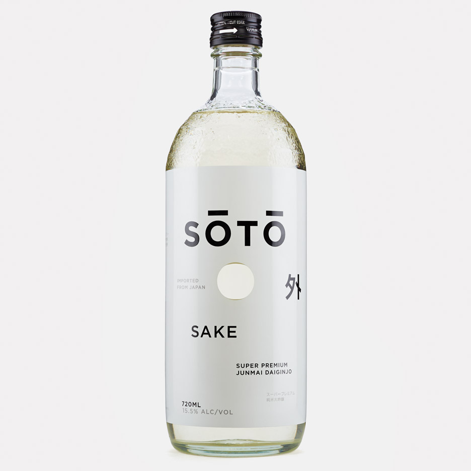
New York designer Joe Doucet created the packaging and branding for a new brand of sake, including a dimpled glass bottle designed to represent the mountains of Japan's Niigata Prefecture.
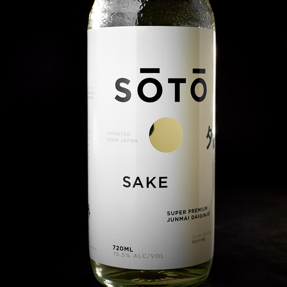
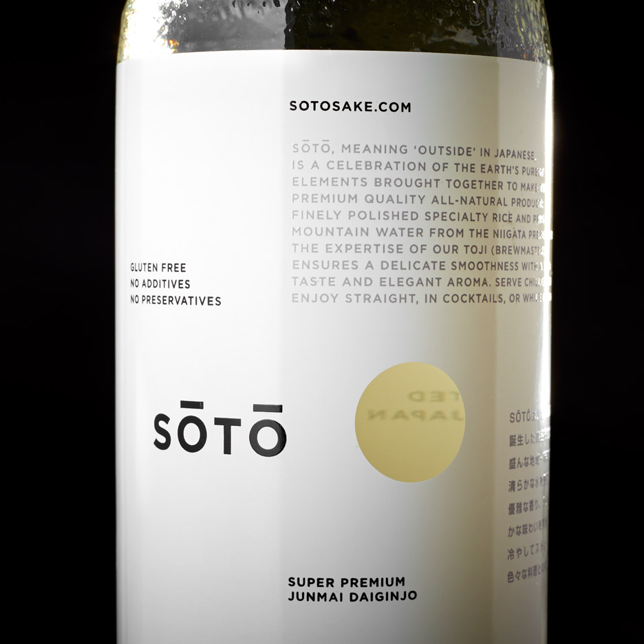
The sake is named SŌTŌ, which means "outside" in Japanese, and is made in Japan using only local materials. The water used to produce the drink is sourced from Niigata, so the region's terrain influenced the bottle's design.
"We wanted the packaging to be 100 per cent produced in Japan and of the quality associated with Japanese craft," Doucet told Dezeen. "We therefore used bottles made in Japan of Japanese glass."
His challenge was to design the bottle and branding for the Japanese alcoholic drink – made using fermented rice and koji mould – for a western audience.
"We saw this as an opportunity to take the fear and dread out of ordering a sake," said Doucet. "To bring this beautifully complex spirit to the rest of the world."
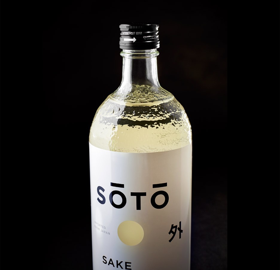
The packaging design is intended to respect and reinterpret the traditional sake bottle, which typically features a paper wrapper around its lid.
"The bottle needed to feel at once traditional but new," Doucet said. "I wanted to be respectful of Japanese culture and aesthetics without mimicking it."
A square of Japanese denim replaces the decorative wrapper that protects the cap of finer sakes. The paper is usually just disposed of, but the denim can be used as a functional element in the drinking experience.
"The denim topper is removed, used to wipe condensation from the chilled bottle and is then used as a coaster to rest the bottle on leaving no ring on fine surfaces," Doucet told Dezeen.
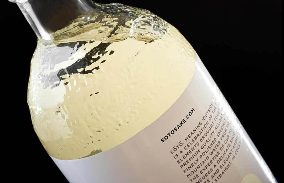
New material choices and technologies were used to ensure that the drink can be served chilled in North America. A water-resistant label replaces the usual paper sticker and a UV coating protects the sake from sunlight.
"Great sake must be served cold," said Doucet. "In North America chilled beverages are served in ice buckets. This meant a paper label was out of the question."
"We chose to do a 360-degree silkscreen, which allowed a full canvas to lay out the copy in a new and interesting way that no spirit has done before," he added.
The opaque label has a hole on either side, allowing the consumer to see straight through the bottle. The text – in English and Japanese – is laid out asymmetrically.
In another renewed take on sake drinking, Kazuya Koike used a fragrant Japanese wood to carve a set of sake cups that fit onto carafes as caps.
Other projects from Doucet include a solid birch chair with a silicone tubular backrest that flexes to the shape of the sitter, a limited-edition collection of "snap fit" marble tables and a mirror that makes the viewer look as if they're immersed in water.
Photography is by Kendall Mills.