Tucker Viemeister proposes Nazi-style logo for Donald Trump
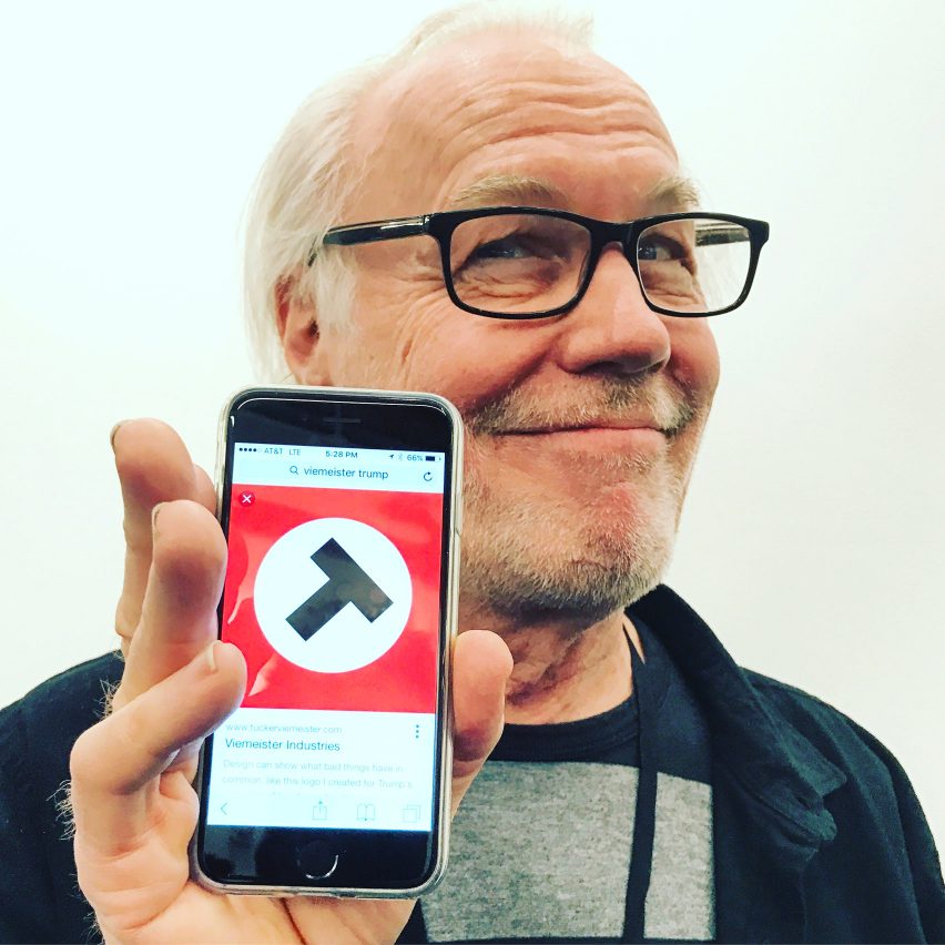
American industrial designer Tucker Viemeister has designed a logo for Donald Trump based on Nazi insignia to reflect the billionaire's "racist hate mongering".
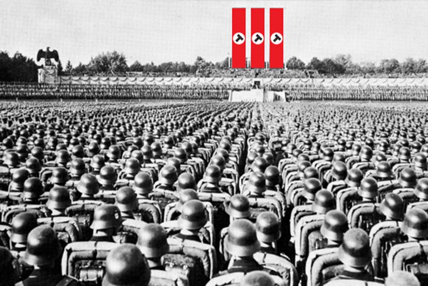
The logo, featuring a tilting letter T inside a white circle on a red background, resembles the swastika symbol used by the Nazis.

Viemeister created the logo in April last year, before Trump became the Republican party's official presidential nominee, posting it on Twitter along with the words "I hope they [Trump's supporters] don't like it!"
He also published the design on his website with a short statement that says: "Design can show what bad things have in common, like this logo I created for Trump's campaign of bigotry and violence."
Following Trump's inauguration as president and his introduction last weekend of the controversial executive order banning people from seven Muslim-majority countries entry to the United States, Viemeister said the logo had new and sinister relevance.

"Obviously the logo is a spin on the Nazi insignia because there is a correlation between Trump's racist hate mongering and the Nazis," he told Dezeen.
"I'm worried that his followers will adapt it for the very opposite reasons I made it," he continued. "They might like that connection with those white power fascists."
"I wish I could make something that would help those followers become more inclusive and tolerant so that we can all work together to solve the issues that we all confront."
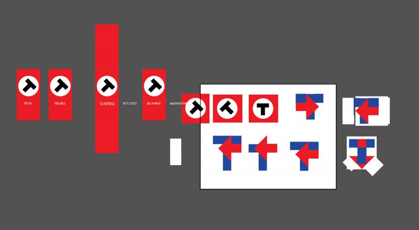
Viemeister shared his preliminary design sketches with Dezeen, showing how the symbol relates to both Nazi imagery and contrasts with the symbol that graphic designer Michael Bierut of Pentagram designed for Trump's rival, Hillary Clinton.

"You can see in one concept I was also trying to do a play on Michael Bierut's [logo]," Viemeister said.
Viemeister, 68, said it was important to understand the ways design can be used for evil ends, as well as good.
"The Nazis are important to study both for their use of a brand system and also from a purely formal point of view: oppressive forms, symmetry, colour choice, order and repetition of elements; how the stuff we design affects behaviour and psychology," he said.
Based in New York, Viemeister is regarded as one of America's leading industrial designers. His best-known project is the OXO Good Grips range of kitchen utensils.