Pentagram draws on Pink Floyd history to create visual identity for new label
Design agency Pentagram has expanded on iconic album artwork by the duo Hipgnosis to create a visual identity for Pink Floyd Records.
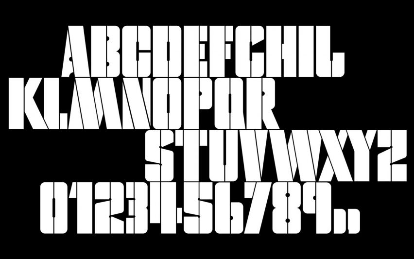
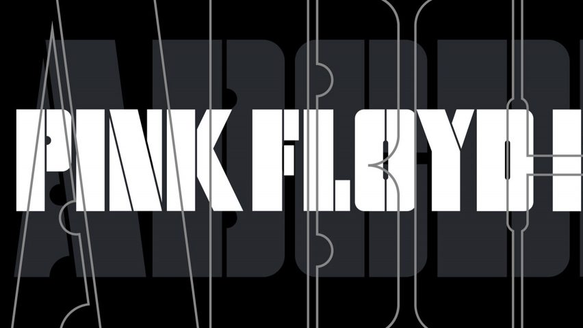
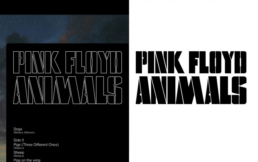
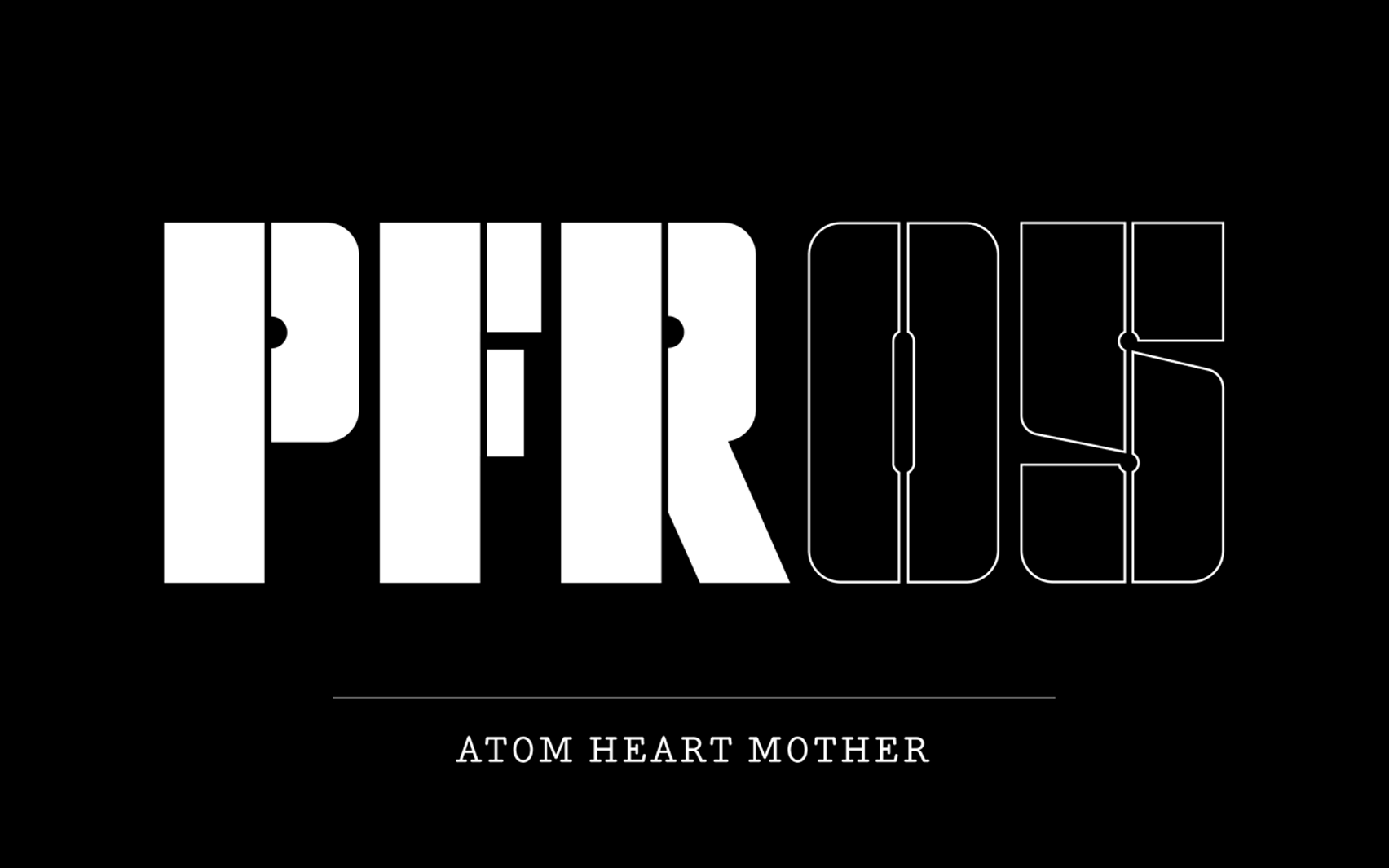
The original stencilled lettering used for the band's 1977 Animals album has been extended into a full alphabet and used in a logotype for the group's record label.
Pentagram's creative team, led by partner Harry Pearce, worked closely with Hipgnosis' Aubrey Powell to create the alphabet, which includes solid and outline versions of letters.
"I loved the idiosyncratic nature of the typography and we immediately saw the potential of expanding the font to a complete alphabet," Pearce told Dezeen.
"Finding a structure and rhythm to the typography beyond a few letterforms was complex, as each original character was full of wonderful inconsistencies," added Pearce, who worked with designer Johannes Grimmond to perfect the finer details of the alphabet.
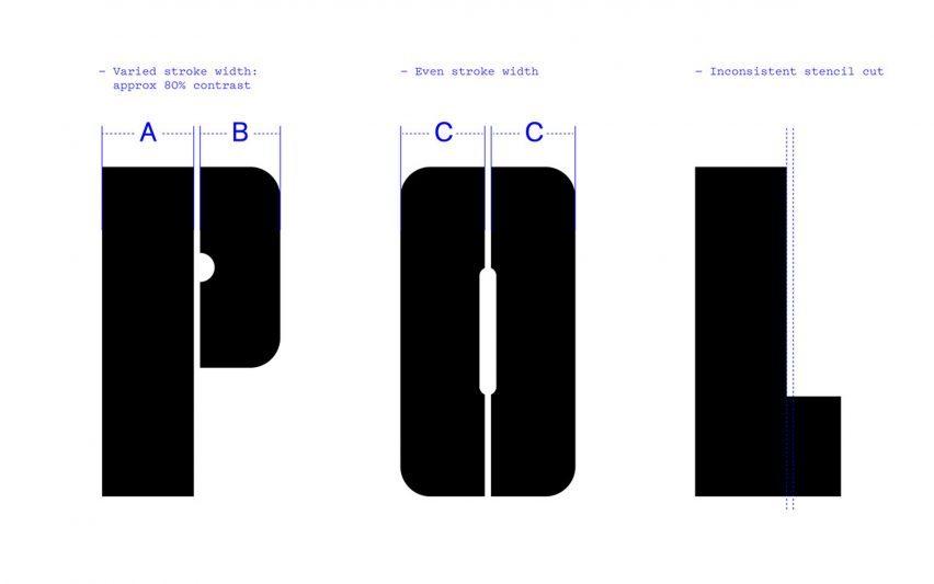
The lettering makes reference to the stencil typography used on the band's tour boxes. It has been used on the label's first release – a 27-disc box set of material from the Pink Floyd archive, which includes unreleased recordings.
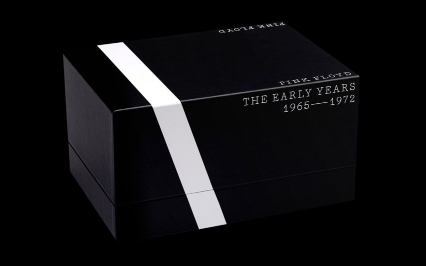
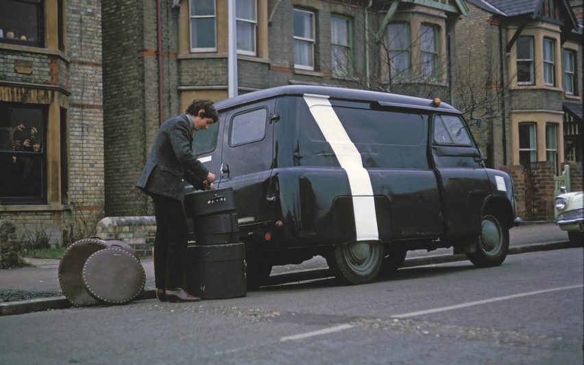
In a further reference to the band's history, the packaging nods to the Bedford van the group used to transport their equipment. The van was painted black with a white vertical stripe down the side – a visual that is now recreated in the packaging.
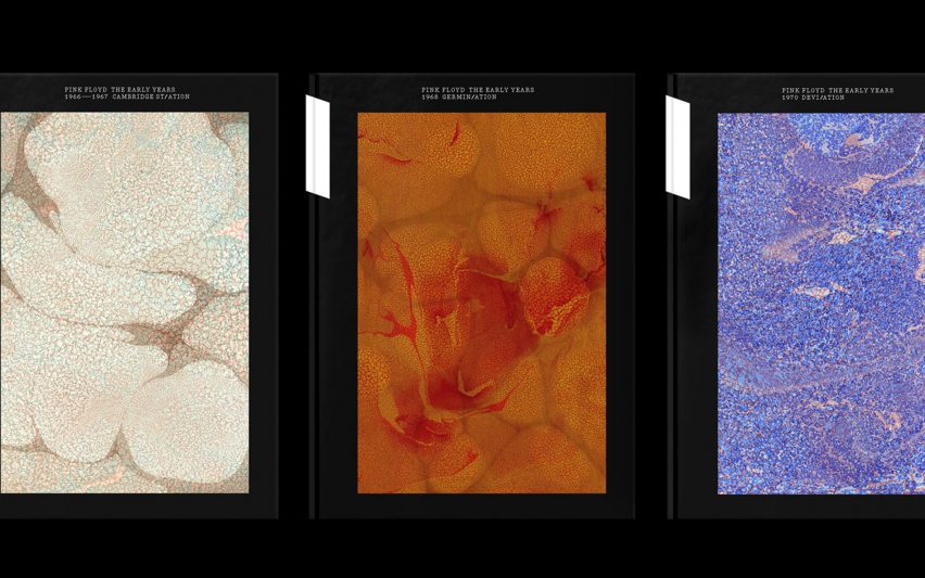
Abstract oil paintings – created by British artist John Whiteley in the band's early days – also feature within the box set.
Pentagram's alphabet has been teamed with a typewriter-style font, to emphasise the "archival aesthetic", and is shown alongside historic photos of Pink Floyd.
Pentagram is unusual in that it is run by 21 equal partners who come from disparate areas of design. The agency was established in 1972 in London's Notting Hill, and now also has offices in New York, San Francisco, Berlin and Austin.
Graphic design and packaging are specialties of the agency, which has worked on several major branding projects including a pared-back redesign of Mastercard's logo and gold embossed packaging for a line of marijuana edibles released by rapper Snoop Dogg.