Pentagram creates new visual identity for The Moholy-Nagy Foundation
Design consultancy Pentagram has created new branding for The Moholy-Nagy Foundation, which aims to embody the style and methods that artist and Bauhaus educator László Moholy-Nagy used in his work.
Established in 2003 by the artist's daughter Hattula Moholy-Nagy, The Moholy-Nagy Foundation aims to preserve László Moholy-Nagy's legacy by creating an online archive of his life and works.
In addition to conducting research on the artist and providing viewers with accurate information regarding his art and photography, the organisation also holds online events and exhibitions.
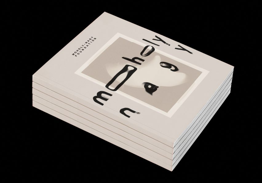
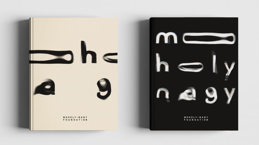
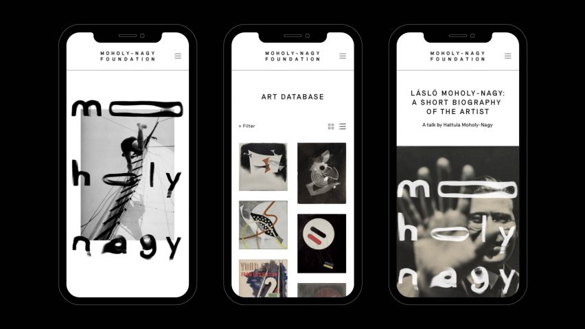
Pentagram partner Marina Willer and her team were tasked with designing an "expressive" visual identity and system for the foundation that mirrored Moholy-Nagy's paintings, films and photography – particularly his photograms, for which he was best known.
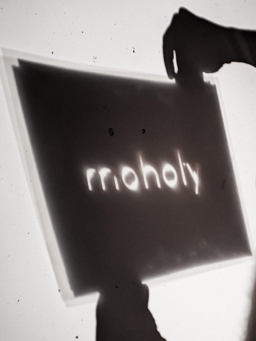
The style of the artist's photograms – photographic prints made by laying objects onto photographic paper and exposing it to light – were used to design a monochrome font.

The Pentagram team created typographic forms by hand in their studio from a series of projections formed using light and water, which resulted in "fluid" letterforms that give a sense of movement.
These letters were used to spell out the artist's name, and form the basis of the branding.
The energetic wordmark features across all of the foundation's printed matter such as letterheads and business cards as well as online on its website, which was also designed by Pentagram.
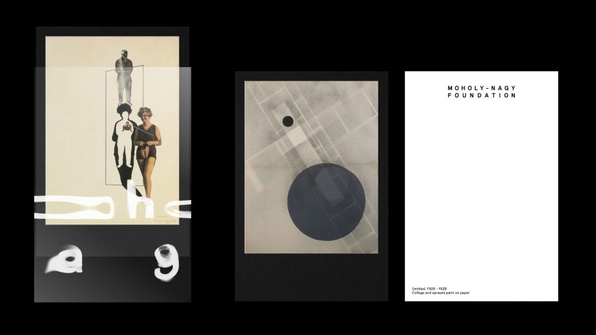
The studio paired this wordmark with a minimal, neo-grotesque font called Riposte by Good Type Foundry, which is used for the rest of the text across the website.
According to the designers, this typeface takes cues from mid-century fonts, but contains contemporary style elements to modernise the brand identity while still maintaining optimum readability.
A pared-back colour palette of black, white and sand was used, informed by Moholy-Nagy's work and mediums. The neutral tones can also be easily paired with any artwork or additional visuals without clashing.
Overall, Pentagram aimed to create a visual identity that doesn't mimic the artist's work, but rather "perfectly honours his amazing legacy".
Hungarian-born Moholy-Nagy was a professor at the Bauhaus School in Weimar, Germany, alongside other artists and designers such as Walter Gropius, Marcel Breuer and Ludwig Mies van der Rohe.
After the war, the artist moved to Chicago to set up the Chicago School of Design, which was known as the New Bauhaus. This journey was documented in a movie released in December 2018, which aimed to draw attention to Moholy-Nagy's legacy.
As part of our Bauhaus 100 series, Dezeen spoke to the film's director Alysa Nahmias about the artist's role in the New Bauhaus, and how he was "not given his due" compared to his fellow Bauhaus counterparts.