Airbnb debuts new scaleable typeface designed by Dalton Maag
Airbnb has launched a new versatile brand typeface in collaboration with international type foundry Dalton Maag, designed to provide good readability across digital and print media.
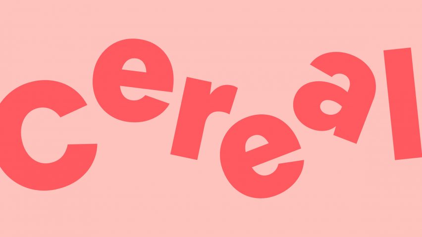
The sans serif font, called Airbnb Cereal, is designed to be characterful, functional and scaleable for use across different mediums.
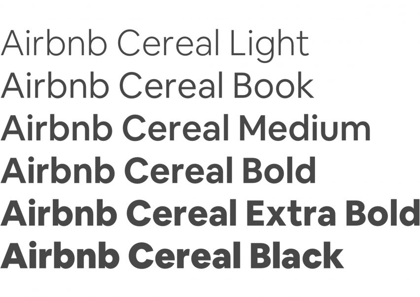
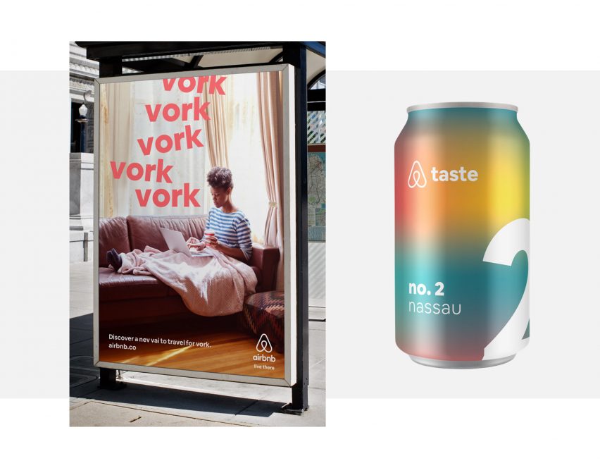
Using the strapline "From button to billboard", the brand launched the typeface yesterday with six weights including Light, Book, Medium, Bold, Extra Bold and Black.
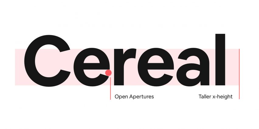
Described as "playful, open, and simple", the typeface's distinguishing features include a taller x-height, which refers to the height of lowercase letters based on height of a lowercase x.
Letters in the fonts also have slightly slanted open apertures, which can be seen in lowercase letters such as e and a.
"Type can get pretty small in UI (user interface) design, and if the weight is too light the type can almost completely disappear," explained Karri Saarinen, Airbnb's design lead of design language systems. "So we paid special attention to the balance of the Book weight as to not be too light or too heavy."
"Lastly we toned down some of the characters so that they wouldn’t distract, but rather would be simple enough to allow people to complete tasks in the UI," he continued.
Following yesterday's launch, Derek Chan, Airbnb's creative lead, marketing, explained in an interview how the typeface will address some of its key business needs.
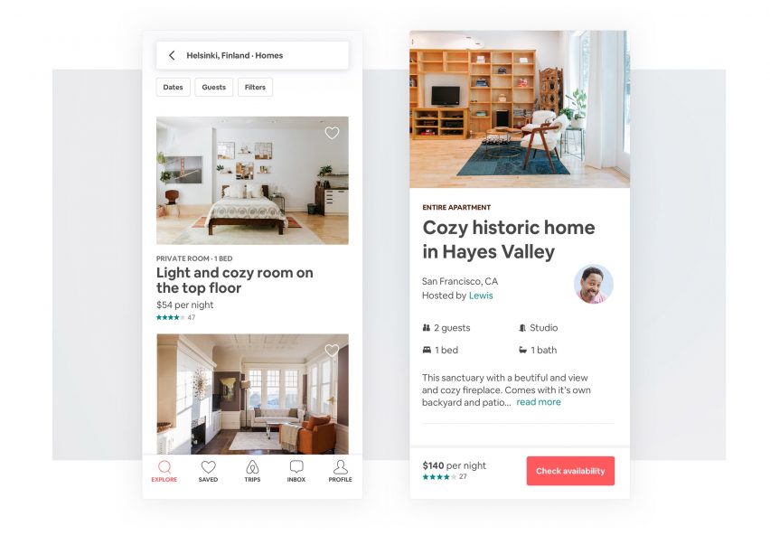
"Our work is extremely typographic, and people experience our brand across various mediums including the platform, Airbnbmag, and metro stop advertisements, " said Chan.
"We have specific business needs around brand distinction, legibility, and scalability, that no available typefaces were addressing," continued Chan.
"We wanted a typeface that would function beautifully online and offline while reflecting our brand personality, so we decided to craft our own."
The brand said that it is currently working across the company to make Airbnb more accessible, and creating a typeface with better readability is part of that effort.
The name for Airbnb Cereal comes from the early days of the company in 2008, when the company's founders launched a line of branded cereal to raise funds for the company.
"On the verge of calling it quits, our co-founders created collectible Obama O's and Cap'n McCain branded cereal, and tapped into the fervor of the 2008 United States Presidential election to raise some cash," explained Airbnb.
"Cereal saved the company and inspired a core value to think about ways of solving problems in unexpected ways. It was a natural choice when naming our own font," it continued.
The new typeface comes almost four years after London branding agency DesignStudio created a new identity for the brand including a logo that "could be drawn by anyone".