DixonBaxi creates branding for Tour de France television coverage
Road markings, race jerseys and crests informed the new visual identity for Eurosport's cycling coverage, designed by creative agency DixonBaxi.
The Home of Cycling branding will be used across Eurosport's digital and television platforms for all cycling events, including the three Grand Tours: Tour de France, Giro d'Italia and Vuelta a España. It covers 2,500 hours of live cycling across 200 days.
DixonBaxi's visual identity includes branding, titles, infographic tools and post-race analysis. The studio's aim was to create a "language that amplifies the sport"
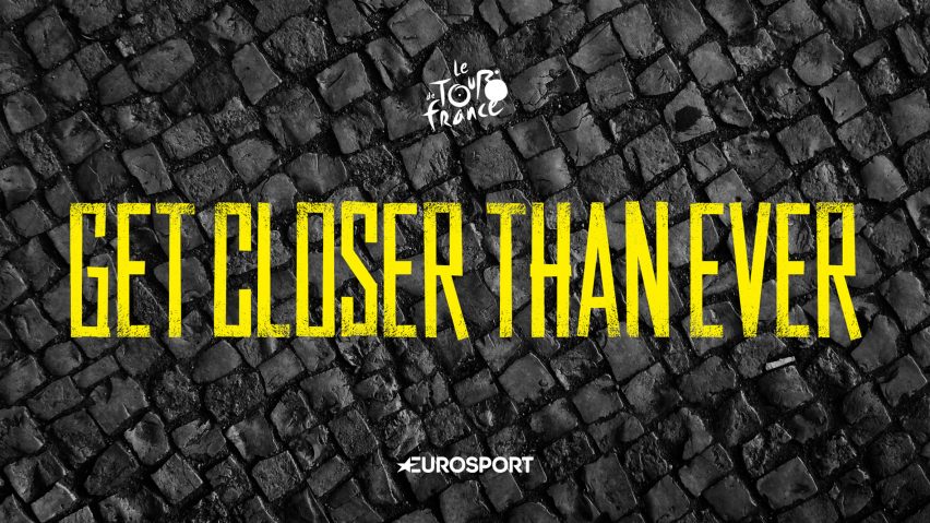
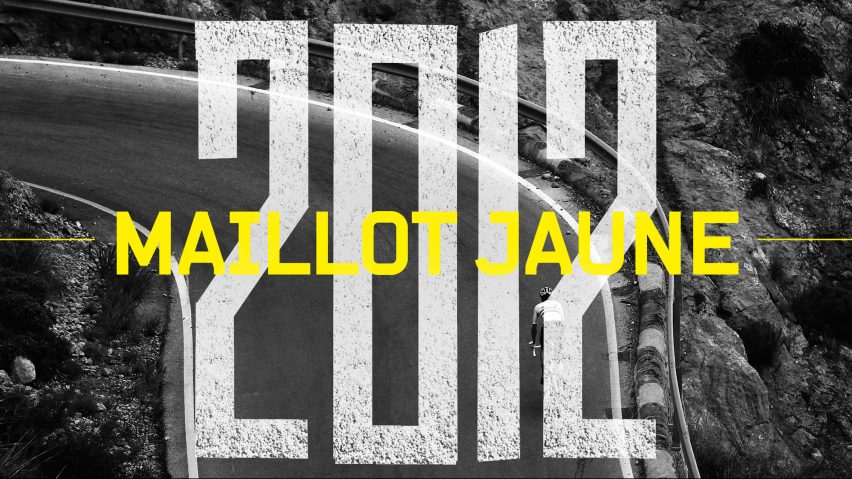
The Home of Cycling titles use a sans-serif typeface with a faded textural effect that recalls road markings. The same typeface and colour palette – bright yellow, black and white – is also used across the network's online and print advertising.
When designing the identity, DixonBaxi was inspired by the often hand-painted signs made by spectators, as well as the bold lines and symbols that are printed onto roads to direct cyclists.
"We drew inspiration from painted messages that are synonymous with the greatest cycle races in the world and made a headline font with a bold, hand wrought feel that looks like it's been rolled right onto the asphalt," said the agency.
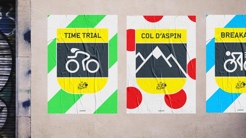
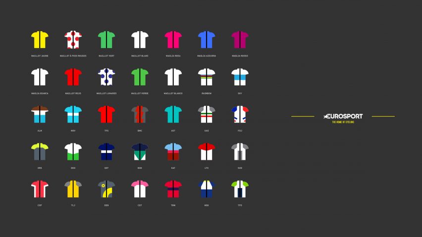
The designers also took influence from the visual motifs of cycling, from the badges and crests found on bike frames to the colours and designs of race jerseys.
"With such a visually stimulating discipline, there was a wealth of imagery, photography, and experience that inspired the Home of Cycling identity: the passion of the fans with their vibrancy, energy and their vivid encouragement on the road and the badges and crests found on bike frames," said the team.
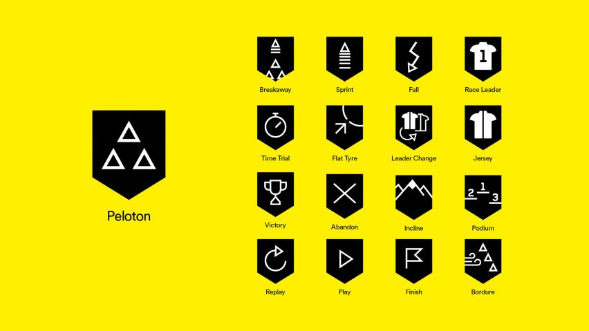
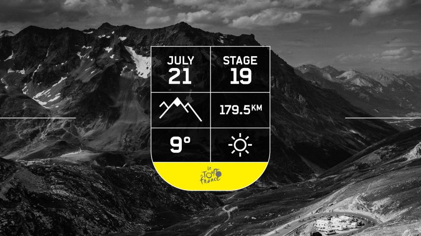
DixonBaxi also created bespoke pictograms to communicate important moments in the races, including victory symbols and images to denote topological and course features such as cobblestones, climbs and sprints.
"These are key to multi-lingual broadcasts and social streams and enable instantaneous communication across all territories," said the studio.
Other major rebranding projects this year have included The Guardian newspaper, which unveiled a new simplified and smaller tabloid format, and the UK Scout Association, which attempted to bring "clarity and focus" to the youth organisation with its minimalist look.