Scouts' new visual identity designed to diversify membership
UK studio NotOnSunday has created a simplified visual identity for the UK Scout Association designed to help the organisation shake off its old fashioned image.
The streamlined visual identity is intended to bring "clarity and focus" to the youth organisation, while helping it to grow a more inclusive and diverse membership.
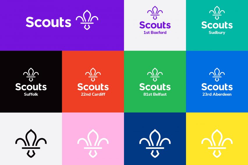
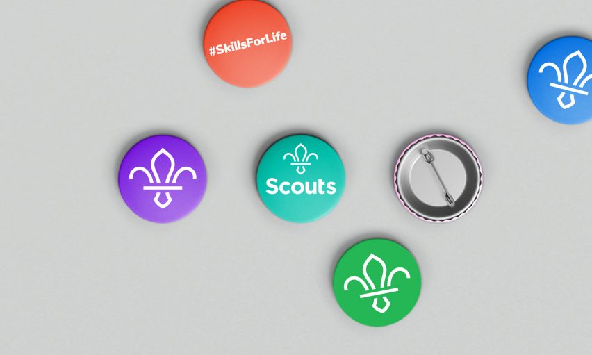
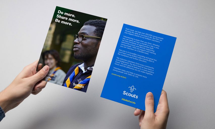
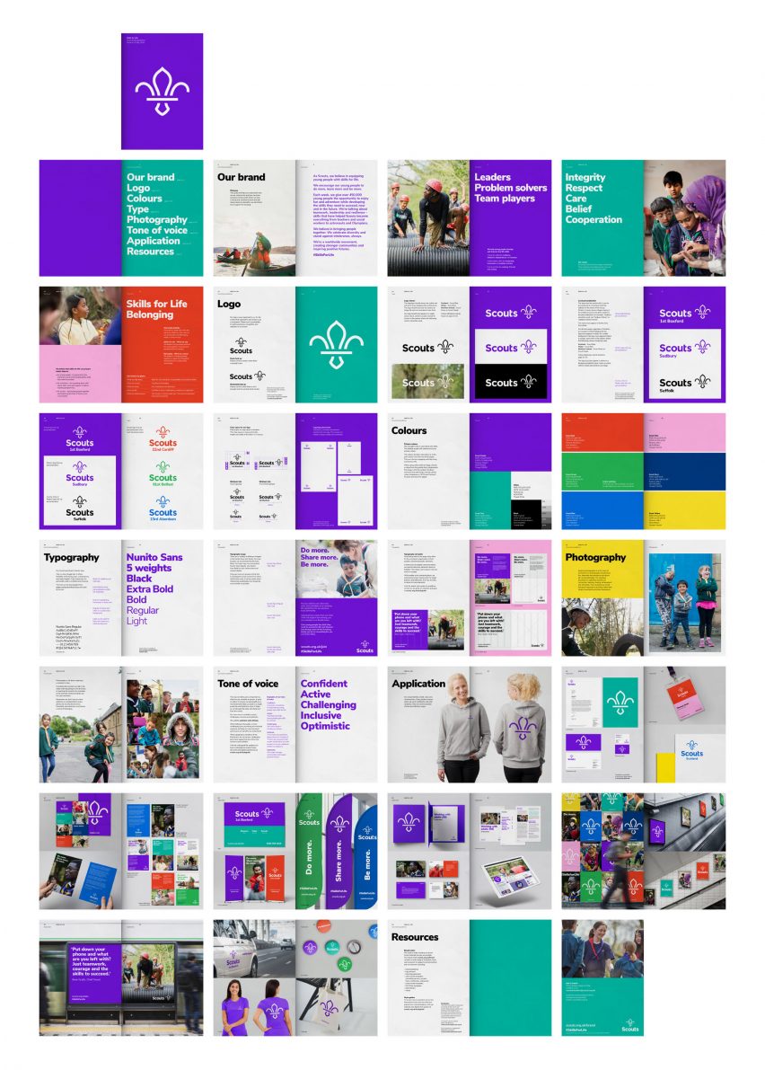
The rebrand includes a revamp of the Scout's distinctive fleur-de-lis logo, the implementation of an open source Google Font typeface and the introduction of a brighter colour palette.
"NotOnSunday jumped at the chance to add to the great story of an established and well-loved charity like Scouts and the vital role it plays in communities," said NotOnSunday founder Trevor Townsend.
"It was important for us that we created a brand that was fun and exciting whilst retaining strong links to its heritage."
The Scouts' fleur-de-lis logo has been in use since the organisation was founded in 1907, and was last redesigned in 2001.
While the previous logo featured some small text that did not work well on digital platforms, NotOnSunday's updated fleur-de-lis is made up of just five lines designed to work more effectively across print, fabric and digital mediums.
"From a visual sense, one of the recognisable elements of Scouts is the fleur-de-lis," Townsend told Dezeen.
"We found that there was so many versions of the fleur-de-lis it was really key that we created something that would be more recognisable to UK Scouting. The different nations had their own version, locally groups had their own, so by creating a new marque that would be used across all groups felt like a greater sense of belonging."
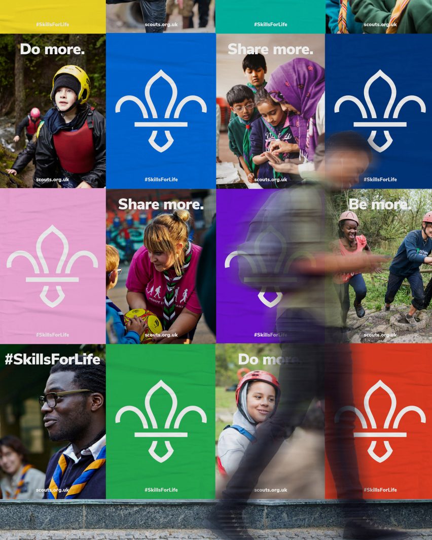
NotOnSunday also updated the Scouts' tone of voice, fonts and colour to reflect a more "contemporary, relevant and digital approach", while also communicating the positive impact Scouting has on both its members and local communities.
"With so many volunteers needing access to the resources and templates the font has to work pretty hard," said Townsend. "We used the really lovely Nunito Sans which feels very friendly and approachable."
"With the font being accessible to all and available for free means it will be so much easier for all the communications to look, feel and sound like Scouts," he added.
The studio also introduced a more vibrant shade of the Scouts' trademark purple, which is used alongside a selection of bright colours.
"Scouts has been purple for as long as I remember and it felt right to retain that link," said Townsend. "We also introduced some new colours that look great stand alone or could be used in pairs. These colour pairings have been made available through the new brand guidelines."
Special colour pairings that represent the nations, such as red and pink for Wales, blue and yellow for Scotland, and navy and green for Northern Ireland have also been implemented.
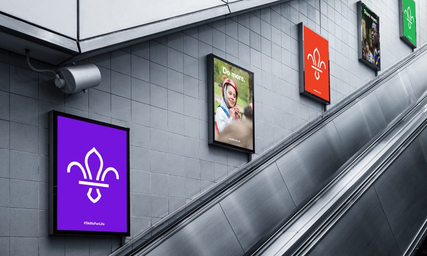
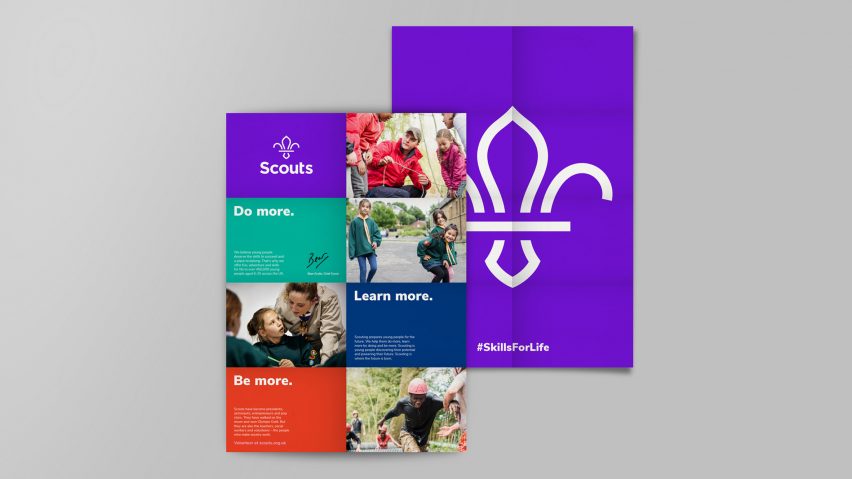
Scout groups across the country will be able to create their own personalised leaflets and flyers by using a series of modular grid templates that are available to download from the Scouts brand centre online, alongside guidelines and other visual assets.
"We had to create something that was accessible in over 7,000 Scout Groups so we created a series of customisable templates," explained Townsend to Dezeen.
"With the Scouts' brand centre everything is made available to use for its members including a local logo generator. Having a system in place that could work up and down the county was really important."
Animated gifs were designed by Mainframe, and a series of 3D versions of the new logo were created by artist, animator and illustrator Moonjam.
The unveiling of the new identity coincides with the launch of an ambitious five-year strategy for the Scouts, which is outlined by a set of goals that focus on growth, inclusivity, and community work.
The organisation hopes that the new visual identity will help it reach its target to increase membership by 50,000 over the next five years while also increasing diversity.
"The new brand was consulted and tested with over 7,000 people across the UK," Townsend explained to Dezeen.
"From this testing it suggests that parents from black and minority ethnic communities not currently involved would be 44 per cent more likely to volunteer, and 69 per cent more likely to send their children to Scouts. Young people aged 14-18 said they were a third more likely to join."
The new visual identity took seven months to design and will be rolled out across all of the organisation's platforms over the next two years.
"The ambition of the Scouts rebrand is summed up in our new brand guidelines – problem solvers and team players," explained Kevin Yeates, head of creative at The Scouts.
"We assembled a unique bunch of creatives, supported by volunteers and staff to reshape our brand to better reflect our values and belief in preparing young people with the skills they need to succeed in life."
Founded in 1907, the Scout Association claims to provide activities to 464,700 young people, aged six–25, in the UK with over 116,400 adult volunteers.
Other high profile rebranding projects this year have included The Guardian newspaper, which unveiled a new simplified and smaller tabloid format, and a new logo and font in January.