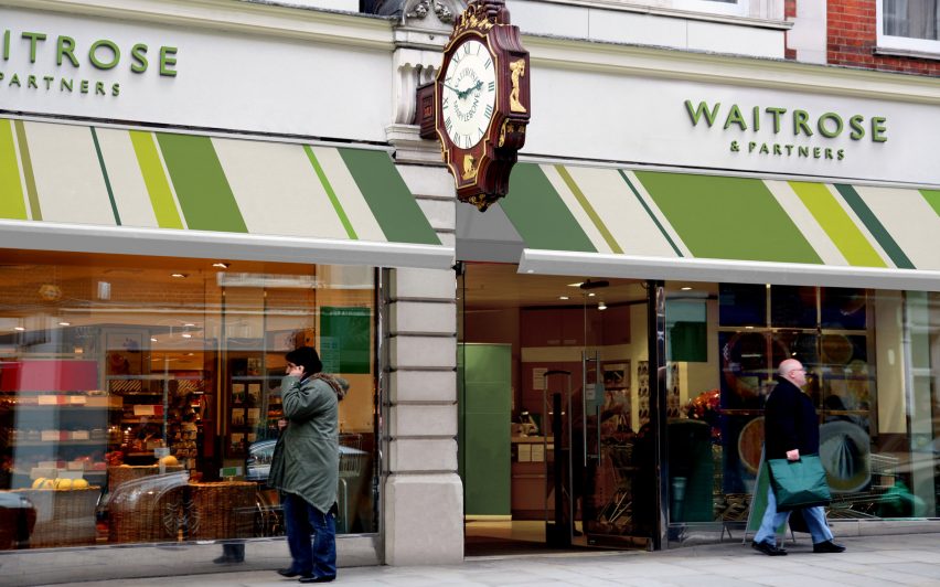
Pentagram rebrands John Lewis and Waitrose to emphasise partnership
Pentagram partner Harry Pearce has created a unified brand identity for John Lewis and Waitrose adding the words "& Partners" to each brand's name to draw attention to the employee-owned business model.
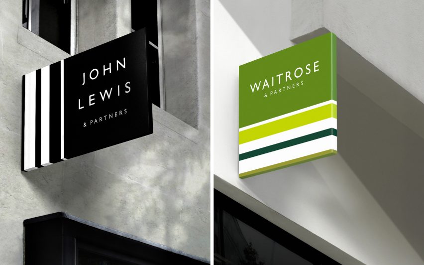
The new visual identity – which spans across all media, products and services – is the department store and supermarket's first rebrand in 18 years. Along with adding the words "& Partners" to both company's logotypes, the branding features line patterns, inspired by the company's 1960s "diamond pattern" motif.
According to Pentagram, the design aims to better reflect the company's democratic ethos. Established in 1929, each of the employees is a partner with partial ownership of the company.

"In an age where consumers increasingly expect brands to be principled and good, the partnership's commitment to John Lewis' original model is an authentic differentiator that it can be proud of," said Pentagram.
"The new identity celebrates this by enshrining the partners into the forefront of the John Lewis and Waitrose brands, with the addition of & Partners to their logotypes," the studio continued.
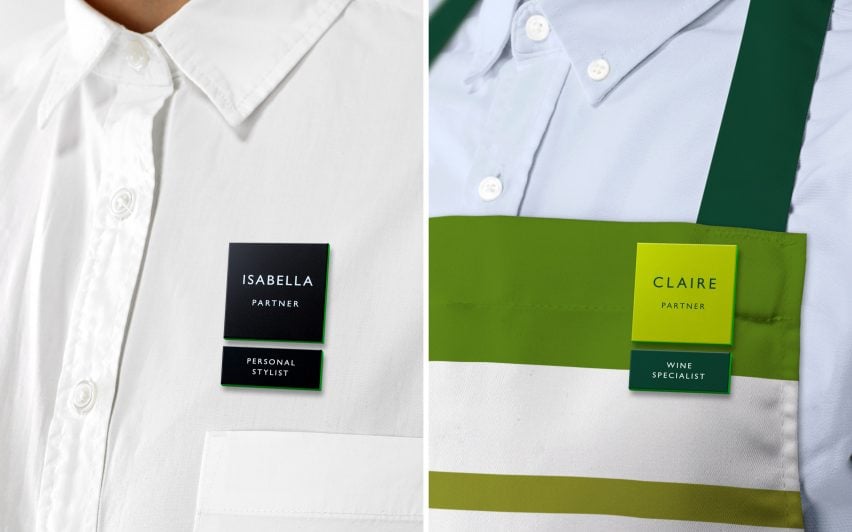
In a reference to the company's heritage, the redesign includes a the line pattern – a nod to founder John Lewis' beginnings as a haberdasher.
This also references the "diamond" branding created by graphic designer Peter Hatch for the business in the 1960s, which Pentagram used as a direct guide when mapping out the proportions for the imagery.
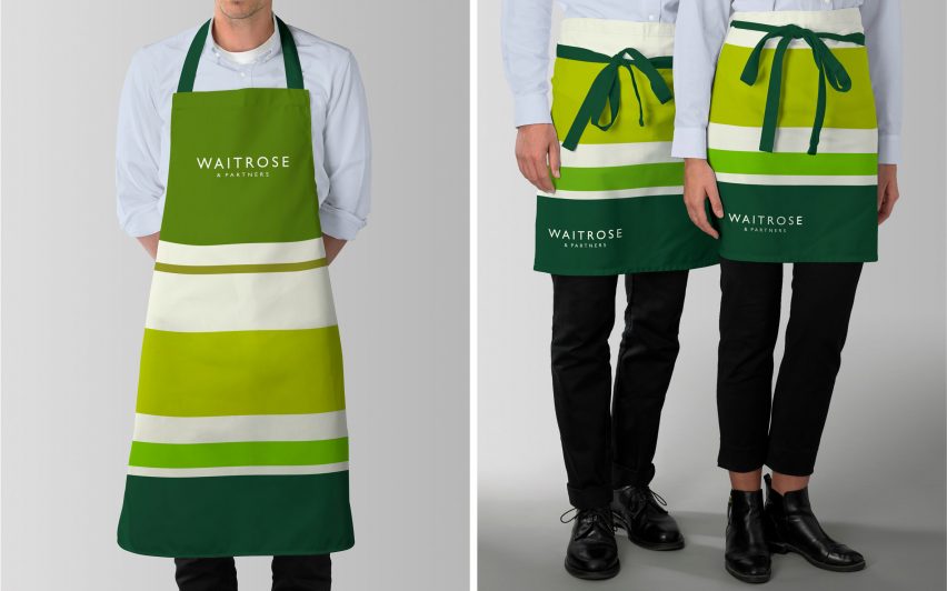
"The pattern can also be softened and integrated with product imagery through blurring, giving an impression of depth and dimensionality in film," said the design studio.
For the colour scheme, Pearce chose a monochrome palette for John Lewis and greens for Waitrose. "The colour scheme is flexible and infinitely adaptable, particularly for Waitrose, which operates in the louder world of supermarket retail," explained Pentagram.
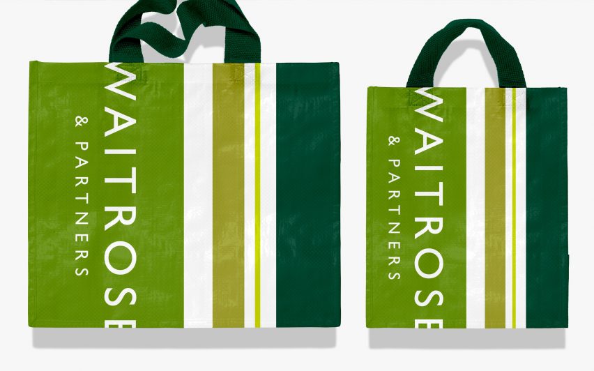
The font Gill Sans was used in the company's wordmarks, from mobile phones to billboards and retail installations.
"The result is a flexible and distinctive visual language that communicates the full spectrum of activity associated with each of the partnership's retail businesses," said the company.

A bespoke hue of green, titled Partner Green, was also created for use exclusively for internal communication between partners and references the shade of green used by founder John Speden Lewis to sign his correspondence. "It is a heartfelt tribute to partnership's most important assets: it's partners," said Pentagram.
In a similar move towards heritage, Riccardo Tisci overhauled the Burberry logo to include Thomas Burberry's initials "TB" in an orange and white monogram, while luxury fashion brand Céline dropped its accent to better resemble its 1960s logo.