Uber "brings back the U" in major rebrand
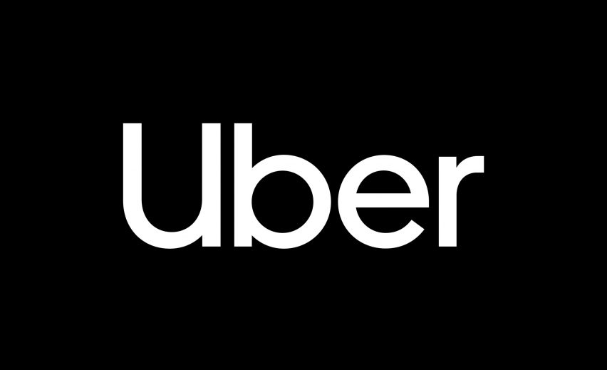
Uber has scrapped its controversial and confusing "asshole" symbol for a simple wordmark, as part of its new visual identity designed with branding firm Wolff Olins.
The collaborative redesign by Uber and Wolff Olins aims to rectify errors made with the ride-sharing service's rebrand in 2016 – heavily criticised for a circular motif logo that was likened to an "asshole". Uber said it also left many "people wondering where the U went" from the old greyscale icon.
To remedy the confusion, the teams gathered research from Uber's audience, coming up with three key findings: let in the light, embrace black; invest in a wordmark, not a symbol; bring back the U.
The new logo therefore comprises the company name, written in white and set against a black background.
The U also forms the framework for the new composition of its marketing material. For example, adverts will feature images wrapped by a white U, or as a backdrop that looks like the letter.
Black and white continues prominently throughout the rebranding, set at a high contrast.
A "safety blue" colour is introduced sparingly during user interactions, like ordering the car, to mark moments of support and assurance.
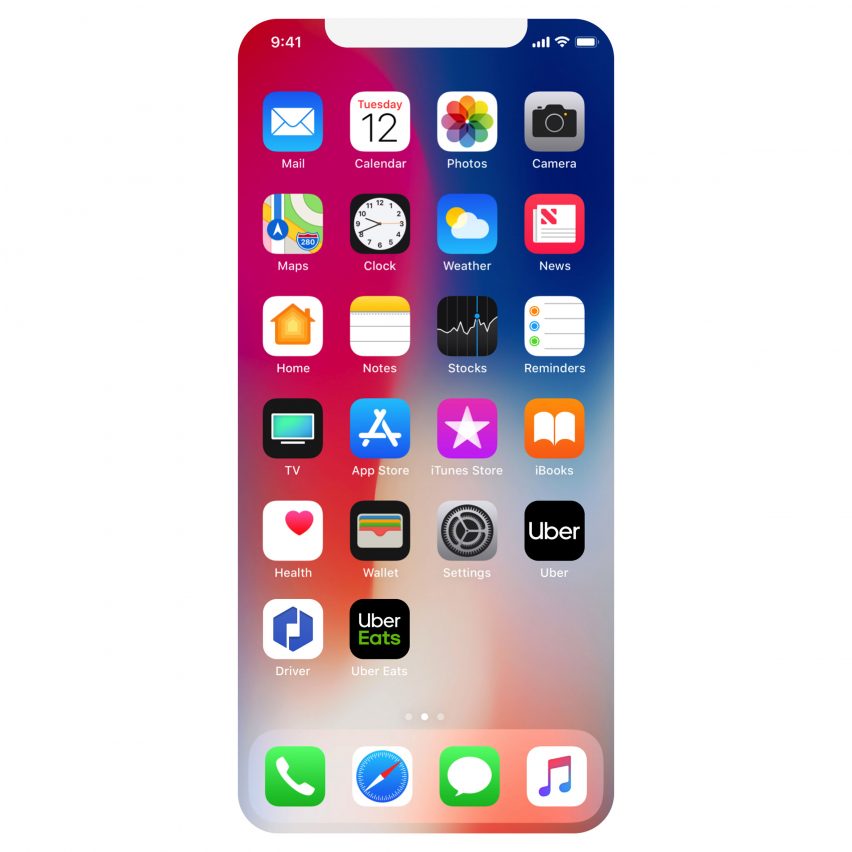
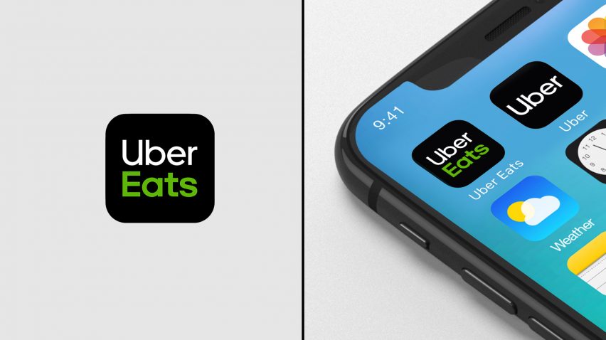
The logo and composition is among a number of new elements that feature in Uber and Wolff Olins's branding project. These include a custom typeface, called Uber Move, designed by Los Angeles type foundry and studio MCKL.
The typography is based on those found in transport hubs, like New York's subway and London's underground, and used throughout the rest of the branding material to provide continuity.
A new set of bold black iconography draws on shapes also found in global transportation, combined with the Uber Move type to create "a seamless system from text to icon".
In illustrations for branding material, images are stripped back to "basic geometric shapes" and filled with block colours to make them easy to understand.
All new features will be rolled out internationally to make the brand recognisable worldwide. Marketing material will be customised through photography specific to different regions.
Uber was founded by Travis Kalanick and Garrett Camp in 2009 as a black car service for 100 friends in San Francisco. Its first logo was a red magnet designed by Camp, which was followed by a greyscale identity featuring a "U" in 2011.
The next rebrand, completed in- house by CEO and co-founder Travis Kalanick and Uber design director Shalin Amin, sparked a major blacklash. The company's head of design Andrew Crow announced he was leaving the company the day after it was revealed.
Crowdsourcing site DesignCrowd also launched a competition for designers to create better alternatives.
Wolff Olins, founded in 1965, has offices in London, New York and San Francisco. Earlier this year, the agency completed a visual identity for OMA-designed art gallery in Paris.
The studio was also responsible for a shape-shifting logo for Brazilian telecoms company Oi, The Metropolitan Museum of Art's new logo unveiled in 2016, and the 2012 London Olympics logo.