Barcelona simplifies crest to promote the team in "the world of digital media"
Brand consultancy Summa has subtly re-designed FC Barcelona's badge, and created a new personalised typeface and visual system for the football club.
The design team has removed the letters FCB from the badge and reduced the number of vertical blue and maroon stripes in the lower half of the crest from seven to five to make the colours stand out.
The football has been made bigger, and centralised to reflect the team's style of ball-centred play, which sees them making many quick, short passes.
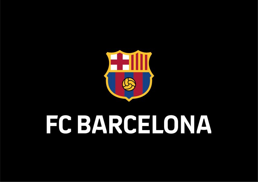
The black outline around the crest remains, however, all internal black lines have been removed to achieve "a more homogeneous, harmonious and brighter crest design", according to a statement on Barcelona football club's website.
The red and white cross of Sant Jordi, or Saint George, the patron saint of the area, and the red and yellow stripes of the Senyera that together make up the flag of Barcelona remain at the top of the crest.

The re-design forms part of the club's strategy to better position the brand internationally while "staying faithful to the historical elements of the crest".
In particular it is hoped that the updated design will ensure that the crest can be accurately reproduced across all media, including digital and social media.
"Since the design was last updated in 2002, the context, society and technology have changed enormously, and the symbols identified with the club need to evolve too," reads the statement.
"The new design now has greater reproduction capacity, especially in the increasingly more important world of digital media," it continued.
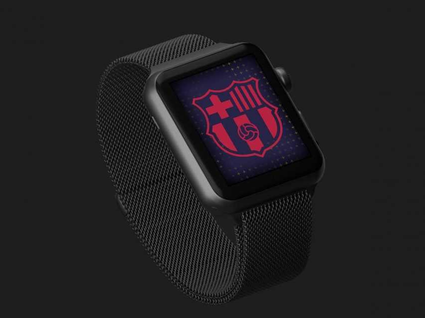
The new typeface is based on elements of the crest, and the visual system that will be applied across the club echoes its colour and patterns.
The branding has been approved by the club's board of directors, but it will need to be submitted for approval by the club's membership at a delegate assembly on 20 October 2018.
Once passed, the new design will be rolled out across shirts, merchandise and in the media for the 2019-20 football season. It will be the 11th time that the crest has been re-designed since the club's inception in 1899.
In recent year's several football clubs have been criticised for controversial rebrands, with Leeds United being forced to scrap its redesigned crest, and Juventus' being mocked for its minimal redesign.