Six of football's most controversial rebrands
With football club Leeds United facing backlash from fans over its redesigned crest, here's a look at some of the sport's most controversial rebrands – from the minimal redesign of Juventus' logo to Red Bull's creation of RB Leipzig.
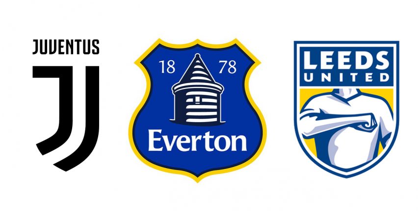
Leeds United Football Club was forced to reconsider its new crest after complaints from fans led to more than 77,000 people signing a petition urging the club not to use it.
The proposed logo featured a torso with a fist placed against the heart, depicting a gesture known as the "Leeds salute" that is widely associated with the club.
With the logo receiving a huge amount of criticism – despite the club claiming it had undergone a rigorous design process that lasted six months – the crest was dropped and a hunt for a new design launched.
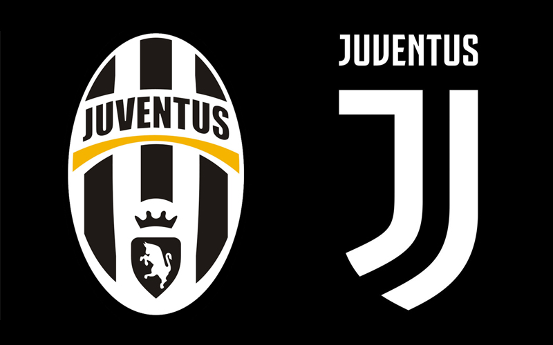
Turin-based football club Juventus swapped its bold logo of a charging bull and a crown to a far more minimal design, featuring two J-shaped stripes that hang beneath the team name.
Fans were quick to mock the crest on social media, with some calling it too corporate and anonymous. Others compared it the JD Sports logo or the shape of former player Alessandro Del Piero's facial hair.
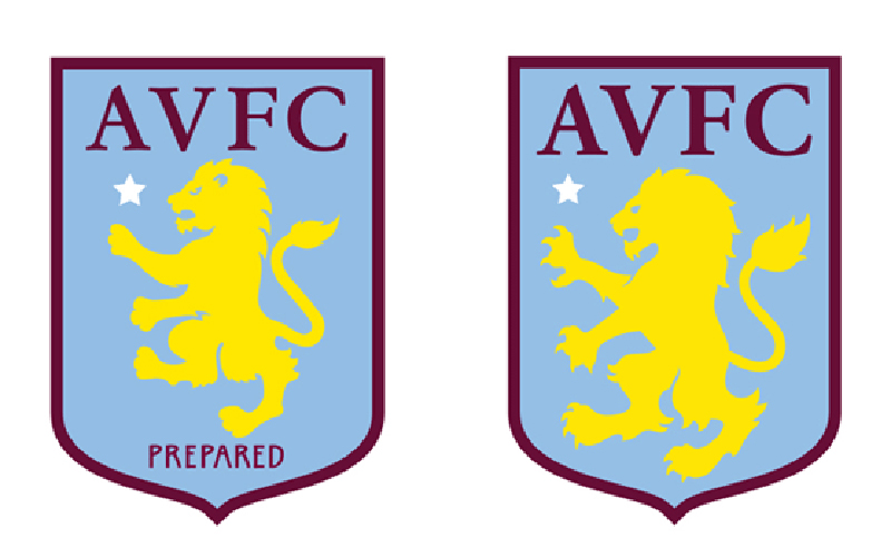
Aston Villa
Birmingham-based football club Aston Villa was initially reportedly to have spent £2 million on its 2016 redesign, which appeared to simply remove the word "prepared" from the previous design.
Although the club later confirmed the project cost less than £80,000, the new logo was met with criticism from fans who believed it was a waste of money, especially as the club was bottom of the UK's Premier League at the time.
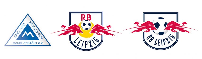
SSV Markranstädt/RB Leipzig
In 2009, SSV Markranstädt's license was purchased by energy drink maker Red Bull, with the team rebranded as RB Leipzig.
The football team became the fourth in the company's sports advertising portfolio with the crest altered to reflect the new name and ownership.
However, all original crests proposed were rejected by the Saxony Football Association (SFV) as they were considered copies of the corporate logo of Red Bull, leading to the team playing without a crest for its first season.
A redesigned crest was used for the next couple of seasons, but this logo was rejected by the German Football League (DFL) during the license procedure for the 2014-15 season, leading to the current crest being introduced.
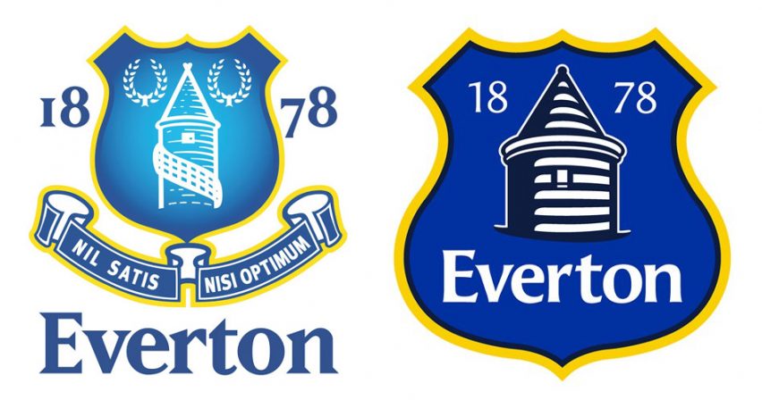
Everton
The English football club's 2013 redesign prompted over 23,000 supporters to sign an online petition calling for the new badge to be scrapped, calling it "amateurish" and "embarrassing".
Designed by the club's in-house graphics team, it depicts local landmark St Rupert's Tower, as well as the club's name and the year of its formation. Responding to fan reactions, the club dropped the crest the following season.
This controversial redesign wasn't just for one team, it was for the entire Premier League.
For the 2016/17 season, the UK league unveiled a new logo and visual identity by creative agency DesignStudio. Featuring a purple lion's head and the league's name spelt in a bespoke typeface, the new design was met with polarising opinions – with some comparing the logo to Disney's The Lion King.
In October 2017, the UK Independence Party replaced its yellow, pound-sign logo with a purple lion's head, drawing similarities between that and the football league.