
Mastercard drops name from logo in subtle brand refresh by Pentagram
Pentagram has removed Mastercard's name from its logo, meaning the credit card company will now use only the red and yellow intersecting circles as its brand mark on cards and at physical and digital retail payment points.
The distinctive overlapping circles logo will remain the same, but the all-lower case FF Mark typeface company name beneath the symbol will no longer be used.
The subtle design tweak by Pentagram, which was announced at the Consumer Electronics Show (CES) in Las Vegas this week, follows Mastercard's full rebrand by the design studio two years ago.
Pentagram's 2016 update to the brand mark was Mastercard's first for twenty years. At the time, the studio swapped the stripes in the overlapping portion of the circles with a solid block of orange, and spelled the company name beneath the logo rather than across its centre.
Announcing the change to a wordless logo on its Facebook page, Mastercard said, "We usually don't like to name drop, but we think we can make an exception…"
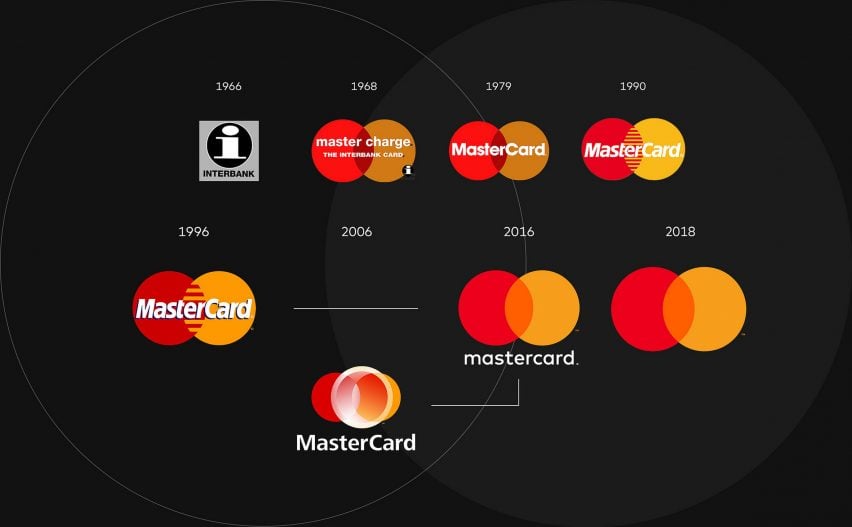
The change follows research by Mastercard that found that more than three quarters of people asked were able to identify the brand from the two interlocking circles alone.
"Reinvention in the digital age calls for modern simplicity," said Mastercard chief marketing and communication officer Raja Rajamannar. "And with more than 80 percent of people spontaneously recognising the Mastercard symbol without the word 'Mastercard' we felt ready to take this next step in our brand evolution."
Talking about the redesign, Pentagram drew positive comparisons with other brands that are instantly recognisable by their logo alone, including Apple, Target and Nike.
"We live in a time where, increasingly, we communicate not through words but through icons and symbols," said Pentagram partner Michael Bierut.
"Mastercard has had the great fortune of being represented by two interlocking circles, one red, one yellow, since its founding in 1966. Now, by allowing this symbol to shine on its own, Mastercard enters an elite cadre of brands that are represented not by name, but by symbol: an apple, a target, a swoosh."
Mastercard hopes that the logo-only redesign will better represent the company globally and will be easy to implement across digital platforms when fewer payments are physically made with a card.
"As the consumer and commerce landscape continues to evolve, the Mastercard symbol represents Mastercard better than one word ever could, and the flexible modern design will allow it to work seamlessly across the digital landscape," added Mastercard in a statement.
Tinder is another corporate brand to have dropped its name from the brand mark. The dating app moved to a slightly rounder version of the flame that previously stood in for the dot over the 'i' in Tinder as its brand mark.