
Tinder replaces wordmark with pink and orange flame logo
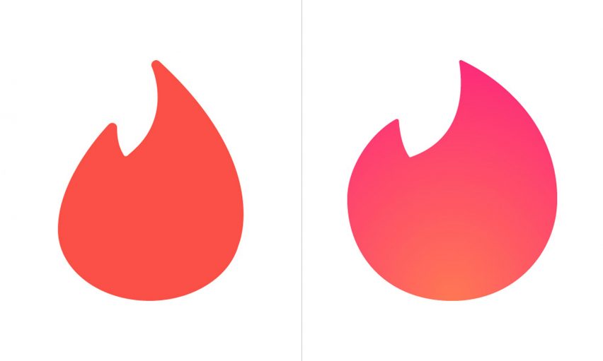
Dating app Tinder has replaced its text logo with a slightly fatter gradient version of its well-recognised flame symbol.
The icon, which had formerly occupied the place of the dot over the letter "i", has been given a gradient makeover and placed centre stage. Previously all-red, the symbol now fades from pink to orange, and has been redesigned with a slightly rounder body and spikier flame tip.
It's somewhat reminiscent of Instagram's 2016 logo redesign, which saw the social network replace its retro camera symbol with a pink, orange and purple gradient icon.
The flame will now replace Tinder's previous logo altogether, serving as a standalone symbol for the company's app, and also its website – which is using a cut-out version placed on a pink and orange gradient background.
"Probably unbeknownst to anyone, the flame became, literally, the hottest app icon on people's phones and, now, reaching Nike Swoosh status, Tinder has decided to forego a wordmark and let the flame do all the brand heavy lifting," said Under Consideration editor and branding specialist Armin Vit of the redesign.
"And it works. I have never used Tinder and even I get the power of the flame and its ability to stand on its own."
The logo update follows an overhaul of the dating network's app, which has seen the company introduce a more "clean aesthetic" and simplified way of displaying images and navigating from profile to profile.
Photos now fill a greater part of the screen, and can be more quickly paged through, while profile details are revealed with a single tap at the bottom of the screen.
The dating app, which has an estimated 50 million active users, is also planning to launch a Tinder Online version that can be accessed through browsers, and which is currently being tested in a handful of countries.
Other popular apps that have recently overhauled their logos include Uber, which offered up a simplified version of its logo in 2016, removing the U in favour of a circular motif on a square background that was said to be inspired by bathroom tiles.
WeTransfer similarly refreshed its logo as part of a stripped-back rebrand that saw the file sharing company ditch the "Transfer" part of its symbol for a simplified "We" logo.
Instagram, Tinder and WeTransfer's updated icons suggests the flat design trend is continuing but with subtle variations, as designers incorporate gradients and drop shadows alongside otherwise minimalist symbols.