Summa designs new visual identity for Spanish postal service Correos
Spanish branding agency Summa has subtly rebranded Correos, the Spanish national postal service, with a simplified logo for the digital age and a new typeface.
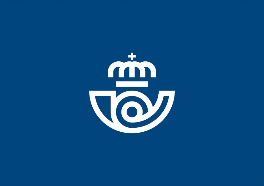
Summa updated the 350 year-old postal service's logo with a "simple" and "purist" design, as well as introducing the new lettering created in collaboration with Monotype.
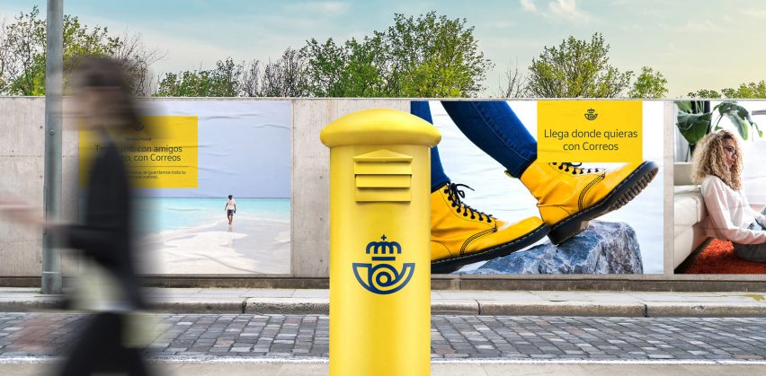
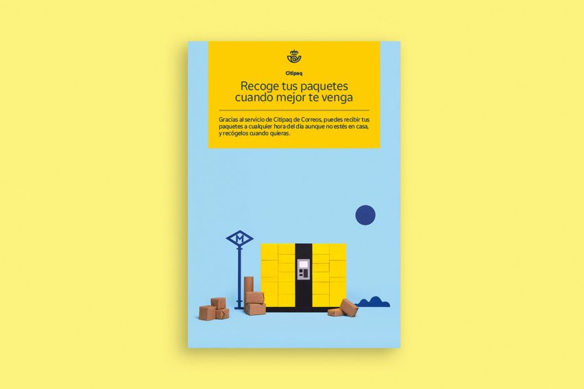
The studio also added a flexible "visual system" based on the packaging label, consisting of a modular yellow box, for use in advertising, communications and online.
The aim was "to embrace its essence and communicate it in a more contemporary and direct way to its audience".
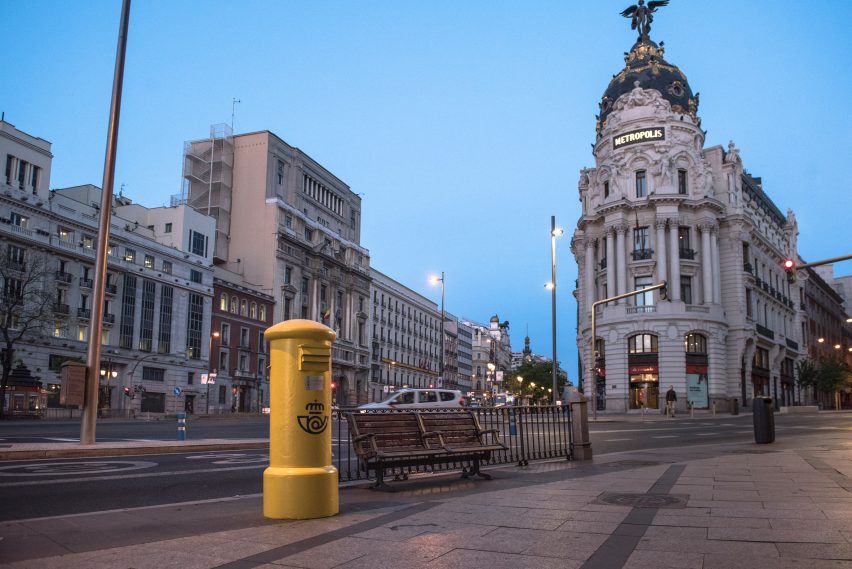
"Our task was to update the brand and position Correos as a player in the industry, leaving behind the time where the brand expressed itself only in its fleet, facades and mailboxes, and covering every outcome across physical and digital media," said Summa.
For the logo, Summa got rid of all superfluous elements, retaining "the two most representative anchors", namely the yellow background colour and the cornamusa – a sort of trumpet with a curled body.
The designers also kept the stylised crown at the top of the logo, simplifying its morphology by removing the dots at its base. The studio also got rid of the dot at the base of the cross.
The fat pen strokes of the logo itself are picked out in royal blue across the visual identity.
Summa found that, while the Spanish public see Correos as a traditional and "endearing" brand, it is not regarded as innovative. By retaining recognisable elements of the branding, the updated logo is clear and easily readable across digital platforms, an evolving area of the business.
"The symbol appears today in many more applications than in previous decades, but could not behave in the desired way in small or digital scenarios," explained Summa.
"Our strategic proposal consisted of applying more oxygen between its lines, redefining some of its elements, and lightening its shapes to turn it into a flexible symbol."
In collaboration with Monotype, Summa designed a typeface called Cartero, the Spanish word for postman.
With light, regular and bold versions, the fonts have softly rounded edges and gently taper where the curves on certain letters meet straight lines.
"Its simplicity ensures the proper functioning of it in all types of messages from corporate to commercial, from digital to traditional environments, and at the same time will make it last over time without losing relevance," said Summa.
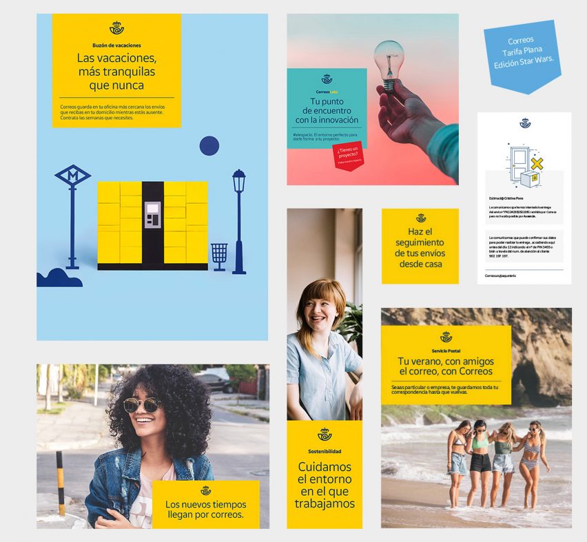
The rectangular yellow "label" provides a further element for use in advertising as well as online.
"Taking into account that Correos communicates through multiple channels, it was essential to ensure consistency between the messages. To do this, we created an additional identification element, the label," said Summa.
It consists of a modular box in the brand's signature bright yellow, featuring the service's logo at the top, with space for text beneath.
"The label adapts to different forms of communication, both the main brand and its sub-brands, and will be one of the elements that will characterise the identity of the Correos," said Summa.
The city of Oslo also recently updated its visual identity, in consultation with its residents. Creative agency Creuna Norway created a flattened, simplified version of the detailed 1928 logo with a single colour background.