OlssønBarbieri makes minimalist chocolate packaging for CF18 Chocolatier
Plastic makes way for moulded paper in this chocolate packaging designed by Norwegian practice OlssønBarbieri to inspire a more mindful approach to materials.
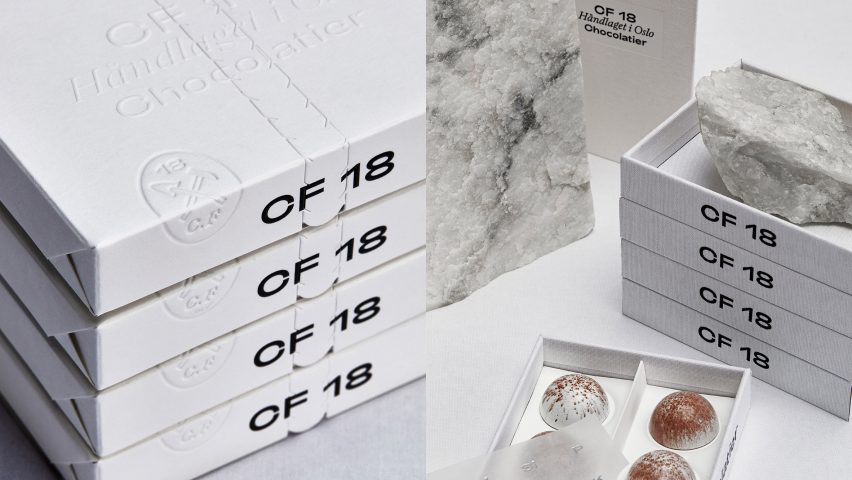
The packaging forms part of a wider visual identity created for local confectionary business CF18 Chocolatier, which has been shortlisted for this year's Dezeen Award in the graphic design category.
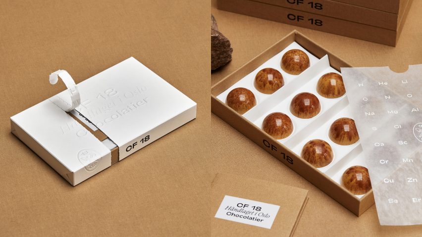
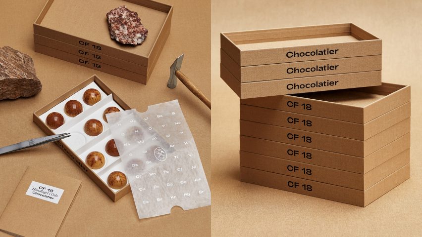
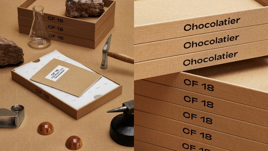
In a bid to cut out the plastic that is normally contained within chocolate packaging, the design makes use of recycled cardboard trays and inlays made from a type of mouldable paper called FibreForm.
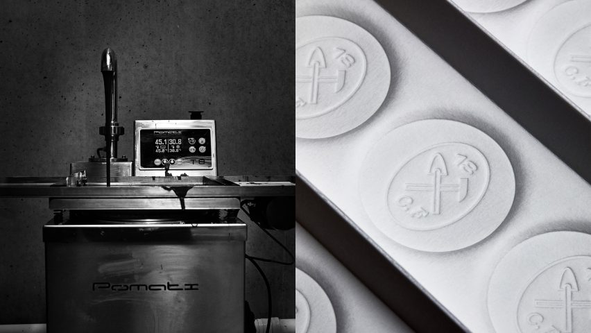
Thanks to its cellulose fibres, which are longer than those of standard paper, the malleable material can be shaped using a special deep debossing machine to create the cavernous, circular indentations, which secure the hemispherical chocolate pieces in place.
According to a life cycle analysis by the Research Institutes of Sweden, the process of creating the material emits up to 71 per cent less carbon than a comparable plastic tray.
"Since plastic is a default solution for many industries, we felt this project was perfect for experimenting with an alternative material due to the artisanal scale and distribution of CF 18 chocolates," OlssønBarbieri's managing director Henrik Olssøn told Dezeen.
"We think this material and its properties could rival plastic also on a larger, more commercial scale, where there is room to invest in a more advanced moulding tool."
In order to keep production costs down, the paper liner is manufactured as a standard module that holds 12 pieces of chocolate.
This can be split in half along a perforated line to fit inside a box of six or doubled up to fit the 24-pack.

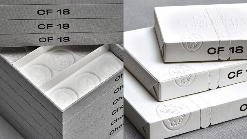
The boxes are housed inside an all-white sleeve also made from FibreForm, which needs to be torn open in order to access the sweets within.
Through this kind of performative ritual, the design hopes to encourage a more conscious, considered relationship with an ephemeral object like packaging.
Inspired by the fact that CF18 Chocolatier's founder used to work in engineering, and the fact that many of his early chocolate designs resembled stones, OlssønBarbieri created a visual identity heavily informed by the sciences.
The company's oval brand mark, which is embossed on the sleeve and into each of the circular indents, features a hammer and a spatula.
"The hammer belongs mostly to geology but is also used to break the chocolate," said Olssøn.
"A spatula is a tool used by chocolatiers for tempering the chocolate but it also resembles a shovel."
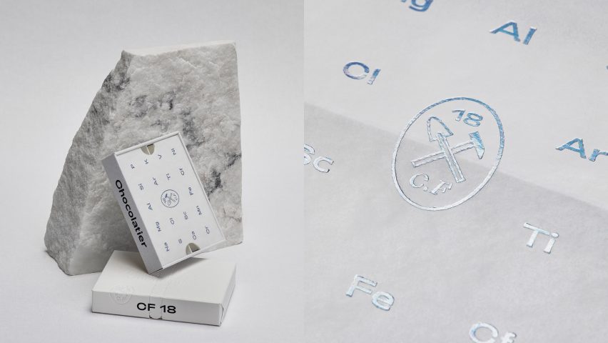
Meanwhile the glassine – the translucent, glossy paper that lies on top of the chocolate – is emblazoned with holographic foil spelling out the periodic table.
OlssønBarbieri was also involved in the design of the actual chocolate, with each flavour featuring distinct patterns and colours that imitate real stones or minerals found in Norway.

The yuzu and orange flavour features an unexpected dark grey colour resembling the speckled finish of larvikite, which is found around the Vestfold and Telemark regions.
The raspberry version, on the other hand, pays homage to a stone called syenite, which is similar to granite and found in the area around Oslo.
Previously, OlssønBarbieri has also designed the visual identity for bottled water brand Snåsa, including a packaging made entirely from materials that are easy to recycle.
Alongside the studio's work for CF18 Chocolatier, other projects that have been nominated in the graphic design category at this year's Dezeen Awards include stamps that reveal the impact of climate change and postcards that explore the UN line between the Greek and Turkish sides of Cyprus.