CIA rebrands to encourage diversity but identity of logo designer remains top secret
America's Central Intelligence Agency has unveiled a new identity aimed at attracting more diverse employees but has refused to disclose the designer behind its new look.
The redesign attracted speculation and ridicule on social media, with artist Ryder Ripps, who has previously designed for Marc Jacobs, Kanye West and Grimes among others, appearing to take credit for the redesign in an Instagram post.
However, the CIA has denied his involvement, telling GQ magazine: "As CIA’s new website states, we're looking for people from all backgrounds and walks of life to work at CIA, but this individual had absolutely nothing to do with our website redesign."
In a scheduled call with a spokesperson at the CIA's headquarters in Langley, Virginia, Dezeen failed to establish the identity of the mystery designer, with the agency refusing to give on-the-record information.
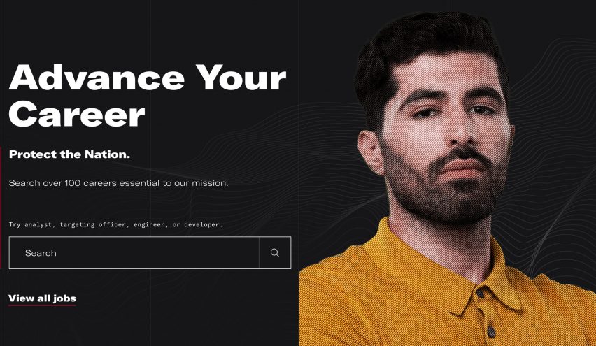
The lack of reliable intelligence on the redesign led to speculation on social media after the CIA announced its rebranding on 1 January with a Twitter post stating: "New Year. New Look".
The CIA website now has a clean, sans-serif typeface, identified by Twitter user Alex as GT America Expanded, as well as a new abstract logo with a background of fractal lines and a border formed of the words Central Intelligence Agency.
It includes an updated careers section featuring images of CIA employees from different backgrounds and was designed to encourage a diverse range of applicants to join the agency.
First design update since 2013
The CIA describes itself as "the first line of defense for the United States" and says its mission is "collect and analyze intelligence to further national security and preempt threats".
Intelligence agencies lag behind other federal bodies when it comes to minority representation, according the Associated Press, with people of colour making up just 10.8 per cent of CIA leaders in 2015.
"We've come a long way since I applied by simply mailing a letter marked 'CIA, Washington, DC,'" said CIA director Gina Haspel.
"I'm proud to share our new website and hope it piques the interest of talented Americans, giving them a sense of the dynamic environment that awaits them here."
The redesigned website, which was last updated in 2013, forms part of a drive by the intelligence agency to modernise its communication with the aim of reaching a diverse range of people. As part of this strategy the agency joined Instagram in 2019 and launched a streaming ad last year.
"We're meeting Americans right where they are – on streaming platforms – to share a glimpse of an exciting CIA career and what it could mean for their futures," said head of CIA talent acquisition Sheronda Dorsey.
Logo criticised on Twitter
It is unclear if the CIA's new abstract logo will be used as the main branding for the agency as a monochrome version of the current "seal" logo featuring a shield and an eagle still remains on the site.
Twitter users were quick to criticise the logo with many likening it to a cover for a music album.
The new CIA logo is literally a Mutek poster pic.twitter.com/3RsPzWzDFt
— snacks pearl (@maxpearl) January 4, 2021
Reporter Max Pearl compared the design to that of electronic music festival Mutek's posters, while many Twitter users, including Washington Post reporter Dave Weigel, pointed out its resemblance to the cover of British band Joy Division's seminal album Unknown Pleasures.
"Tired: Unknown Pleasures. Wired: [Redacted] Pleasures", Weigel wrote, referencing how the CIA redacts documents to protect information.
Graphic designer and Pentagram partner Michael Bierut indirectly commented on the redesign with a tweet that read: "CIA used to have fantastic graphic design."
He accompanied it with Ty Mattson's reimagining of the TV series Homeland, which follows a CIA agent, as vintage jazz record covers.
The CIA used to have fantastic graphic design pic.twitter.com/OjahZQwQHq
— Michael Bierut (@michaelbierut) January 5, 2021
Twitter users suggest alternative designs
Users also made fun of the fact that the CIA is rebranding, ostensively to attract a new kind of employee, by creating their own updated CIA logo designs in the styles of contemporary graphic design cliches.
Graphic designer Ryan Hobbs created a "rejected redesign for the CIA" in the muted colours, combined with a friendly-looking typeface, that have come to represent "millennial" design.
Rejected redesign for the CIA pic.twitter.com/PGULcfzb9B
— ᖇYᗩᑎ (@bjorlax_) January 4, 2021
Redesigning logos and turning them into memes has become a popular Twitter concept. When the Expo 2025 Osaka logo was unveiled, Twitter users quickly turned it into everything from food to a video game opponent.
An official version of the Space Force logo unveiled by Donald Trump in January 2020 was derided as a Star Trek knock-off, and later replaced with a more minimalist version.
Photography courtesy of the CIA.