"Data replicates the existing systems of power" says Pulitzer Prize-winner Mona Chalabi
On the heels of taking home this year's Pulitzer Prize for illustrated reporting, journalist Mona Chalabi discusses the pitfalls of visualising skewed data and the Israel-Hamas conflict in this exclusive interview.
In the technical, male-dominated world of data journalism, Chalabi is known for "rehumanising" statistics through her hand-drawn illustrations, making abstract numbers tangible and digestible for the general public.
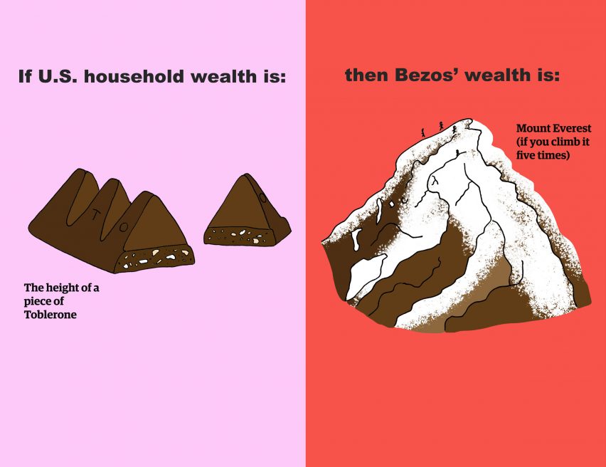
Often, her infographics paint a picture of hidden social injustices, tackling everything from housing inequality and its effects on mental health to the unfathomable wealth gap between Jeff Bezos and the average person, which she visualised for the New York Times.
Earlier this year, this very illustration earned Chalabi the world's most prestigious journalism award, a Pulitzer Prize, in what she describes as a "very, very weird but mostly joyous" experience.
"Fundamental asymmetry" in Israel-Palestine coverage
The Pulitzer Prize was announced in May, but the ceremony itself didn't take place until five months later on 19 October, when the world's headlines were dominated by the ongoing Israel-Hamas conflict.
"The world has changed since May," Chalabi told Dezeen. "But I was surprised that, for something that felt so joyous, actually the ceremony itself felt quite sad. It didn't feel good."
"I just kept on thinking about Palestinian journalists right now," she added. "It was so incongruous knowing that I was dressed up and I have colleagues in Palestine who are literally getting bombed."
Israel declared war on Hamas on 7 October after militants carried out an attack in Israel that killed at least 1,200 people, mostly civilians, and took over 200 hostages. Since then, Israel has responded with thousands of airstrikes against Hamas in Gaza.
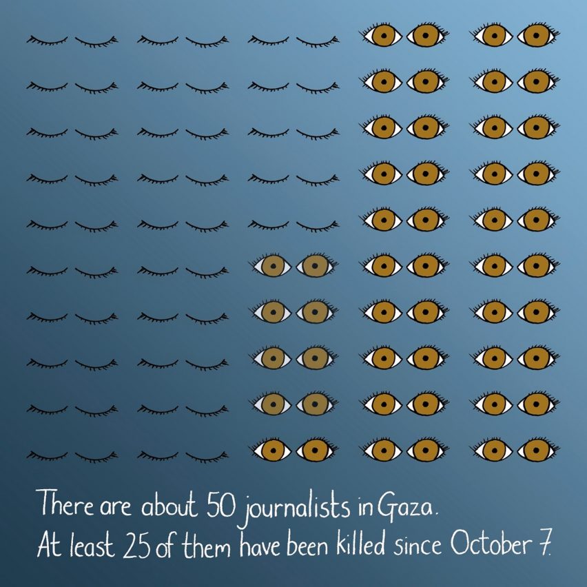
According to the health ministry in Gaza, more than 11,000 people have been killed in the strikes so far. Most of those killed are women and children, as well as at least 42 journalists.
Many of Chalabi's latest illustrations address the conflict, including a series based on data collected by UC Berkeley researcher Holly Jackson, which suggests there is disproportionate coverage of Israeli deaths compared to Palestinian ones in major US publications and a marked difference in the language used to describe those deaths.
"There is just a fundamental asymmetry there," Chalabi said. "It's causing me to have this big meta-crisis about journalism, about the ways that actually very often we are reporting using the voices that are able to speak the loudest and I don't know how we fundamentally address that."
Illustrations can be "as accurate as any computer graph"
Chalabi is only the second person ever to win a Pulitzer for illustrated reporting and commentary, which last year replaced the long-standing category of editorial cartooning.
This pivot, she believes, is a reflection of how news outlets are increasingly using graphics and illustrations as part of their regular reporting.
"I really welcome the fact that the Pulitzer board has adjusted those categories to keep up with the way that journalism is shifting," said Chalabi, who has been the Guardian's data editor since 2015.
"When I first started doing this, everyone was just like: what a load of bullshit," she continued. "Everyone else was building these really complicated data interactives and that was seen as the cutting edge and the fact that I was drawing it was seen as feminine. It was seen as innocuous."
In fact, Chalabi says all of her graphs and charts are millimetre-accurate – even if they are shaped like penises to illustrate the overwhelming percentage of men working in different tech companies.
"The thing that a lot of people don't realise is I'm creating these charts in Excel, in Google Sheets, rarely but sometimes in R," she explained.
"And then I load the charts into Photoshop and digitally alter all of my hands-on illustrations to line up pixel-for-pixel with the computer-generated graphics, so they're as accurate as any computer graph that you're going to see anywhere else."
Data won't save the world
By combining digital accuracy with graphics that are hand-drawn using pencils, felt tips and ink, Chalabi hopes to remind viewers that data is collected by humans and is therefore fallible.
"I don't have this data-is-going-to-solve-the-world mentality," she said. "Very often, data replicates the existing systems of power."
"The existing systems of power say there are two sexes, female and male, so for the vast majority of datasets that I'm looking at, that's all I can break the data down by."
"Until the systems of power recognise different categories, the data I'm reporting on is also flawed," she added.
In a bid to account for these biases, and any biases of her own, Chalabi is transparent about her sources and often includes disclaimers about her own decision-making process and about any gaps or uncertainties in the data.
"I try to produce journalism where I'm explaining my methods to you," she said. "If I can do this, you can do this, too. And it's a very democratising experience, it's very egalitarian."
Nuance and transparency can hinder instant comprehension
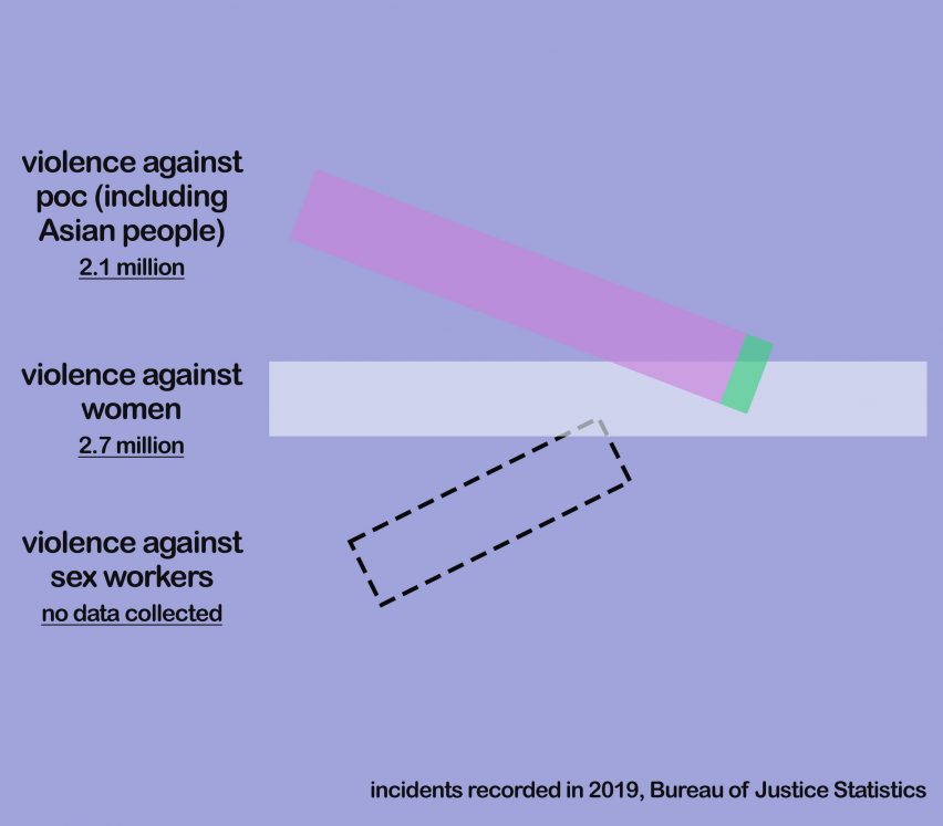
In an ideal scenario, she is able to integrate this background information into the illustrations themselves, as evidenced by her graphics on anti-Asian hate crimes and the ethnic cleansing of Uygurs in China.
But at other times, context is relegated to the caption to ensure the graphic is as grabby as possible.
"What I have found is literally every single word that you add to an image reduces engagement, reduces people's willingness or ability to absorb the information," Chalabi said.
"So there is a tension there. How can you be accurate and get it right without alienating people by putting up too much information? That's a really, really hard balance."
Often, this need to ensure quick and easy comprehension is also at war with the illustrator's desire to avoid stereotypical depictions that could reinforce existing biases.
"When you're looking for fast comprehension, very often you're relying on people's existing visual semantic connections," she explained. "Let me take the example of men and women."
"We are so used to seeing a silhouette of somebody in a dress and somebody in trousers and we're like: man, woman," she added. "It's fast comprehension, even if it's utter bullshit."
"So how do you come up with a more nuanced, smarter way of saying man and woman that isn't bewildering?"
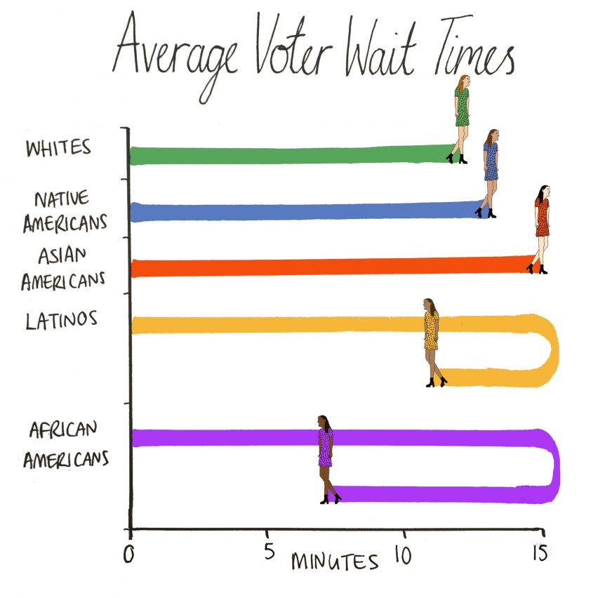
Chalabi has previously created illustrations to take people's minds off the coronavirus pandemic and was among a number of graphic designers and creatives who shared illustrations supporting the Black Lives Matter movement after the killing of George Floyd.
The top image is by Mary Kang.
Comments have been turned off on this story due to the sensitive nature of some of the subject matter.