Wedge reimagines boxed wine to be "worthy of the MoMA store"
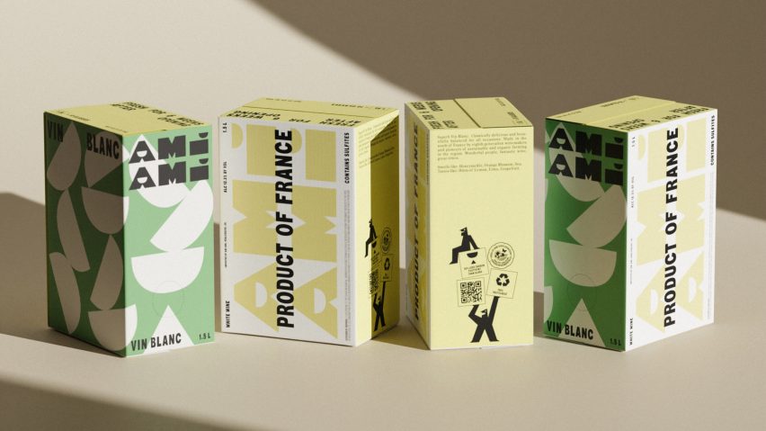
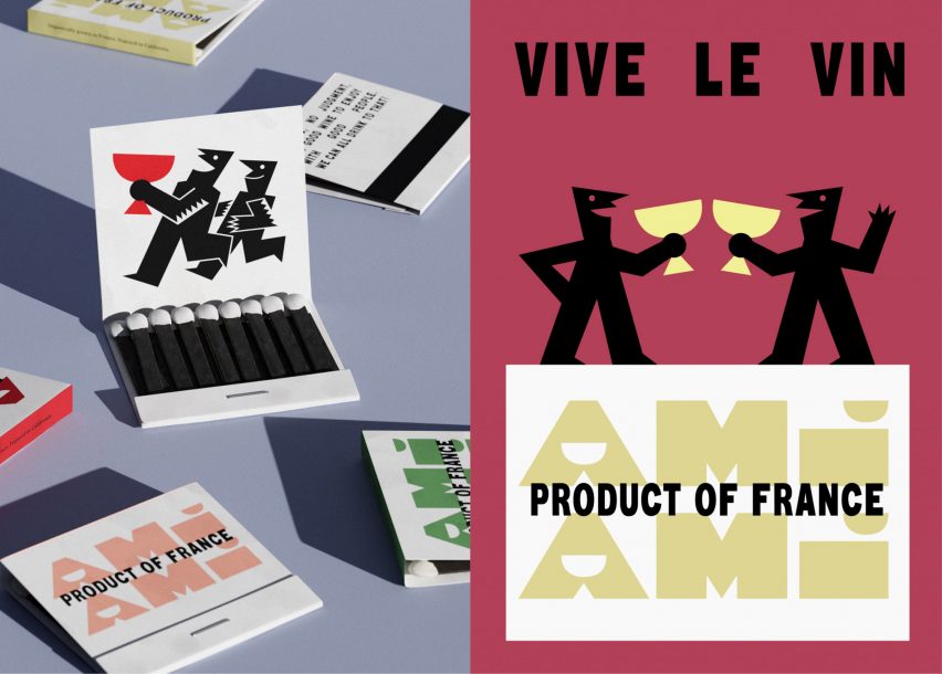
A pattern of exactly 10 half moons decorates each box of wine by California company Ami Ami, which branding agency Wedge has designed to suggest the number of glasses yielded by each carton.
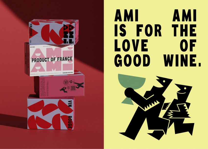
The brand's newly created identity combines a restrained tonal colour palette with geometric figures that pay homage to the Campari characters created by Italian futurist Fortunato Depero in the 1920s and 30s.
In this way, Wedge hoped to subvert existing associations of boxed wine with binge drinking and a cheap buzz.
"Boxed wine never had a brand, it just had a poor connotation," the studio's founder Justin Lortie told Dezeen. "In America, boxed wine is associated with frat parties – you can put two and two together – or the poorest of poor quality."
"The day the Californian founders decided to import good quality French wine and put it in a box is when box wine needed a true brand to signal something different."
Lortie and his team set out to design packaging for Ami Ami that would be "worthy of the MoMA store" and that users would happily display in their homes like a piece of design rather than hiding it away.
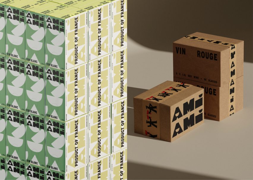
The first step was to choose a smaller 1.5-litre box – around half the size of traditional boxed wine – which gives the design an "irresistible cuteness", according to Wedge, while making it easier to carry along to picnics or dinner parties.
The studio set out to design every surface of this little box, rather than just the front, embellishing it with a haphazard pattern of semi-circles that resemble the bowl of a coupe glass.
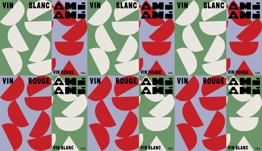
Each box was emblazoned with 10 of these shapes, equivalent to the number of glasses that can be poured from each carton and in total amounting to around two bottles of wine.
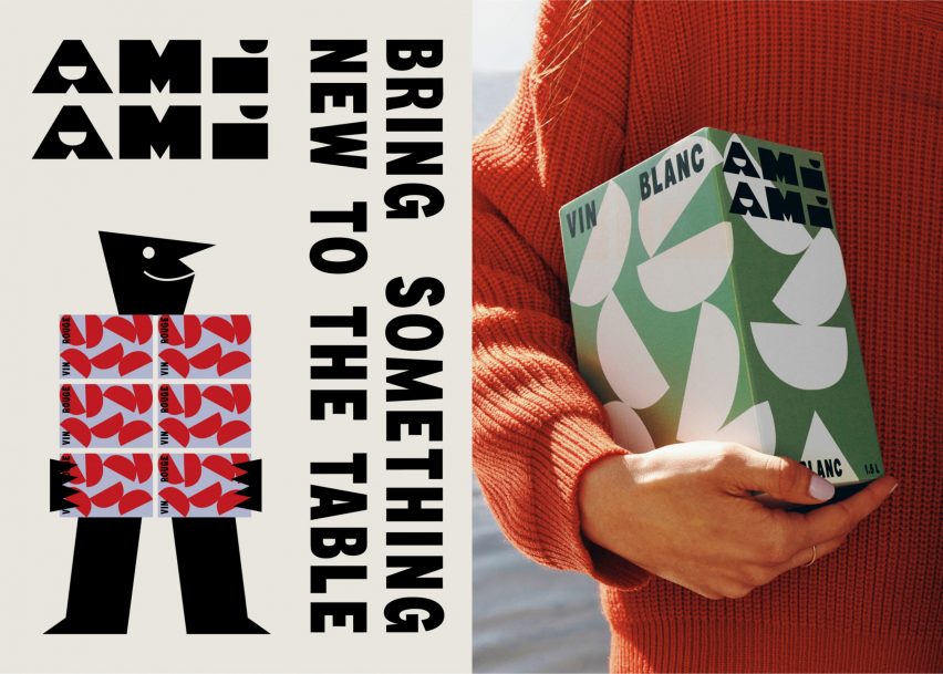
This same half-moon shape was also used to dot the I and form the hollow of the A inside the Ami Ami wordmark, which takes over an entire side of the box.
In an attempt to communicate the quality of the wine within, the remaining typography was designed to resemble that of the Vin de France designation found on French wine crates.
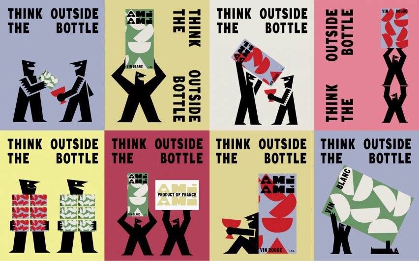
Adding a playful element to the branding are two little geometric characters, rendered entirely in black in a nod to the seminal illustrations created by the artist Depero for Italian liqueur company Campari.
"Depero represents a moment where art became integrated with commerce, especially in the world of spirits," Lortie said.
"The choice is a nod to this moment, a familiarity that gives a layer of enduring time and a gesture that brings a delightful European warmth, modernised for today."
In many of Ami Ami's graphics, these two characters are shown clinking glasses or playfully glugging straight from the box.
On the packaging itself, they serve to draw attention to the company's sustainability claims, namely that the cardboard box is completely recyclable and that shipping the wine in boxes rather than glass bottles generates 50 per cent fewer carbon emissions.
The packaging does not disclose that the plastic bag, which holds the wine inside the box, cannot actually be recycled in the US.
But Wedge argues that glass, too, is rarely recycled in the States, with around 70 per cent of discarded glass ending up in landfills or being combusted.
"We are used to thinking that glass is recyclable and therefore more sustainable full stop," Lortie said. "But the cost of producing and transporting glass is quite high in energy consumption, in comparison."
"And most often glass bottles aren't recycled when infrastructures are not in place," he added. "All things considered, at the moment, boxed was the better choice to reduce the total impact."
By contrast, recycling rates are much higher in Europe, where many countries are already recycling 75 per cent of their glass waste.
In a similar attempt to reduce the emissions associated with shipping wine bottles, British company Garçon Wines created flat wine bottles and a matching box to allow the alcohol to be packaged more efficiently.
Ami Ami has just been shortlisted in the graphic design category of this year's Dezeen Awards, where Wedge is up against Manual's branding for the Eames Institute of Infinite Curiosity and the Second Sea calculator, which predicts damage to global cities from rising seas.