Origami crane informs Nendo's minimalist overhaul of Japan Airlines amenity kits
Nendo has completed a comprehensive makeover of all of Japan Airlines' in-flight amenities, from meal trays to slippers and earplug wrappers, which draws on the lines of a paper crane.
The revamp is based on the national carrier's logo – a traditional crest known as a tsurumaru, in which a crane forms a circle with its outstretched wings.
This motif is extrapolated into a more minimalist, red origami bird that, according to Nendo, acts as "a symbol of peace, prayer and the spirit of hospitality".
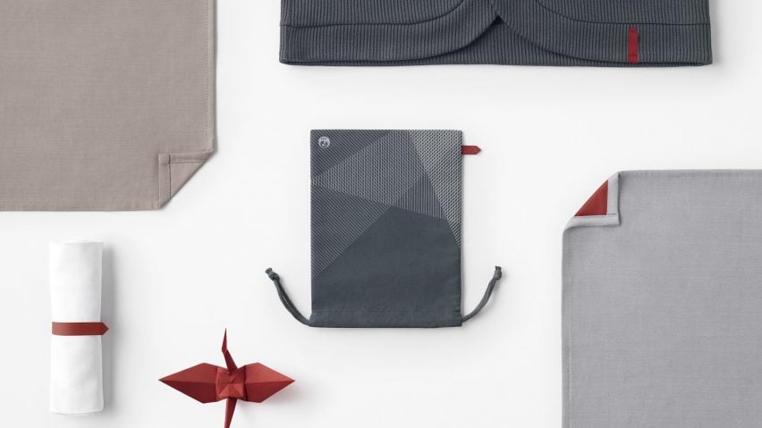
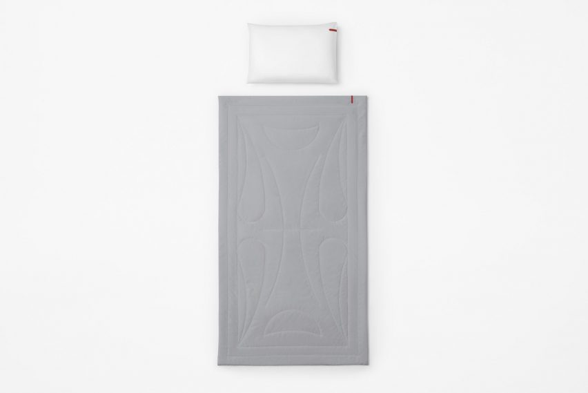
Its graphic folds are referenced throughout the entire line of products, with a tag attached to accessories such as eye masks, slippers and pillows nodding to the shape of its pointed wingtips.
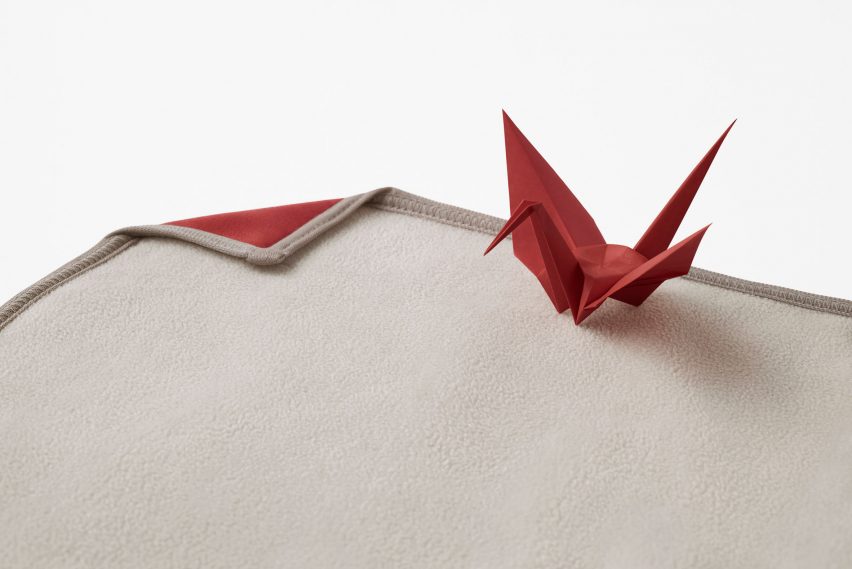
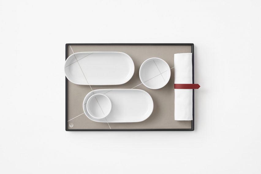
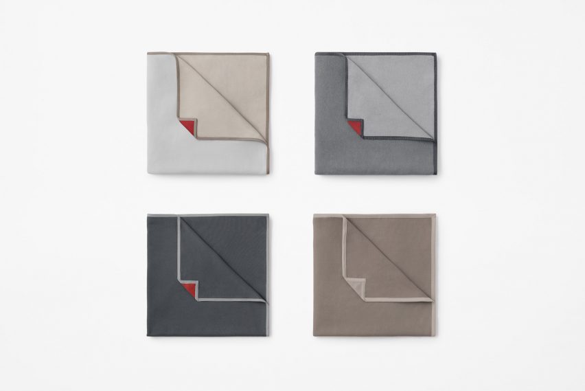
A similar red band resembling an inverted bookmark is also wrapped around the rolled-up napkins that hold the cutlery, while the paper crane's triangular head is referenced in the folded corners of blankets, tablecloths and napkins.
Elsewhere Nendo took a more abstract approach, incorporating the tessellated patterns that are left behind on a piece of paper when the origami bird is unfolded.
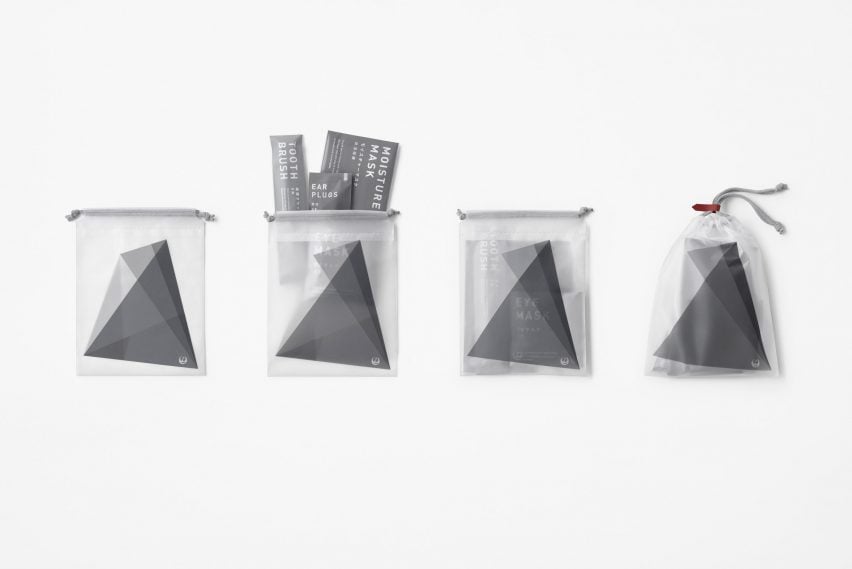
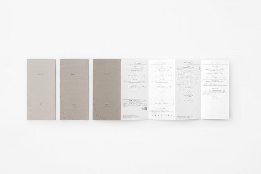
These are found on the in-flight cosmetics bags as well as on the cartes du jour, where the linework helps flight attendants differentiate between Western and Japanese menus'.
Similarly, paper placemats and dishes are crisscrossed by white and grey lines, which allow them to be perfectly arranged and stacked on the meal trays to reveal the crane's folding pattern.
Since amenities for Japan Airlines' international flights are printed and manufactured in different places, this complicated the process of exact colour matching and led Nendo to chose not just one but seven different shades of grey to offset the red accents.
Ranging from granite to warmer beige tones, this helps to distinguish the planes' different classes while maintaining a cohesive overall design.
Textiles and accessories in economy feature a mix of three different lighter tones to give the cabin a sense of airiness despite its compact dimensions, and in business class, a silvery shade is contrasted with a darker, slate grey for a "sharp and modern look".
Red-tinged hues are reserved for first-class and also used to distinguish meal trays and menus designed for Western cuisine from the cool grey employed for their Japanese counterparts.
For items that stay the same across all Japan Airlines travel classes, such as earplugs, toothbrushes and cosmetic sachets, Nendo opted for a neutral tone and unified their opening mechanism to work in the same direction along a dotted line.
Other design studios such as London-based PriestmanGoode have focused instead on cutting back on the amount of single-use plastic that is used during in-flight meal services.
The firm designed an entire table setting made from edible and commercially compostable materials, including a tray formed from coffee grounds and a cup made of rice husks and lined with algae.