
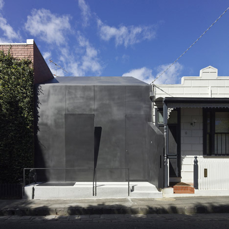
A drawbridge-like flap lowers from the steel-plated facade of this Melbourne bunker to reveal a bedroom window.

Australian architects Muir Mendes designed Law Street House for themselves.

The building occupies the site of a former workman's cottage and is flanked on three sides by other houses.

Designed to be termite-proof, the house features a steel structure plus steel doors, window frames and joinery, as well as a tallow wood floor that is unpalatable to the bugs.

A bedroom, living area and bathroom occupy the ground floor of the two-storey property, while a study, second bedroom and second bathroom are located on the first floor.

A double-height corridor crosses the house and is naturally lit by a skylight.

Law Street House is the fourth Australian house to be featured on Dezeen this month, after a cliff-top home anda glass-roofed residence in Sydney, and a cantilevered house in Melbourne - see all our stories about Australia here.

Photography is by Peter Bennetts.

Here's more information from the architects:
Law Street House
Located in a tight single lane street in South Melbourne the original dilapidated one bedroom workman’s cottage built in the 1880s formed the initial brief for architect’s/owner builders Bruno Mendes and Amy Muir. To pursue the desire to construct using ones own hands formed a very important part of the brief.

Joe Mendes who manages steel fabrication for a large construction company formed the final link. The following 3 and a half years of demolition, excavation and construction would be referred to as ‘the daddy Mendes apprenticeship’.

While working full time in practice the new house was constructed on weekends. This formed the construction program and associated cash flow.

The 93m2 site adjoined to the north and south neighbouring properties and contained by a rear property called for access to natural light and a view beyond. Flanked by a two storey modernist red brick façade and the ornamented timber cottage to the south, Law Street House became the fourth little pig.

Constructed from plate steel the façade adopts a condition of blankness concealing the second storey within the adjusted roof pitch mimicking the form of the site’s former cottage. A ‘draw bridge’ to the front window provides privacy and curates light to the front bedroom providing a signal of occupation to the house beyond.

Upon entry the double height corridor directs the gaze through the full length skylight to capture a view of the existing palm tree. The inversion of the enclosed cottage corridor is adopted in order to maximise the penetration of natural light to the interior and provide an aspect ‘out’ of the tight site.

Sky becomes an important distraction for the gaze. The white walls play host to the passage of light that dances across the interior as the day passes patterning the walls as it moves.

A memory of the original lean to roof lines ripple across the underside of Level 1 defining the ‘section’ of the house.

The rear of the house forms a continuation of the roof line folding down the Rescode diagram to the south. The rear façade to the east is tilted ensuring that no additional overshadowing was caused to the neighbouring property.
Click above for larger image
Internally the wall is pleated incorporating the heating panel and concealed blind to the window on Level 1.
Click above for larger image
Steel construction was adopted to combat the tight site and aggressive termites. Windows, doors, stairs and joinery have been fabricated from steel puncturing the white interior. Tallow wood flooring was selected given that it does not suit the selective pallet of the termite. The flooring folds through the space and up the walls providing a robust skirting.
Click above for larger image
Two bedrooms, two bathrooms, one study, open plan living and storage have been carefully crafted into the 115m2. The house is divided into two living zones with the Level 1 gallery study forming the in-between space.
Click above for larger image
Borrowed light and borrowed vistas articulate a space for living, for gazing, for pondering, for thought.


I find it interesting that when designing the bathroom one would not remember towel rails? Nice house all the same and neat kitchen island detail.
that's so funny, i didn't notice! good eye, man!
There are more things that need to be addressed. I do not think this house is fully finished. Which is perfectly ok by me at this stage of a project.
;)
Why no bookcase?? :( Looks icky on the floor like that.
love the ground floor ceiling!
ugly. But useful in a Zombie apocolypse.
Beautifully crafted home. The natural lighting strategy is particularly fine, as is the palette of materials.
Right but I would like to know why one needs a skylight over his head in the bedroom?
maybe to gaze into stars…
The house has a very nice atmosphere. Absolutely love it.
A really inspirational home-love the clean lines and hygienic look. Love the use of materials too- i think using steel for a home is quite hard to do, but it looks great. Also it fits into it's environment really well.
It’s wonderful. It plays on traditional materials, is safe and functional but light and living. I’m from South Africa, we already have zombies, so this house would work well there. ;)
I think the architects can be very proud.
I find the interior fantastic except for a few minor details. I love how much light comes into the house from the roof and backyard areas. Unfortunately, the front of the house does not fit into the Melbourne street landscape. Innovative in so many ways but the front reminds me of a bomb shelter. Sorry guys, it is difficult to achieve what has been done but I think the front facade of the house lets down what has been achieved on the inside and the view at the back of the home.
I like the front facade best. So cool! Well done, guys.
What does the front facade say to the neighbors, I like the architecture hate that front facade, I know it's considered avant-garde , I guess, ok if you live in a blighted warehouse district, need to look at the surrounding area
love the use of light, love it, but as much as i wanna like the front, i don't
Nice interior however I don't understand its street presence. Its windowless facade makes it look like a bunker… protecting the inhabitants from what… termites? It looks uninviting and unfinished
It looks like a nightclub…..
beautiful !!! this is the sort of thing that could be used for "filling the gaps" in big cities well done.
I love it my girlfriend hates its lol I know it doesn't look very homely but id still live there
When I read comments such as “where is a bookshelf” reminds you how the present consumer is “narrow-minded” “brain-washed” and a challenge of a designer/ architect to be trusted by a consumer in delivering new way of living suited to “individual” as oppose to “rabbit-cage” consumer conforms to live in.
And thank you for such consumers like at Law Street whom ARE individual enough by not being “cattled” down the line to a “book shelf life”.
It’s not up to anyone to judge if you love it or hate it – it is the individual choice and the bravery should be respected.
It is ingenious!
Well said
Very interesing project. Almost idealistic if not puristic. Controvertial? Sure, a bit, but are we all the same?
How does one get a council planning permit for such a house, it's completely out of place? To me it seems like the front is a return to Brutalist monstrosities, but steel, not concrete.
@mischa: I may be “brainwashed and “narrow-minded”, but sweeping and mopping around those books is not a price I want to pay for a high-design (but low functionality) statement. Plus, what house worth living in has so few books, so perversely “shelved”?
$10 says the artistes flee for a rabbit cage the moment baby makes three, leaving an unsellable “bunker” to languish unsold, lowering property values and pissing off the neighbors. And forever, since even the termites shun it.
House designed and lived by the architects themselves – they are entitled to put their books on the floor, have no towel rail, or look at the stars before they sleep. Should people be that critical on others' lifestyle? It is their own house…
Regarding the front facade and "pissing off the neighbors" – looking at the picture of the laneway with blank fences and garge door opposite, adjacent 2-storey brick box covered with greens and timber cottage – which neighbour should one please?
The bold blank facade and the mundane context may not be entirely incompatible (do note how it subtlely picks up the lines of the cottage next door).
Considering how many laneways in Melbourne are sprayed with graffiti, it only makes sense a laneway unit would make reference to the street “art”. It’s kinda funny.