Google's design guidelines spell the end of days for skeumorphism
Feature: the visual language of glossy glass, brushed metal and soft fabric that informed the first wave of interface design for smartphones and apps might be dead, but not all designers are convinced about its replacement, reports Alex Wiltshire.
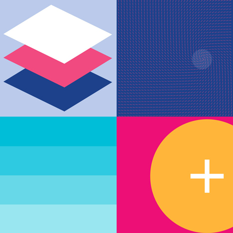
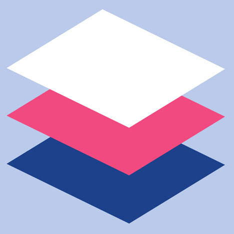
Google dealt skeuomorphism yet another mortal blow when it revealed Material Design at its I/O software developer conference last month. A new set of design guidelines for software running on smartphones, tablets and PCs, Material Design's elegant typography and bright colours join Microsoft's Metro and Apple's iOS7 and OS X Yosemite in kicking to the curb "skeuomorphic" on-screen imagery of polished wood and gleaming knobs.
In design, skeuomorphism is when visual cues from one thing (such as a leather-bound diary) are used in another (such as a diary on a computer). The term comes from the Greek words "skeuos," meaning vessel or tool, and "morphē", meaning form.
Over the past five years or so skeuomorphism's visual metaphors of glossy glass, brushed metal and soft fabric, used to form plump, 3D-looking buttons and switches and textured backgrounds, have helped us understand touch interfaces and integrate them into every facet of modern life.
"Skeumorphism acted as a way to get people used to smartphones, making them think that it is an evolution of their daily life objects, like an agenda," says Ludovic Vialle, CEO of LevelUp Studio, who makes the popular Android Twitter app Plume.
Now, though, the training wheels are off. Material Design is part of a new way of thinking about software presentation commonly referred to – if maybe a little too broadly – as 'flat design'. Here, buttons are often simply text, blocks of colour are used to guide the eye and finger, and smooth animations respond to each interaction.
Flat design recognises that we've learned to understand what we can and can't interact with on computer screens, allowing the interface to slip away, and what you're reading, watching, or whatever, take the stage. It's about "content before chrome", if you can stomach Microsoft's phrasing.
For Gabe Campodonico, chief designer at Evernote, who directs apps across every computer platform, moving away from skeuomorphism gives computer interfaces new opportunities for expression.
"We needed a way for users to quickly and intuitively understand what a button was, so we made something look exactly like a button in the real world," says Campodonico. "That works but is also limiting. It goes beyond what is necessary. When you strip away unnecessary visual decoration and rigid metaphors it creates new opportunities for how an interface can work."
Flat design therefore signals a maturation of a whole dimension of computer development. Software developers are now thinking like graphic designers, and they're aided by better technology. On high-resolution displays fonts look beautiful, the current generation of LCD and OLED screens reproduce colours cleanly, and powerful graphics chips smoothly animate on-screen objects and lend them translucent effects.
Like iOS7 and Metro, Material Design is rather beautiful in a stark kind of way. "It is really great and modern," says Vialle, but he recognises like all developers that it's not really about pure aesthetics. Which is probably just as well, given some of Google's rather empty language around it:
"We challenged ourselves to create a visual language for our users that synthesises the classic principles of good design with the innovation and possibility of technology and science."
Instead, it's really about pulling together Google's ever more fragmentary world of Android smartphones and tablets, and their manifold screen sizes, as well as all its websites, a PC operating system in the form of Chromebook, and even smart watches. That's a pretty stern challenge.
"This is a really positive thing for the Android platform," says Campodonico. "In the past, they've had a reputation for having an inconsistent and fragmented experience. Material Design is the latest and most significant step in trying to fix that."
"Google has so many platforms with different designs that they had to unify," agrees Vialle. "You will be able to recognise from the design that it has been designed to run on Google products, which is important for branding. But another important reason is to have the developers working on your platform share the same identity with clear rules."
So Material Design lays out dos and don'ts for ways of introducing things like animation to help you know that the device is responding to your command. Animate from where your touch is, rather than somewhere else, to reinforce the relationship between what you touched and its result. Animate elements in turn to direct attention, rather than all at once, which can confuse.
The guide is a fascinating sourcebook of ideas and best practices. And don’t think of it as a design philosophy, Campodonico cautions. "That misses the point, in my view. The important thing is that this establishes a strong visual design vocabulary as well as a consistent and complete set of UX [user experience] patterns for the platform."
Consistency is the key for Android – and everything in the Google-sphere. If you've ever used an Android device you'll know how every app tends to behave slightly differently. They're made by an incredibly wide group of people, from multinational companies creating apps for every device to bedroom coders making one-off projects.
Having worked for some seven years to next to no standards, the result is a vast library of apps that have to be learned, one at a time, presenting an overhead to understanding that Google could really do without. And also the sneaking sense that Android can't cut to the quality of iOS, where there's far greater consistency. "Without any guidelines, [developers] would not really care and do what they want, sometimes the cheapest way," observes Vialle.
"There's a part of this that serves to increase design literacy on the Android platform," adds Campodonico. "In many cases the way they talk about animation and visual design concepts is in terms of general design principles. They are raising the level of discourse and interest in design which leads to a perception that design is a highly valued and integral part of the platform."
Not that every developer feels this way. "I won't even bother using it, except to the minimal extent possible," says Alexey Yakovenko, developer of DeaDBeeF, a highly rated music player for Android. "Many Android projects, including DeaDBeeF, are made for fun by programmers who don't have design skills, nor budget to hire professional Android GUI [graphical user interface] designers and developers. This new stuff will only affect large projects which can afford designers, or the projects developed by programmers with design skills, who have a lot of free time."
And yet Google's ideas – as much as they're equally a result of the thinking of design groups at Microsoft, Apple and hundreds of other progressive software makers – will surely trickle down to all developers and designers working on Google's devices. But will the impetus really come through Google's immaculately presented design guides, or through well-made software? For Campodonico it's clear: "Real inspiration and influence comes from the apps themselves."
Alex Wiltshire is a video game consultant, with clients including London's V&A Museum. He was editor of Edge Magazine until 2013 and has written for a wide range of publications including Icon, The New Statesman, PC gamer, Eurogamer, Design Week and Architects Journal.