WeTransfer focuses on its two most important letters in stripped-back rebrand
File-sharing site WeTransfer has unveiled its first ever rebrand, which includes a refresh of its logo, identity and website.
The updated site launched last week and is the first time WeTransfer – which enables people to send each other digital files via the cloud – has undergone a rebrand since it began in 2009.
As part of the refresh, WeTransfer has changed its colour palette, site and font. It has also dropped the word "Transfer" from its logo – a decision the company's vice president of design Thijs Remie says was reflective of the company's sense of community.
"WeTransfer has never been about making something just 'decent' – we want things to be great," said Remie in a blog post. "Two key factors in our success have been the product's ease-of-use and aesthetic appeal."
"I think that over the years our definition of 'we' has shifted," he continued. "It's now much more about you and us, together."
To create the simplified "We" logo, the company began the design in-house before reaching out to type studio Bold Monday's Paul van der Laan to work on the finer details.
"Starting with an empty canvas, our mission was to create a symbol that captures just the right personality, one that is technically well-executed, and can clearly be read as 'we'," said Remie.
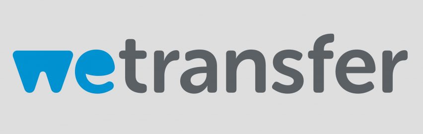
The old logo was scribed in a sans-serif lowercase font, and was made up of a blue We symbol with a dramatically curving "e", followed by the word transfer in grey.
As well as being without the "transfer" portion, the new logo sees the bold We symbol become thicker, and with a higher smile on the e.
While focusing on two letters made the logo appear cleaner, Remie noted that the design needed to be tighter.
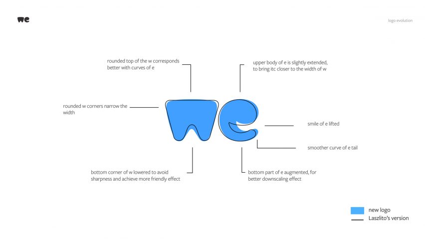
"When focusing on just two characters for a logo, good is no longer good enough," he said. "It needs to be perfect, all the way down to the tiniest detail."
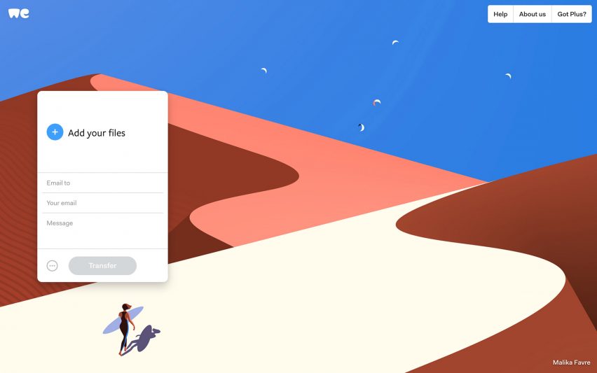
The rebrand comes alongside a redesigned website, which is updated with clearer navigation, a bigger transfer box and a new feature allowing people to download single files.
Brands are increasingly scrapping their previously complicated logos in favour of simplified designs. England's primary professional football competition kicked off its 2016/2017 season with a significantly more minimal lion's head logo, while Design agency Pentagram gave Mastercard its first branding redesign in 20 years, creating a more minimal logo and visual identity for the credit card company.