Tokujin Yoshioka designs minimal packaging for Japanese skincare brand
Tokujin Yoshioka has created a range of minimal bottles and tubes for a Japanese skincare brand, which are each topped with lids made to look like natural stone.
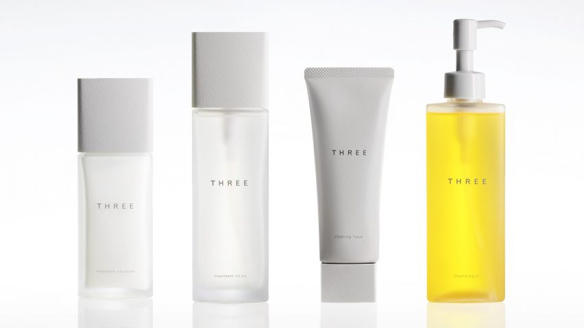
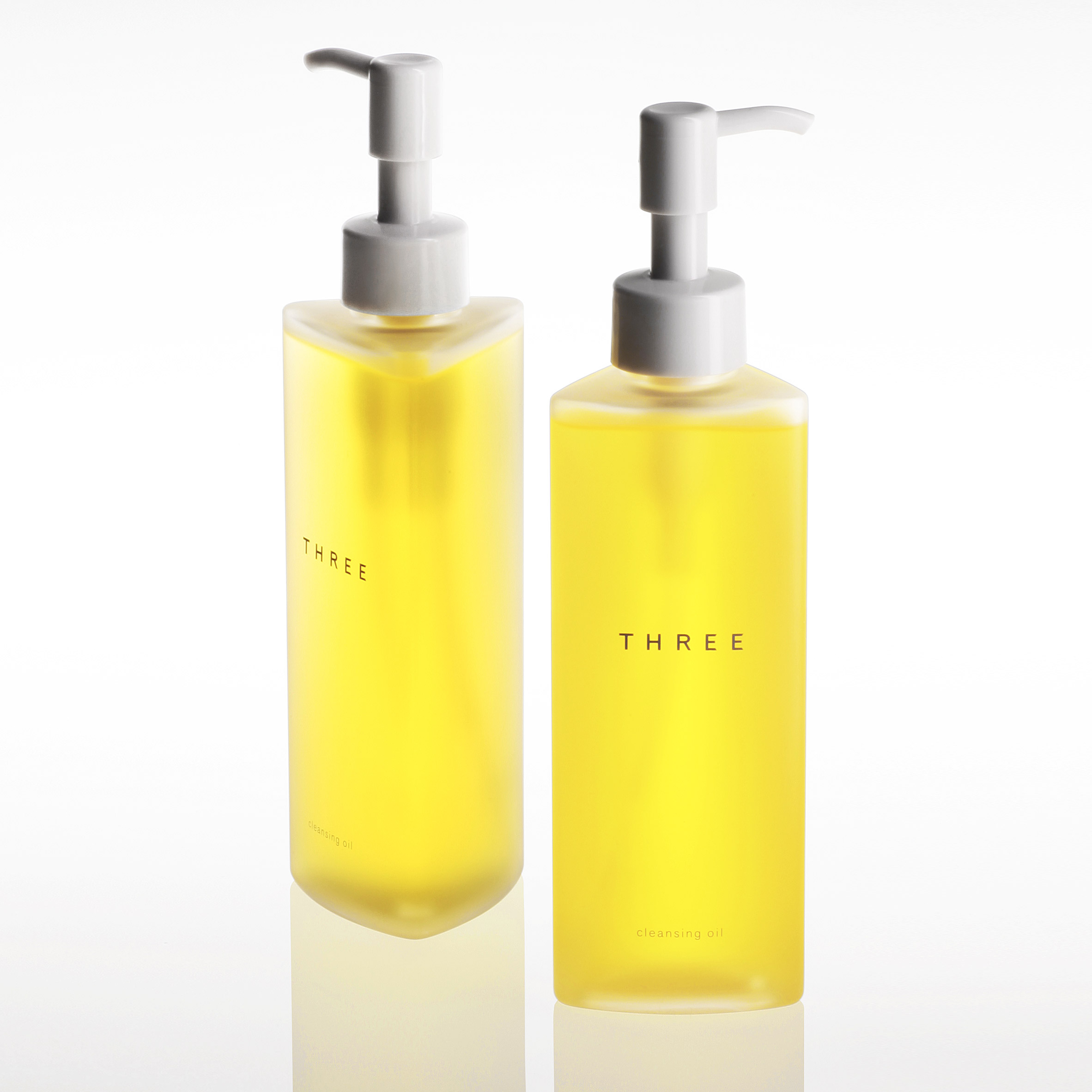
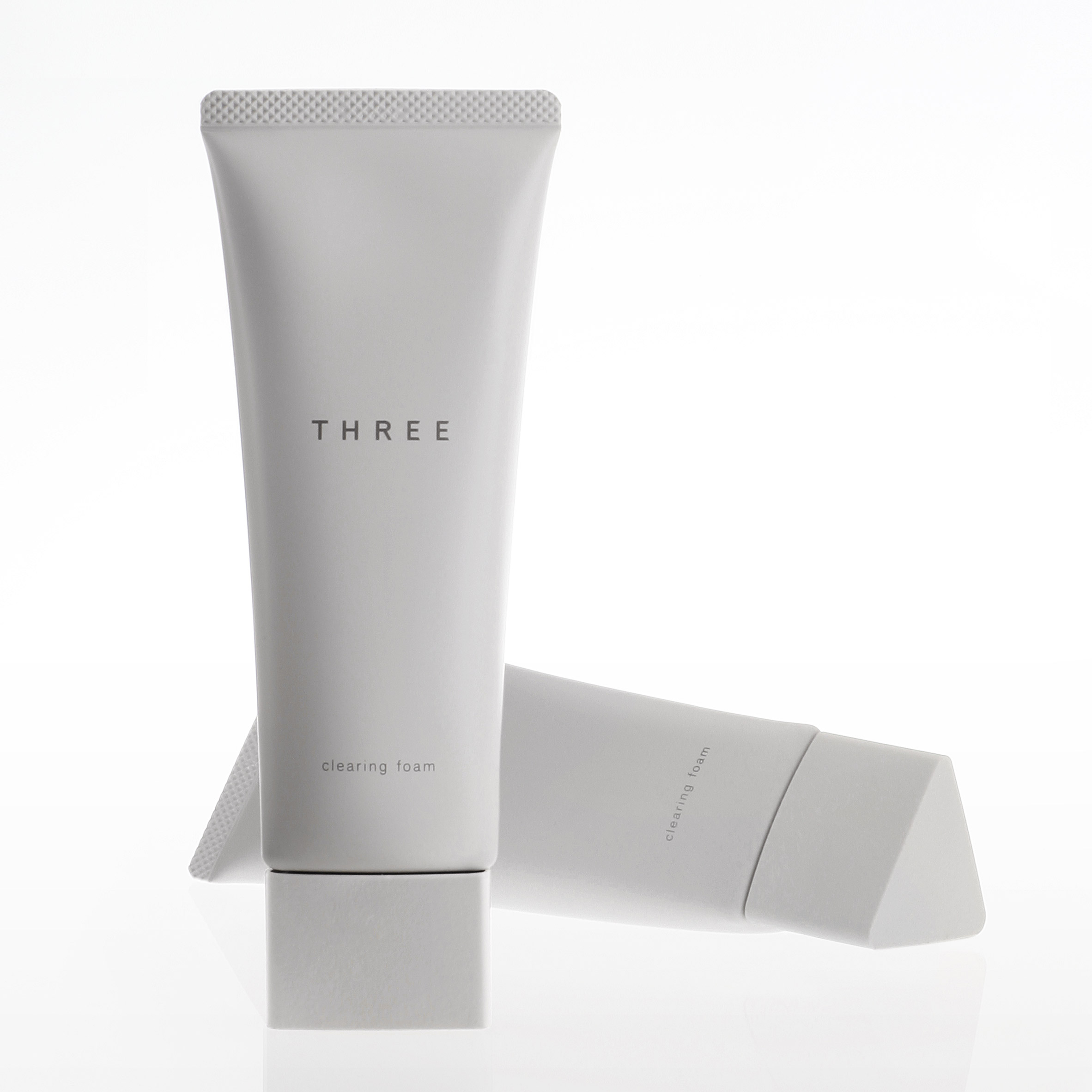
Yoshioka created new packaging for Japanese cosmetics brand Three, whose range includes cleansing oil, clearing foam, treatment lotion, treatment emulsion, and treatment cream.
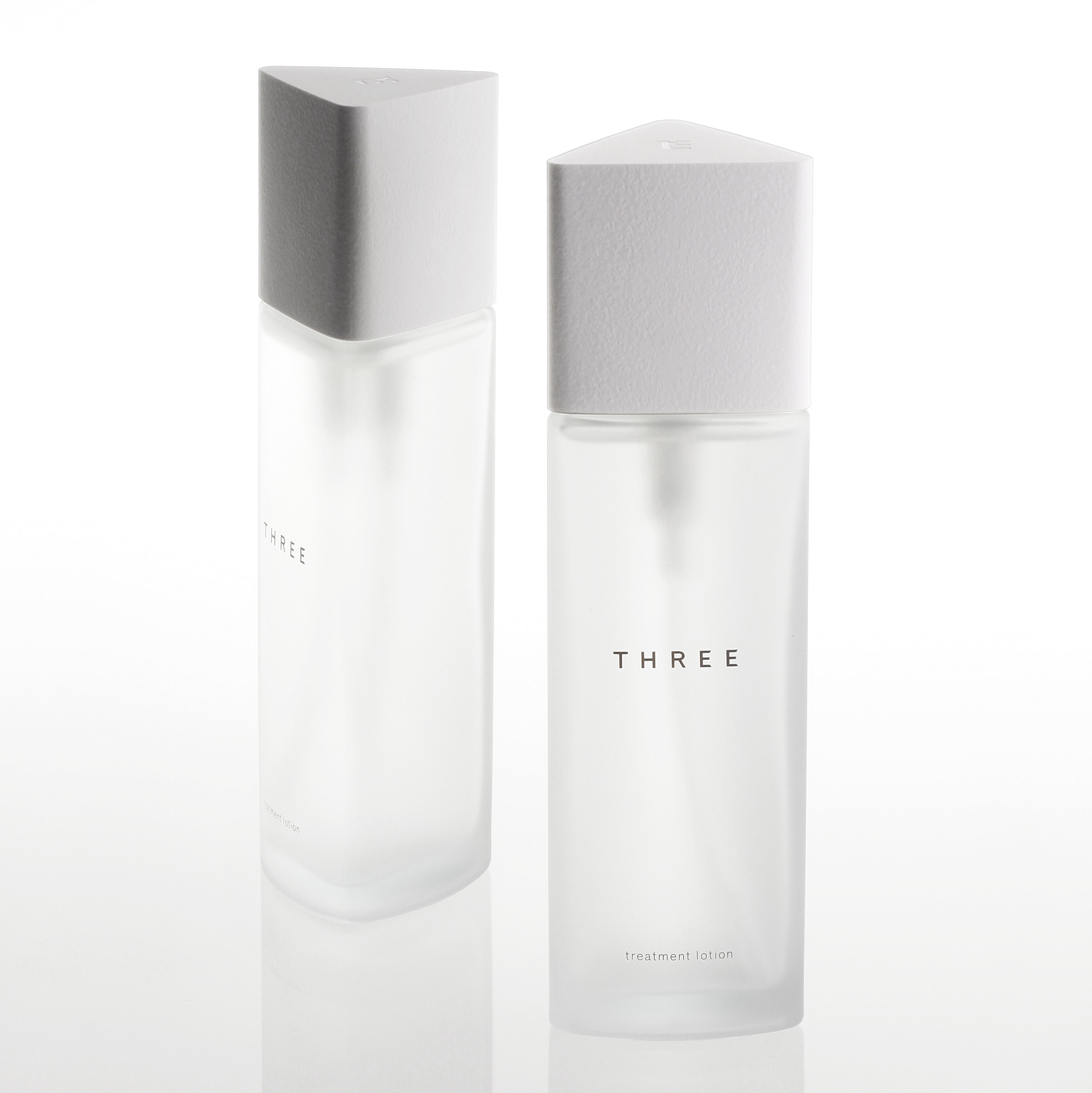
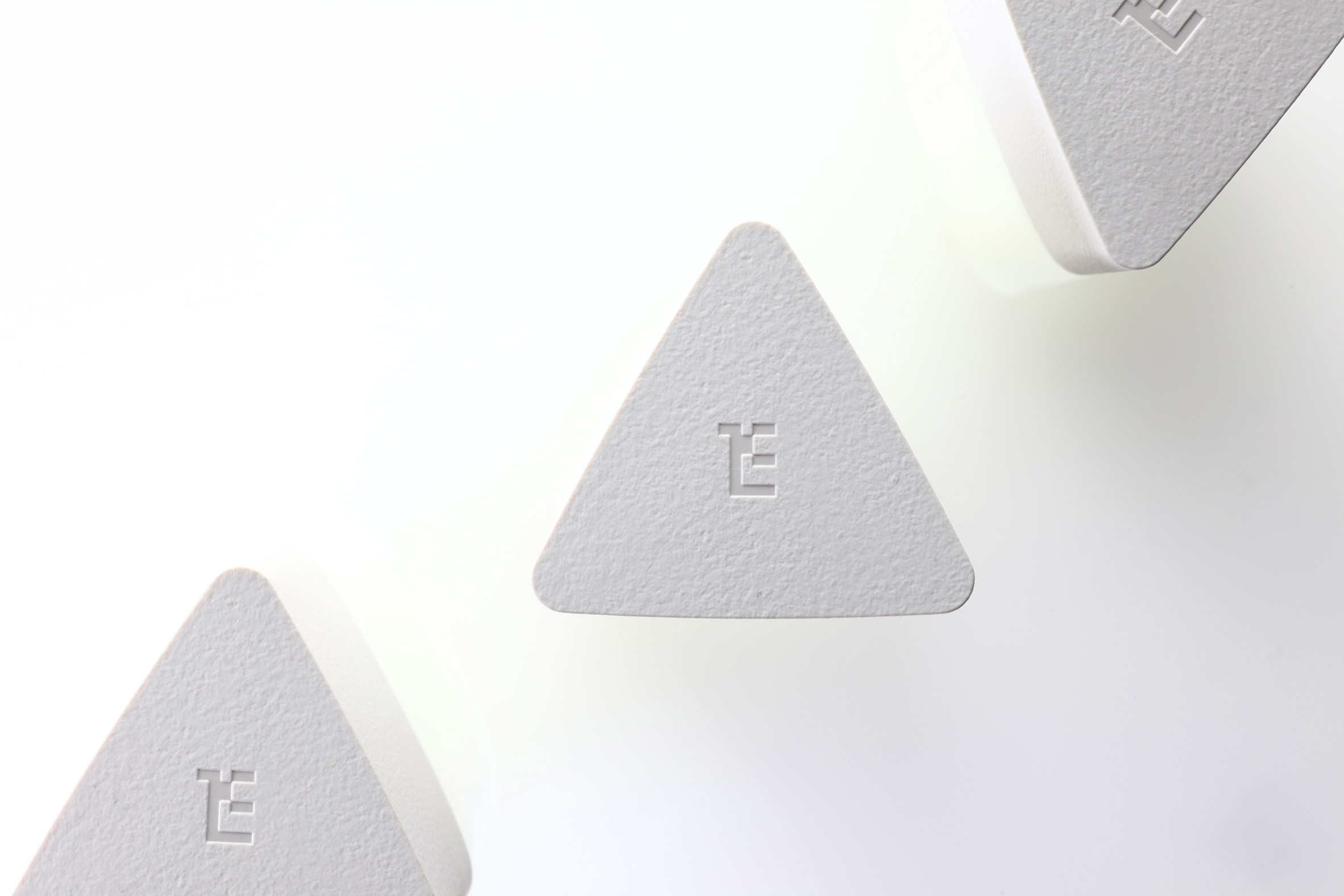
For each bottle and tube, he adopted a triangular shape inspired by the brand's name as well as its three-pronged philosophy: Natural, Honest, Creative.
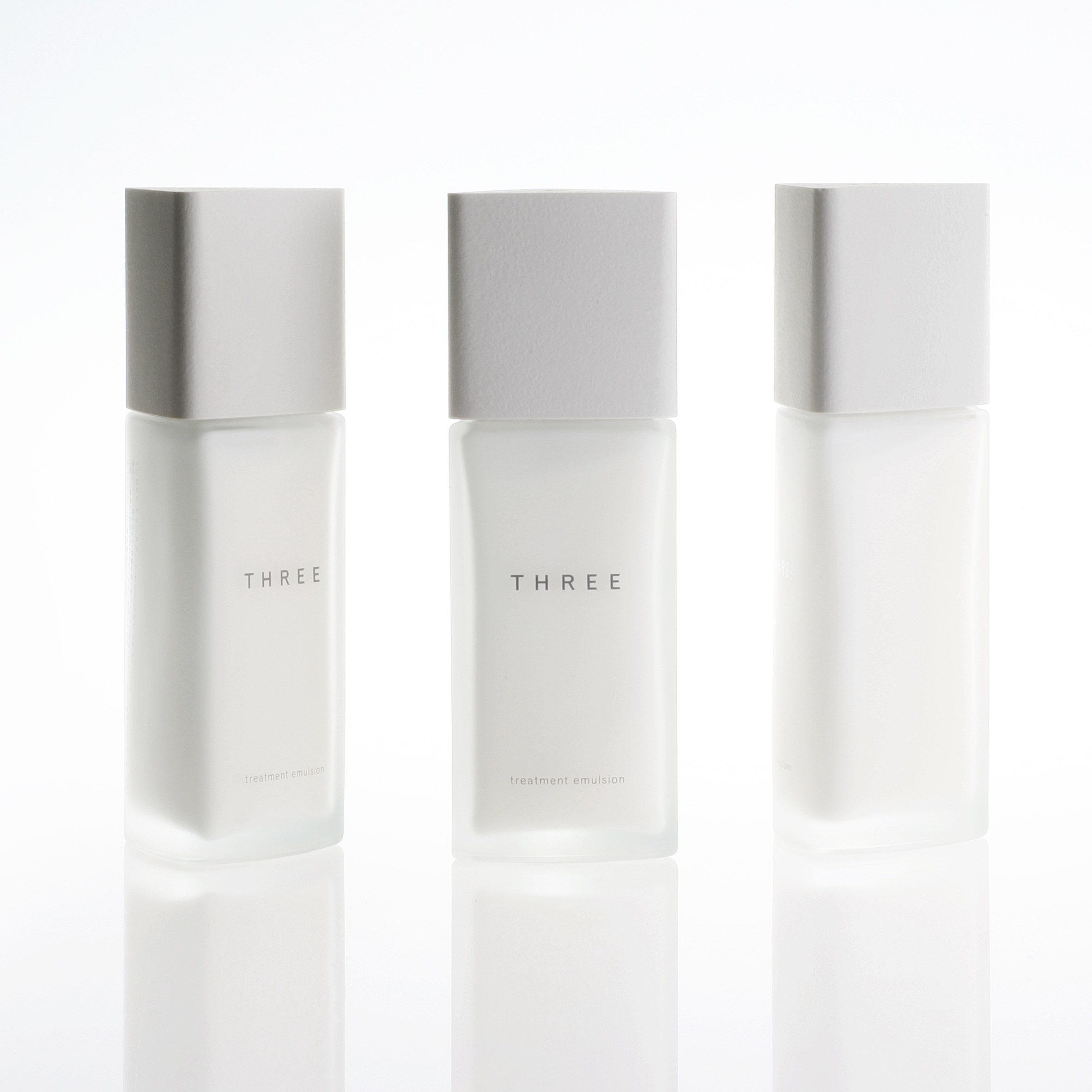
Each container is topped with a triangular lid with a rough stone-like texture, which was achieved by moulding a natural stone surface.
"The natural stone pattern applied to cap reflects the beauty and essence of the nature," said the Japanese designer's studio. "The pattern is harmonized with elegantly soft texture, and emphasizes the high quality of the product."
In addition, the triangular bottles are delicately tapered from top to bottom to create a more comfortable grip.
"This unique detail fits the hand comfortably," continued the studio.
"By unifying the earth, nature and human, the design not only awakes all senses, but also brings the hidden charm of oneself and leads to a praise of the beauty."
Yoshioka, who is known for his minimal designs that play with transparency and light, has previously created conceptual perfume bottles for brands such as Swarovski and Cartier.
More recently, the Japanese designer masterminded a huge installation for LG in Milan that featured a glowing wall and chairs made from OLEDs that showcased a spectrum of light and colour.
Brands are increasingly shunning fussy identities in favour of stripped-back logos and packaging.
Recently, Nendo used brush strokes in soft, pastel hues for a range of minimal packaging for an organic cosmetics company, while Yuta Takahashi created pared-back packaging for a range of natural chocolate bars to reflect their simple ingredients.