Pentagram rebrands Nashville art museum with 1930s-influenced logo
Pentagram's Austin studio has included an "art deco-style" letter S in this new identity for an art museum in Nashville, Tennessee, taking cues from the 1930s building it occupies.
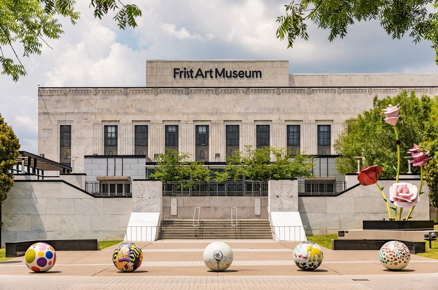
Design agency Pentagram was enlisted to deliver a major rebranding The Frist Center for the Visual Arts, which included simplifying its name to the Frist Art Museum and designing an accompanying new identity.
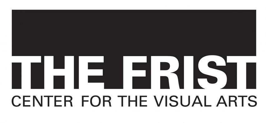
The studio intended the rebrand to offer "personality" compared to its predecessor, which comprised a capitalised sans-serif typeface paired with simple graphics. "The Frist" was written in white and set against a rectangular black, with "Center for the Visual Arts" set below in smaller black letters.
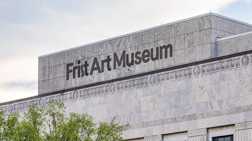
To refresh this, the Pentagram team reference the history of the museum's art deco building, which has been its home since 2001. The structure was completed in 1932 as a post office and is now listed on the National Register of Historic Places.
"The goal was to give the museum a modern identity that is simple, confident, and has staying power – that will still feel fresh and undated in 10 years – but also pays tribute to the institution's art deco roots," said Pentagram in a statement.
The team returned to the museum's identity from when it first opened, which was later passed over in favour of a more modern interpretation, but left affixed to the front of the building when Pentagram took on the project.
The stylised S in the new identity mimics a similar version of the letter in the old design, which was based on a marking on one of the tiles at the 1930s building.
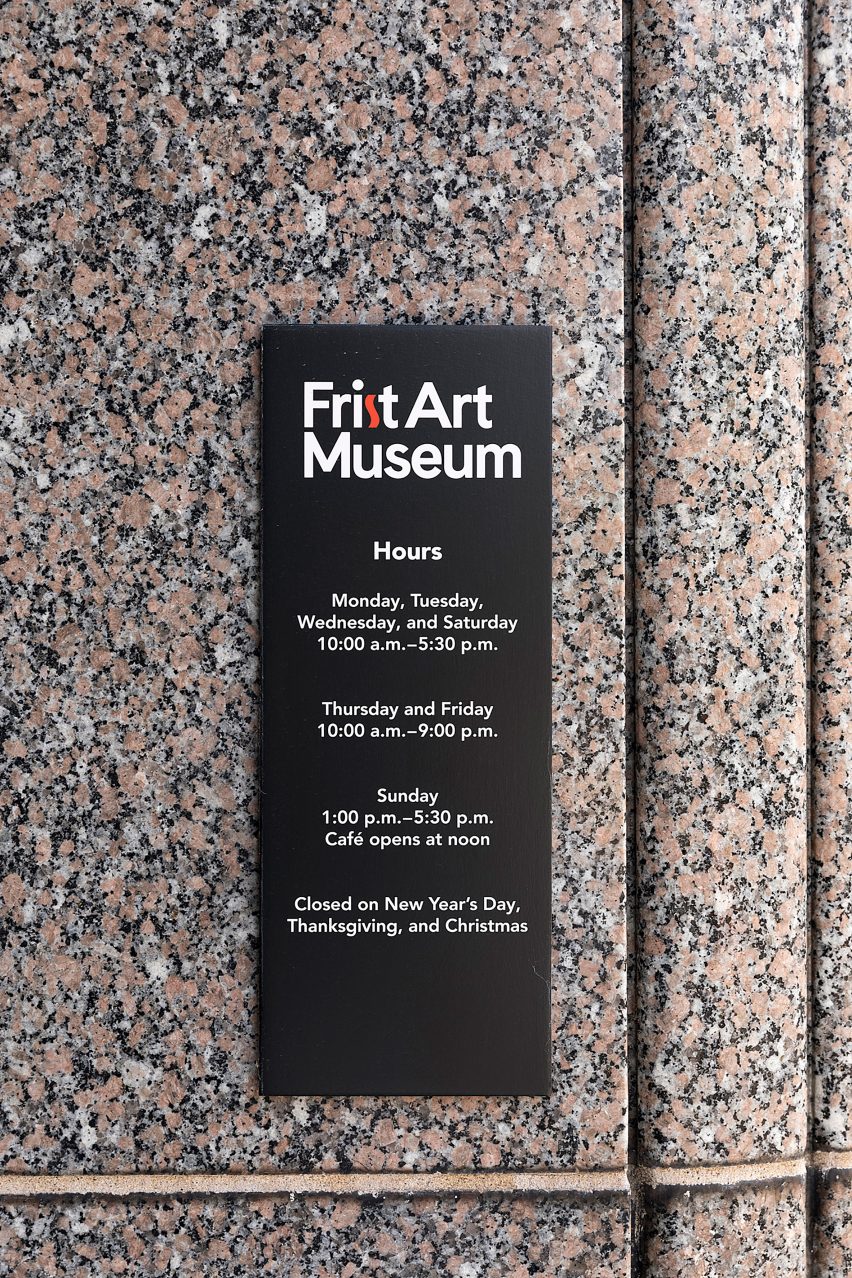
"The mark was locked-up with the word 'Frist' set in all-caps in a slender vintage 1930s font," said Pentagram's statement. "The art deco-style letter 'S' in the word took the form of an elongated snake."
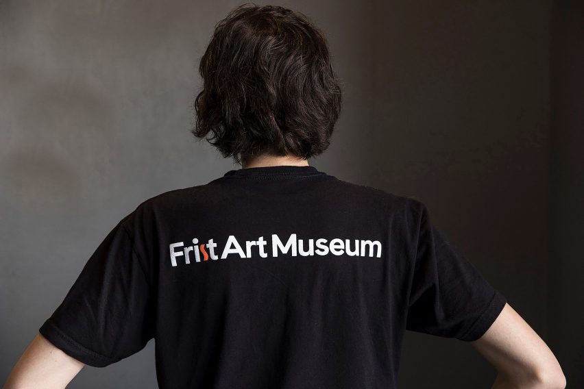
In the new logo, the feature letter stands out against the rest of the text, which is written using sans-serif typeface Cádiz. The S is also coloured red in signage and paraphernalia.
Pentagram also rebranded the institution as the Frist Art Museum (FAM) to make it more simple, as some confused the term "visual arts" in its name with it being a performance venue.

"The previous name, wordy and indirect, was originally adopted in an attempt to communicate the family friendly, community-oriented ethos of the place," said the studio. "The resulting name, although well intentioned, ended up being awkward and a bit confusing."
Several names were mooted, including Nashville Museum of Art or Nashville Art Museum, but these were eventually thrown out in favour of retaining a reference to the museum's patron, Thomas F Frist.
Pentagram was established in 1972 and is now one of the best-known graphic design agencies in the world. The company operates several offices globally, including New York, San Francisco, Berlin and London, as well as the Austin outpost that worked on this project.
Recently completed visual identities by the firm have been for tech company Cytora, animal charity Battersea Dogs & Cats Home, and rock band The National.