LogoArchive magazine explores the visual language of mid-century branding
Richard Baird has created a quarterly magazine to celebrate minimalist mid-century logos. Speaking to Dezeen the London-based designer picks five of his favourite examples.
Called LogoArchive, the publication accompanies the designer's popular Instagram account of the same name, which features over 1,000 examples of mid-century logo design.
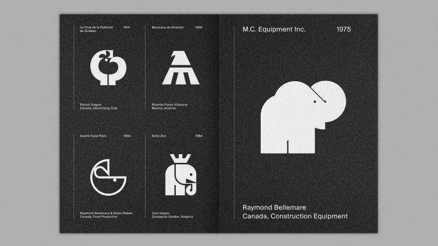
The success of the Instagram account inspired Baird to create the quarterly magazine. The first issue includes 12 pages of black and white logos, ranging from a "charming" elephant created for a Canadian construction company in 1975 and a V-shaped bird icon made for German fashion brand Vogel in 1965.
"The formalisation of corporate identity design was in its infancy during the mid-century," Baird told Dezeen. "There were a lot of opportunities to keep logos simple and communicatively immediate without the potential of infringing on the trademarks of others."
The logos featured in LogoArchive have been taken from Baird's personal archive and the collections of fellow designers.
"I have been scanning and archiving logos for a long time, and I have a network of designers with whom I collaborate with, who have access to an invaluable volume of historical artefacts, in particular, Christophe De Pelsemaker of LogoBooks and Blair Thomson of CanadaModern," said Baird.
"All the logos featured in the zine speak to me personally, be that in the conviviality of a metaphor, the retention of a distinction and memorability, or a clever take on a family symbol."
Baird explains five of the most interesting logos featured in the magazine below.

Enterprise de Construction Aéronautique Canadienne by Patrick Dugast, 1976
Building on the maximum meaning with a minimum of means, compounding allows a designer to deliver a layered graphic expression and introduce two moments of form language.
Finding the potential for and being able to pull off a natural synthesis of two images is a mark of a good designer. Here, the bird and maple leaf capture location and flight in a playful and creative way.

Place Fleur-de-Lys Centre Commercial by Claude Plante, 1972
This logo was selected for the designer's capacity for observation, for link forming and effortless execution in the creation of something simple yet distinctive.
Recognising the potential of one form to become something else is the heart of this concept; a simple geometric rendering of a fleur-de-lys is given a completely different association through its rotation, calling to mind the shape of a bird.

MC Equipment Inc by Raymond Bellemare, 1975
MC Equipment Inc's logo stands out for its conviviality of metaphor – the strength and physicality associated with elephants applied to construction.
Its rendering, a combination of heavy fills and fine lines, gives it a graphic immediacy and yet, with its almost child-like story-book qualities, an approachable and distinctive quality within a typically technical and masculine industry.

Le Pussycat by Raymond Bellemare and Gilles Robert, 1969
Designed for a cinema, Bellemare and Robert's work for Le Pussycat is highly accomplished and identifiable as a cat. It is distinctive in its rendering, confident in its balancing of heavy fills, and has a satisfying geometry and proportionality."
Figuratively speaking, it has mysterious potential: curled up, curious and cosy.
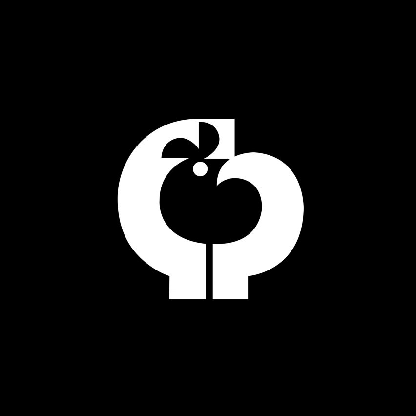
Le Club de la Publicité de Québec by Patrick Dugast, 1974
When curating the LogoArchive Instagram account, I'm primarily looking for a strong use of form language, but also maximum meaning with a minimum of means.
Negative space is a fantastic way of doing this. Here, a bird is drawn out of the loose rendering of a C and P. This sensitivity to ink and the absence of ink – in the use of dual imagery – serves to establish a distinctive and memorable symbol.