Re-public designs visual identity for restored Hafnia-Hallen sports centre
Local design agency Re-public used the lines that mark out various sports pitches as the basis for a visual identity and wayfinding at Denmark's largest sports centre – the Hafnia-Hallen in Copenhagen.
Re-public was asked to come up with a new name and visual identity for the Hafnia-Hallen sports facility, which was built in 1996 as the Club Denmark Hall and was used for elite football training.
After a partial collapse of the roof in 2010, the building lay empty until it was taken over by the City of Copenhagen, which began working on a plan to redevelop it as a multi-sports venue.
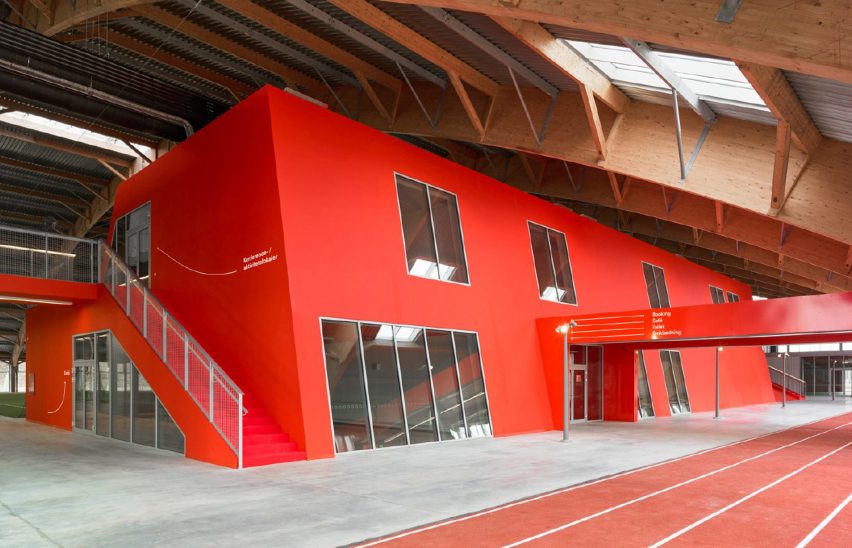
Local architecture firm Christensen & Co worked on the restoration of the 9,200-square-metre structure, which now hosts football pitches, handball and badminton courts, a fitness area, climbing wall and conference rooms.
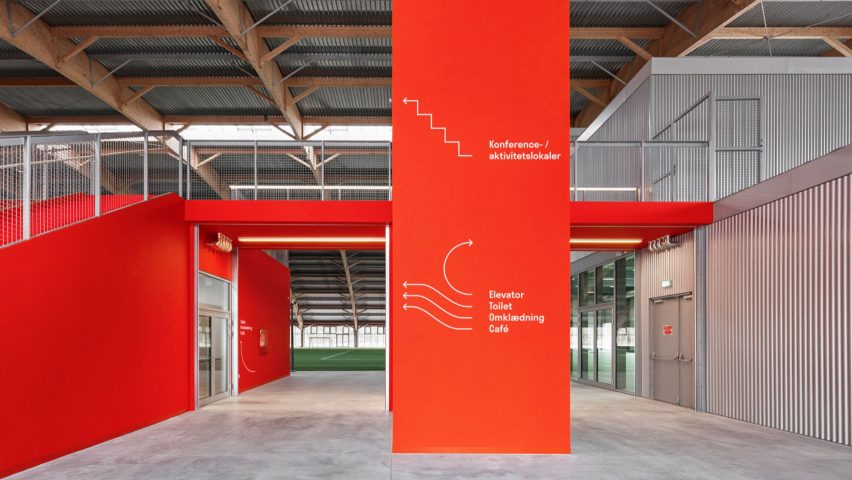
As part of the architectural project, the huge cross-laminated timber roof was restored and a clubhouse area containing changing rooms and staff facilities housed in a bold red volume was introduced.
Towards the end of the renovations, the City of Copenhagen approached Re-public about creating an identity centred around a new name that reflects the centre's changing purpose.
"As it was transforming from this elite facility into a multifunctional place intended for public use by all Copenhageners, the name itself was very important," Re-public CEO Morten Windelev told Dezeen.
"Hafnia is the old way of saying Copenhagen in Latin, so that was a way of making it clear that this is a place for everyone."
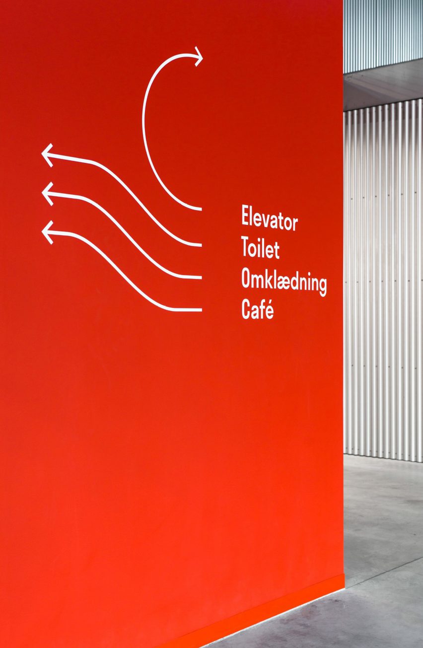
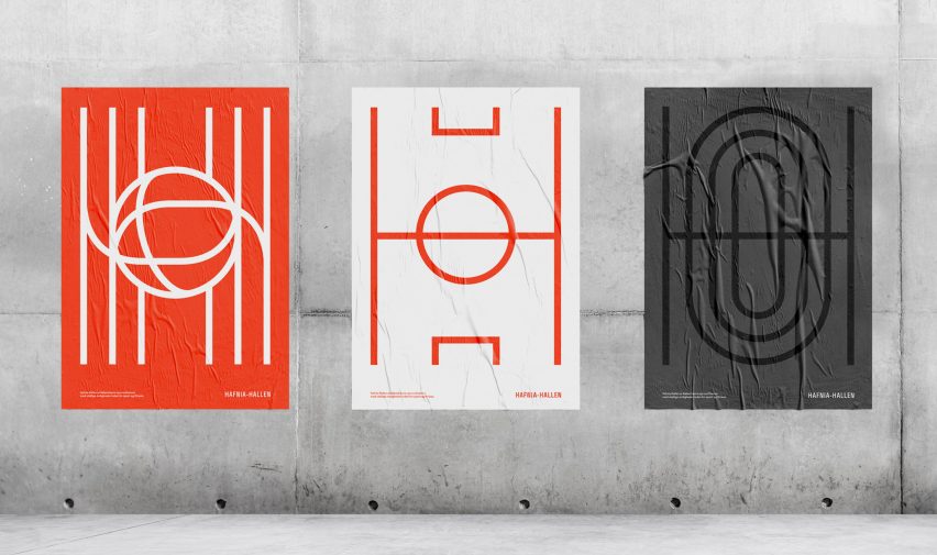
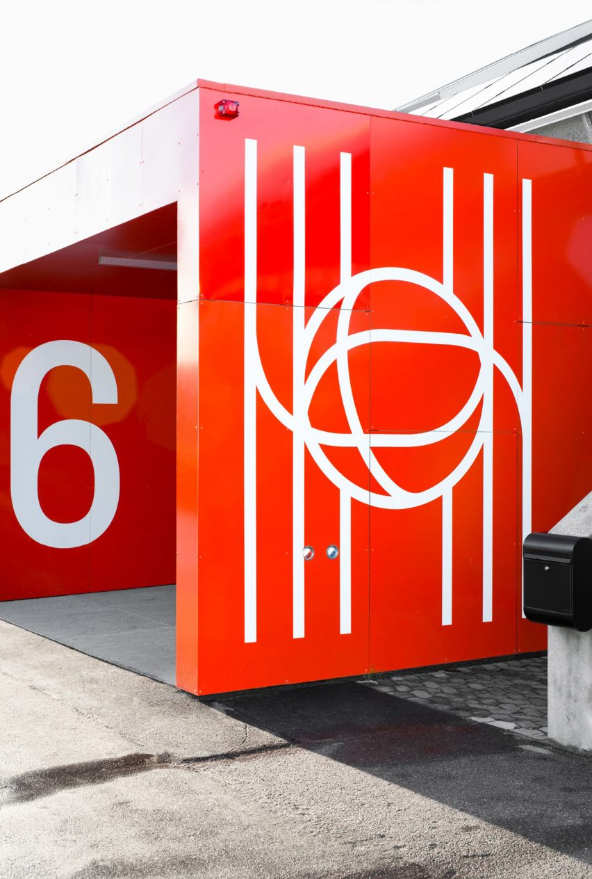
The new name formed the basis for the identity and logo, which features lines like those used to define the boundaries of different sporting grounds to form a stylised letter H.
"In a multifunctional arena like this you have all these lines that form a pattern on the floor," Windelev added. "We wanted to transform this into something communicative."
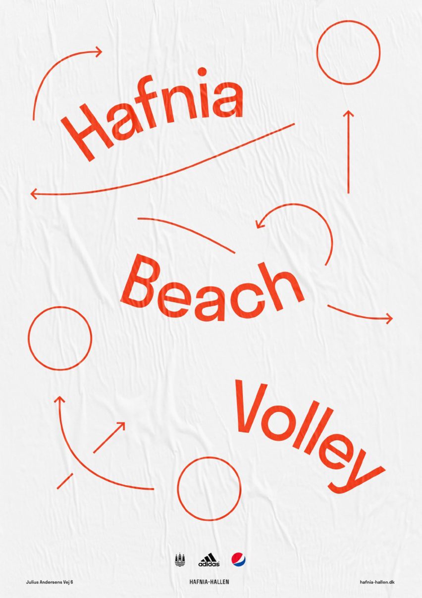
In the logo, the lines forming the vertical elements of the H merge to create the shape of a ball at the centre. Other versions used for promotional materials resemble the lines of a football pitch and a running track.
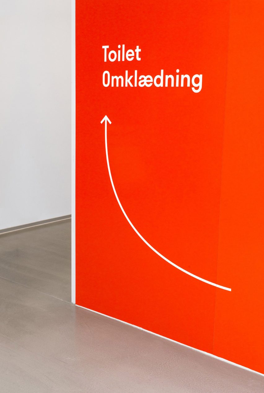
The same lines are used to create arrows or icons as part of a wayfinding strategy applied throughout the building.
A sans-serif font called Stratos by digital type design agency Production Type was chosen to complement the pared-back design.
The simplicity of the graphic treatment is intended to aid clarity, as well as creating a friendly feeling within the facility that is appropriate to its new purpose as a public space accessible to all.
The use of white allows the lines to stand out against the red backdrop of the clubhouse. It also references the contrast of the lines on football pitches and running tracks.
The Hafnia-Hallen project is shortlisted in the graphic design category of the Dezeen Awards 2019, alongside a visual identity for a digital conference that features lengthy texts instead of conventional graphics, and packaging for contact lenses featuring circles that represent different prescriptions.